eXtreme Type Terminology
Part 4: Numerals and Punctuation—by Paul Dean
Read Part 1 | Part 2 | Part 3 | Part 5
“The very air of the room seemed charmingly alive with little floating dollar signs and fat little ciphers, commas, more ciphers, all winging around happily, waiting for a mere scratch of the pen to call them into action.” — Dawn Powell, Angels on Toast, 1938.
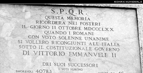
The Roman alphabet came equipped with its own numbering system, and Roman numerals still have their uses. They are commonly seen, for instance, on clock faces, in movie credits, and on the pages of a book which precede the introduction and the text itself. The letters M D C L X V and I, used in combination and sometimes with a bar over the letter, Roman numerals can signify all whole or natural numbers. Well, everything but zero (0). The zero was invented in India, and it has maintained the same form, generally a circle but sometimes just a dot, ever since.
The word cipher, derived from the same root zephyr and zero, usually suggests a zero but it can refer to other digits too. The European digits that have generally come to replace Roman numerals are sometimes referred to, inaccurately, as Arabic numerals. They might more properly be called Indian numerals, because they evolved from characters that, like the zero, originally came from India. The term Arabic numerals can lead to confusion with Arabic digits, the numbering system currently in use in Arabic culture. Arabic numerals and Arabic digits have similar ancestors, share some formal characteristics, and consist of ten characters, but are completely different symbol sets.
Typographically speaking, there are several ways to classify European digits. Tabular figures share a common figure width and are used for tabular data because they form orderly rows and columns. Proportional figures have varying widths and are used for everything that doesn’t require tabular figures.
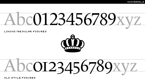
Old Style or text figures are designed to work in harmony with the ascenders and descenders of a typeface; they sometimes fall below the baseline, and sometimes rise above the x-height. Lining figures are usually drawn to match the base and the height of, and thus align with, capital letters, but some type designers create a second set that is slightly shorter than the capitals and looks better in running text.
A specialized font might also include numerator and denominator figures. Smaller numbers that rest below or just higher than the regular characters are known inferior or subscript (the lower numbers) and superior or superscript (the higher ones).
The forward slash (/), which we met earlier, is used to create horizontally bound split fractions. Stacked fractions, also known as horizontal bar fractions or vertical fractions, consist of numbers stacked above and below a figure dash. A nut fraction is a stacked fraction that is specifically designed to fit an en space. A built fraction is one that is painstakingly assembled element by element, whereas a piece fraction is one that comes as part of a font.
Speaking of math, the basic typographic units of measurement are the point and the pica. There are 12 points in a pica, and a pica is equivalent to 1/6 inch, thus making a typographic point 4.233 mm or 0.166 inch. Type is typically measured in points, and type size is referred to as point size. (Point size is determined by measuring from the top of the highest ascender to the bottom of the lowest descender, and therefore cannot be accurately measured from a single character.)
Dashes, Rules and Dot Leaders
The smallest typographic line is the hyphen, the short dash used to link hyphenated words and for wordbreaks at the end of a line. Ems and ens return to help describe the other line dashes: the en dash, the width of an en space, and the em dash, a popular line the width of an em space.

As Alexander & Nicholas Humez, describe it in the book ABC Et Cetera, “The em dash is used to indicate abrupt transitions—What?—and quasi-parenthetical expressions—such as this one.” The two-em dash and the three-em dash are precisely as long as their names imply.
The two remaining character-size lines are the underscore or understrike (_), and the increasingly popular pipe, also known as a vertical or a vertical bar (|). Incidentally, the grids created using vertical bars and understrikes, open at the top, for the filling-in, letter by letter, of information are known as combs.
Larger typographic lines are referred to as rules, which is perhaps not surprising in a field as traditional as typography. A hairline rule is a particular fine line; other rules are defined by width as measured in points. At some undefined point a wide rule becomes a bar. Bar width is also measured in points. Cutoff rules are used to distinguish the width of columns of type, and a leader of dashes sometimes carries the eye across a column of information, linking, for instance, a chapter title to a page number. A dot leader is a row of periods or midpoints set for the same purpose.
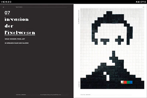
The ruled box in the upper right hand corner of an envelope or postcard that contains permit information instead of a stamp is known as the indicia. The left and right hand pages of an open book or magazine spread are known as the verso (the page on the left) and the recto (the page on the right).
The page numbering is known as the pagination. A page number is also known as the folio. Folio refers to the printed number, not the page itself, and so a page without a page number is known as a blind folio.
Punctuation
There were no extraneous specks, lines or squiggles to distract from the beauty of the original Roman majuscules. There were not even any spaces between the words, and this helped give Roman lettering, particularly when inscribed in stone, a harmonious texture. For sheer aesthetic appeal, legibility be damned, a comparison of wordswithoutspacing and space between the words reveals the beauty of the former and can leave the latter looking like gap teeth.
The first punctuation mark was a dot or small triangle situated midway between the top and bottom of the letters, which was used, instead of spacing, to indicate a named or title. The interpunct, centered dot, middle dot or midpoint has been hailed by Wikipedia, as “perhaps the first consistent visual representation of word boundaries in written language.” So the interpunct may be the mother of all punctuation marks, and not just the obviously similar, but slightly bolder and much lower full point, full stop, or period (.).
Today we would be lost, or at least often confused, if we didn’t clarify our prose with this handy little dot. The period once had an even loftier role in world affairs: most nineteenth-century newspapers had a period at the end of their mastheads. The New York Times continued with the period until 1966, half a century after most other papers had dropped the dot. Perhaps the editors felt that the period suggested stability and tradition, and was therefore worth the $84 a year in ink that type designer Edward Rondthaler once jokingly estimated that it required.
There is more to punctuation than just periods, of course. As every type designer soon realizes, a complete font set will also need an apostrophe (’), colon (:), semicolon (;), comma (,), hyphen (-), an en-dash (–), an em-dash (—), ellipsis or suspension points (…), and an exclamation mark, sometimes known as an exclamation point, screamer or bang (!).
In Britain the exclamation mark is sometimes referred to as a dog’s prick, and that, further, the combination of a colon and a dash (:—), out of fashion now but long used to represent a restful pause, is known as a dog’s bollocks. This is because the combination is, according to the online Oxford English Dictionary, “regarded as forming the shape resembling the male sexual organs.” The “dog’s bollocks (also dog’s ballocks)” also serves, incidentally, as British slang for the best of anything; as in the “bee’s knees.”
The question mark, query or squiggle (?) is of course crucial mark, and there are two types of quotation marks: smart quotes, also known as curly quotes or, in Britain, inverted commas (“”), and prime marks, a catch-all which includes the foot mark (′), the inch mark (″) and hatch marks or dumb quotes (″″). Both smart quotes and dumb quotes can be referred to as single quotes (‘’) or double quotes (“”). Standard punctuation marks also include a set of braces or brackets ([]) and its variations: curly brackets ({}), chevrons (<>), guillemets, otherwise known as angle brackets or angle quotes («»), and, of course, parentheses, which is both singular and plural for the ubiquitous curls (()), which can be distinguished individually as open parentheses (() and close parentheses ()). (Parenthetically, parenthesis, spelled with an i, refers to the inserted material, while parentheses, with three e’s, refers to the typographic glyphs.) And these days every typeface needs a slash or forward slash, also known as a slant, stroke, diagonal, whack, separatrix, or virgule (/). A pair of these, leaning as they do on every page of the Internet, are known as a double virgule (//).
The ampersand (&) is a stylized ligature of e and t, and represents the Latin word et or ‘and.’ Other commonly called for but unusual marks are the asterisk or splat (*), the commercial at sign, more commonly known as the at (@), the backslash (), bullet (•), caret (^), currency marks (such as ¢, $, €, £, and ¥), a dagger or obelisk (†), double dagger (‡), degree mark (°), an inverted exclamation point (¡) and inverted question mark (¿) for Spanish exclamations and interrogations, a lozenge (◊), a percent sign (%), a paragraph mark, paragraph sign, pilcrow or alinea, from the Latin a linea, meaning “of the line,” (¶), a section sign (§) and what must surely be the most-named typographic mark of all time, an octothorpe (named by Bell Labs’ engineer Don MacPherson by combining octo-, meaning eight, with the name of the 1912 Olympic decathlon champion Jim Thorpe), with the variations octothorp or octothorn, also known as the crosshatch, double hashmark, pound sign, number sign or, in computerese, a crunch (#).
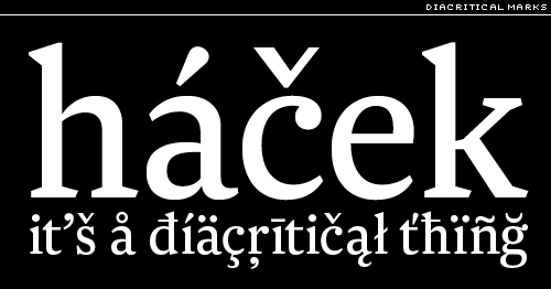
Accent marks, which rest over and under the letters of foreign expressions, are also known as diacritical marks or diacritics. Some common diacritics are the acute or aigu (é), the cedille (ç), the caret, circumflex or circonflexe (ê), the grave (à), the tilde or swung dash (ñ), and the umlaut, a feature in many German words (ü), is identical to the diaeresis or trema (ö) that is rare and not mandatory in English (don’t be naïve), but is a regular feature of Dutch, French and Spanish.
A floating or non-spacing diacritic has, in the computer’s mind, zero width, and so one diacritic can be easily combined with any of a variety of letters.
Dingbats are typographic ornaments or simple illustrations, the most famous set of which, Zapf Dingbats, was designed by Hermann Zapf. They are sometimes also known as ornaments, or as fleurons if the illustrations are of a horticultural nature. A set of pi characters, also known as a pi font, consists of nothing but unusual type forms, generally known as all sorts, special sorts, or peculiars.
Slang punctuation refers to typographic signs that are created by the user of a typeface, rather than the type designer, by combining pre-existing characters of the font. Two examples are a combination of question marks and exclamation marks (!?) to express exasperation, or augmentation by repetition (!!!) for emphasis. A third is a form of expression that has developed as a consequence of the surge of email and text messaging: emoticons, such as the apparently timeless smiley face. =)
In Emoticons During Wartime, a recent article in The New Yorker (December 10, 2007), Tom McNichol documents the usefulness of emoticons in communicating by visual innuendo. Emoticons can mean whatever the writer and reader want them to mean, until, of course the meaning is explicitly defined for all by The New Yorker. Two striking examples are:
“=|:-)= This e-mail is being monitored by Uncle Sam for your protection,” and “:-x I’d rather not say in an e-mail that’s being monitored for my protection.”
“When the world blows up and the final edition has gone to press the proofreaders will quietly gather up all commas, semicolons, hyphens, asterisks, brackets, parenthesis, periods, exclamation marks, etc. and put them in a little box over the editorial chair.”
—Henry Miller, Tropic of Cancer, 1961.

Part 1 | Part 2 | Part 3 | Part 5
[Font credits: Numerals—Le Monde Livre PTF; Dashes: Archer; Diacritical Marks: Newzald]


