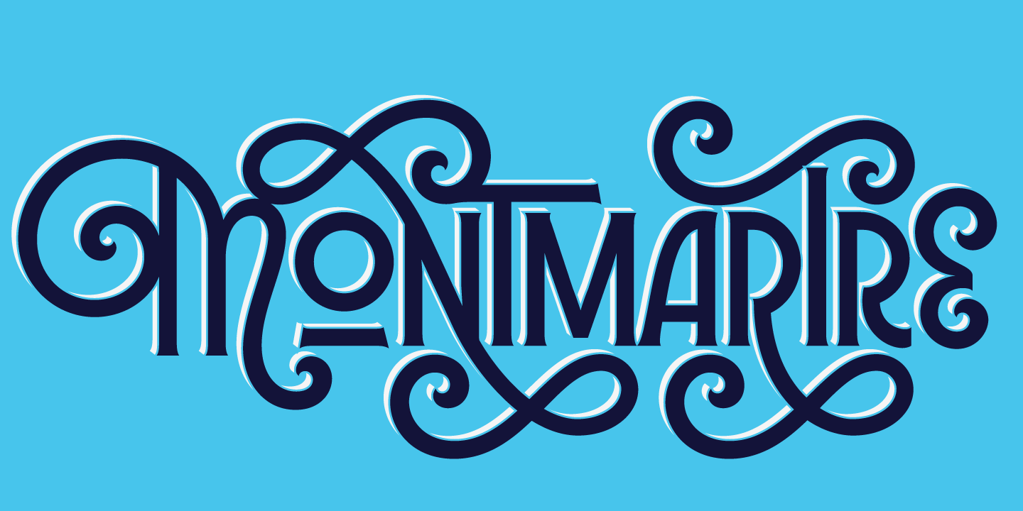
Sunday Type: birthday type
One Candle on the Cup Cake
It’s a little premature to celebrate ILT’s first birthday, but August 7th marks the day. In the coming weeks I’ll be organizing some prizes and competitions as a way of celebrating and thanking you, the reader. I have numerous things planned for ILT in the coming year, so stay tuned.
Let’s get Sunday Type off to a flying start with some bones by Bjorn Johansson:
Via Street Anatomy | Trend Hunter.
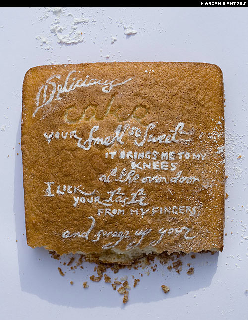
If you’re ever hungry for type, then a bite of Marian Bantjes (please don’t bite her) might well sate your appetite. Her food-inspired pieces are wonderful, and this one commissioned for Creative Review’s subscriber bonus magazine Monograph (wish I’d renewed my subscription now) is no exception:
Be sure to take a look at the others in the Love Stories series. Via Veer.
There’s a good piece on Kiwi type designer Kris Sowersby in the Sunday Star Times. I wish I’d been at the meeting. You can read Kris’ interview for iLT, and read the brilliant—and one of iLT’s most popular articles—From Moleskine to Market, charting the course of his Newzald typeface, from initial sketches to font.
Thanks Matthew for the shout.
Type Videos
More so-called kinetic type:
And yet another fantastic piece on the Linotype:
http://www.vimeo.com/1459865
Many thanks to Tobias for mentioning this video in the comments to last week’s Sunday Type.
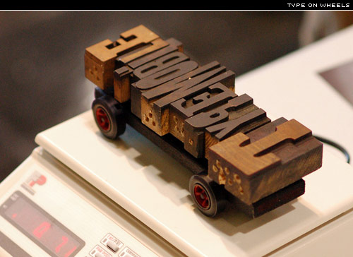
I had never heard of a Pinewood Derby Car until reading about them on Gentle Pure Space. I think I want one:
Manuel sent me this great link to some dynamically drawn type. My favourite is Helvetica accompanied by Nirvana—simply because it makes me feel young; Nirvana, not Helvetica, that is:
And there’s a tutorial on how to do it here (PDF).
I’ve seen this kind of lettering before, but never in something as (usually) mundane as a parking lot:
By Axel Peemoeller. Found by swiss miss.
Some great spreads on serifmag‘s Flickr:
The excellent work of Jamie Hearn during his first year at Central Saint Martins in London:
Also found this wonderful Bulldog Clip typeface by Dave Wood, while browsing Johnson Banks‘ site.
Why not have a go yourself. Take an everyday object, and turn it into an alphabet. Be sure to let me know if you do.
Free Font
Another quality free font from FontShop. This one is the medium weight of FF Nuvo OT:
These freebies are only available for a limited period, so hurry while it’s still available. Remember to read the license too.
Some more Letraset art; this time from Erik Binggeser:
Be sure to check out the rest of his Deviant Art.
And yet more Letraset from Grapplica:
If you missed it, there’s some more in this May Sunday Type.
Sunday Links
Typography in Exhibit Design
Halo Corpse Alphabet—thanks Ian Alec
Forget the Film, Watch the Titles
Giant Wooden Outlines—typeoff
Inspiring Advertisements—designerdaily
Top 15 Inspirational Typography and Font Blogs
Good to see the specimen book making a comeback. Here’s a new one from the wonderful P22:
There’s more about it on the P22 blog.
A big thank you to Vivien at inspirationbit for sending me this to celebrate iLT’s first birthday:

Thank you, Vivien.
If you were looking for an excuse to buy toy soldiers, then this is it:
Under Consideration interviews the creator of Fire in the Hole, Oliver Munday.
Need a desktop wallpaper for this month? Then here are some from Smashing Magazine to get you started:
And another from New Fangled. There are of course some wallpapers on iLT for your desktop and for iPhone. A number of you have sent me wallpapers; I’ll post them to the site as soon as I get a spare minute. Keep them coming. I like this iPhone wallpaper by David Yeiser, and set in Stern Pro small caps:
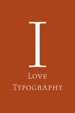
Stern—both metal and digital—is on my shopping list. There’s an excellent piece by John D. Berry on Stern on his blog Easily Amused.
I really like this advert for Marcel Berlanger and poster for Simon Starling by Sara De Bondt:
Featuring Wiels by Jo De Baerdemaeker.
Small Caps Revisited
Alec Julien wrote for iLT on the importance of Small Caps, as opposed to those ersatz, scaled down full caps. Here are some lovely small caps:
Digging through the Typophile archives I found this great tutorial on how to create good small caps. You’ll need to know your way around FontLab to make any sense of it, however. The most important thing to remember with small caps is that they should match the weight of the lowercase.
Events
Sleepless Nights on the Baseline. An Illustrated Lecture on Type Design by Jovica Veljović, awarded the Prix Charles Peignot for Excellence in Type Design in 1985.
Jovica Veljović is a calligrapher, printmaker, graphic artist and world-renowned type designer. His type designs include Ex Ponto, Silentium, Sava, ITC Esprit, and ITC Veljović, as well as several custom fonts for corporate clients. He studied at the Academy of Applied Arts, Belgrade, in the former Yugoslavia. Now living in Germany, he teaches in the design department of the Fachhochschule-Hamburg. We are fortunate to host him for this rare visit to the United States while he co-teaches FOC’s Summer Workshop with Ward Dunham.
More information on friendsofcalligraphy.org. You can see some of Jovica’s type here.
Pelican Uppercase by Marcus Schaefer:
Made from the perforated foam of a Pelican photo case. Yes, the same Marcus Schaefer behind Action Type.
Today’s Type
Alphaville, a mechanical sans serif from Nick Shinn of ShinnType:
Coming Up
Some articles from the Linotype Matrix magazine, an interview, and that piece I’m writing about Why Type Matters—almost there. I’ll also be doing some work on ILT; tidying up a few things (especially the coding), and also creating a new page from which you can more easily access all ILT articles. It’s back to work for me. Thanks for reading, and have a great week.


