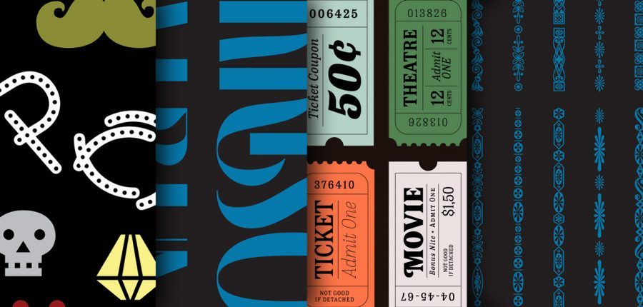
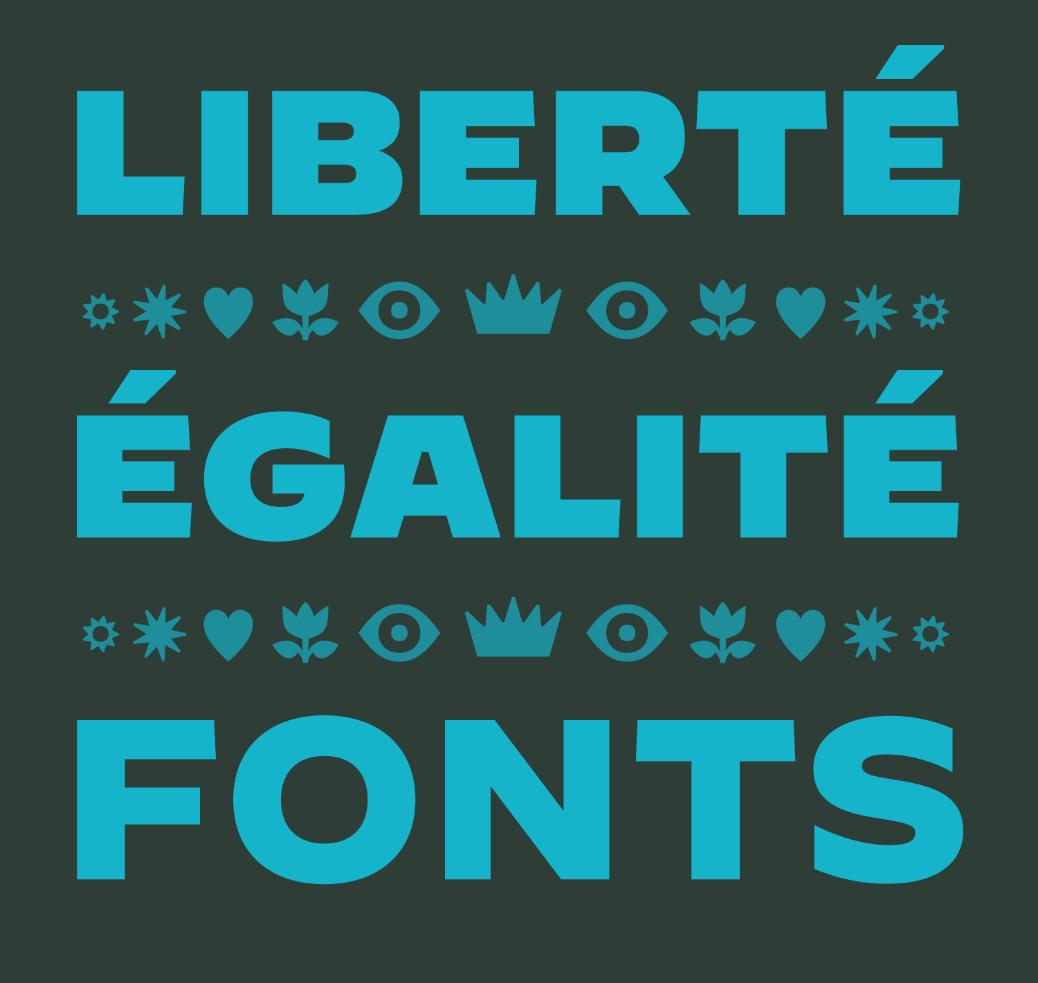
ILT’s Favorite Fonts of 2023

December 7, 2023
It’s that time of year again. Join us as we look back at some of our favorite new fonts released on ILT in 2023.

Tag: fonts in focus
It’s that time of year again. Join us as we look back at some of our favorite new fonts released on ILT in 2023. It’s that time of year again. Join us as we look back at some of our favorite fonts published on ILT in 2022. It’s that time of year again. Although, for many reasons 2021 is best forgotten, it was a great year for type design. Join me as I look back and talk about my top ten favorite typefaces published in 2021. Hannes von Döhren, award-winning designer of the expansive Brandon superfamily, has teamed up with Bernd Volmer to produce yet another typographic hit with the release of the splendid Palast superfamily. Among my favorite kinds of typefaces are those that don’t fit neatly into predefined or existing categories; those that dip their toes into more than one genre, or take their cues from disparate historical periods. These twilight zone hybrids aren’t always easy to pull off. Welcome to Magnat… Issue #3 of Fonts in Focus takes a look at Joona Louhi’s weird and wonderful, high contrast display typeface, Louche. Unusual weight distribution and some unorthodox and quirky details make this new release well worth a second look. After a decade, our annual Favorite Fonts list is back. In addition to a top-ten of favorite typefaces, there are now another 50 typefaces in the Honorable Mentions list. There’s also a section devoted to my favorite glyphs or characters from fonts released in 2020, and a few words about the magical selection process. Oh, and there’s even a typographic Space Invaders Easter egg! The list is back! For the first in this new series of Fonts in Focus, we visited the New York offices of Hoefler & Co. For this second installment, we remain in New York, just fifteen minutes’ walk from Broadway to Lafayette street and the stateside offices of Commercial Type, established in 2007 and headed by Christian Schwartz in […] Type designers take care of the details so that we aren’t unnecessarily distracted by them. And good type designers relish those details. To listen to them explain their craft and describe their font-making processes is like watching the child of zero-sugar parents eat its first candy bar.
ILT’s Favorite Fonts of 2023
December 7, 2023
ILT’s Favorite Fonts of 2022
 March 14, 2023
My Favorite Fonts of 2021
 January 19, 2022
Fonts in Focus: Palast
 December 17, 2021
Fonts in the Twilight Zone
 July 28, 2021
Fonts in Focus: Louche
![]() April 3, 2021
April 3, 2021
My Favorite Typefaces of 2020
 January 12, 2021
Fonts in Focus: two
![]() February 15, 2020
February 15, 2020
Fonts in Focus: Decimal & Chill
 October 28, 2019


