Blazing
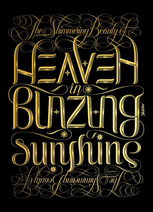
I’m proud to present ‘Blazing’, my new limited edition print. This piece is released exclusively through POW who sell the work of some extremely talented and well known artists including Banksy and Antony Micallef. For anyone who might be interested I thought I’d offer a little background information.
Generally speaking the art that has always moved and impressed me most has been work that brings together the highest levels of three things – beauty, originality and craftsmanship. So the idea behind ‘Blazing’ was to try to really push myself beyond what I’ve achieved in previous prints in terms of these three qualities.
As with my print ‘Flames’ I spent a long time thinking about the project before I actually started serious drawing. Lots of research and planning. Hundreds of sketches and scribbles. The print is an invertible ambigram, which means it can be read both ways up, but I didn’t want that to detract aesthetically as is often the case. The print had to be legible and beautiful in it’s own right, with the fact that it’s an ambigram being the icing on the cake.

I’m not religious and I use the word ‘Heaven’ in this piece simply to describe a condition or place of great happiness, delight, or pleasure. The words stem from the idea of dressing beautiful concepts in beautiful letters. I’m told that beauty is subjective but it’s never felt that way. Some shapes are inherently beautiful and some aren’t. The most beautiful lettering styles to me are often the most cursive so ‘The Shimmering…’ line adopts a highly cursive, flourished, formal script style. I’ve contrasted it with a lettering style that I wanted to look strong, majestic and timeless. As if it’s inscribed in stone or metal, ancient and cutting edge at the same time.

I’ve updated my site today with the print and new commissioned work. I have no idea how ‘Blazing’ will be received but I think it’s the best print I’ve produced so far. I hope the deep passion that I feel for letterforms comes across in this piece. ‘Blazing’ draws from some of the most beautiful lettering styles in history but, I hope, presents something that appears fundamentally modern, original and beautiful.

Seb Lester works in London as a type designer, illustrator and artist. He has created typefaces and type illustrations for many of the world’s biggest companies, publications and events, including the likes of Apple, Nike, Intel, The New York Times, The 2010 Vancouver Winter Olympics and JD Salinger’s final reissue of The Catcher in the Rye. He is passionate about letterforms. — @seblester


