Sunday type: napkin type
The Bestest Type
Welcome to another Sunday Type. Thanks to all those who sent in samples of their handwriting. I’ll gather them together and post them some time. If you haven’t sent in your handwriting sample, then you can still do so.
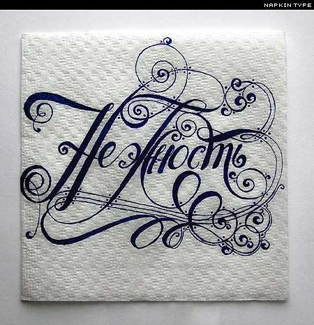
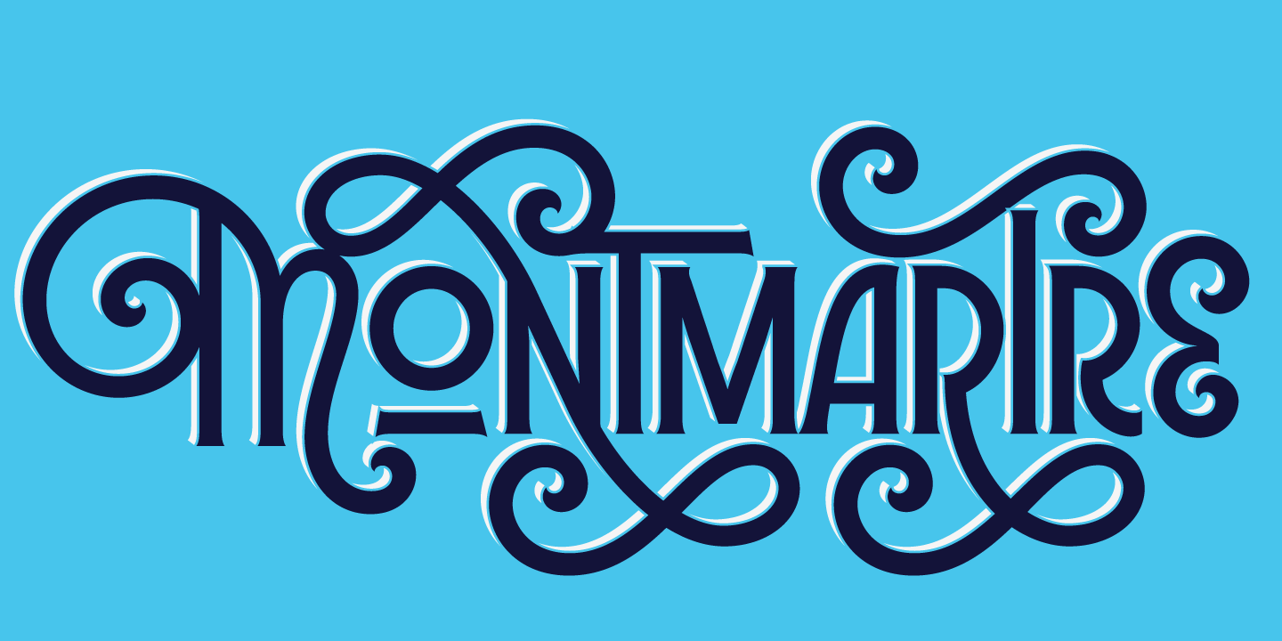
I’m sure most of you have at some time or another, with time to kill, scrawled or doodled something on a napkin. I certainly wouldn’t post mine here; in fact they’re not even worthy of a photograph. However, these are something you might like to aspire to:
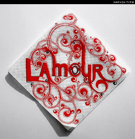
And if the above doesn’t make you envious enough, then how about this one:
From the SHCH Graphics Group. Does anyone know anything else about this designer(s)? I think I’ll be buying more coffee to practice. And, I think I can feel a best lettering on a napkin competition coming on.
Vernacular Typography is a wonderful set of Polaroids from Douglas Wilson:
Via jnack.
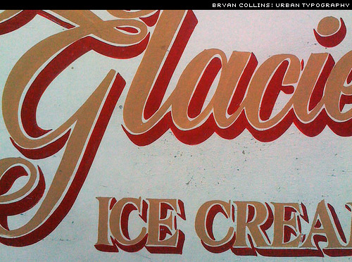
Bryan Collins’ Journal of Urban Typography:
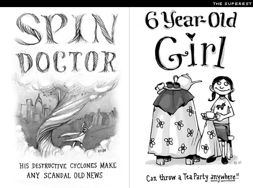
I regularly take a look at the magnificent Superest, but never thought to mention the incredible lettering until Aegir at Ministry of Type did so.
Superest is headed by the insanely talentd Kevin Cornell (the guy behind Bearskinrug and illustrator for A List Apart, among others), and Matt Sutter of Inkfinger (I mentioned his Typtopus t-shirt here recently).
The bestest super-heroes you’re ever likely to lay eyes on. Matt also has a new t-shirt; a Stag (don’t ask me why) made solely of type:
Freebies
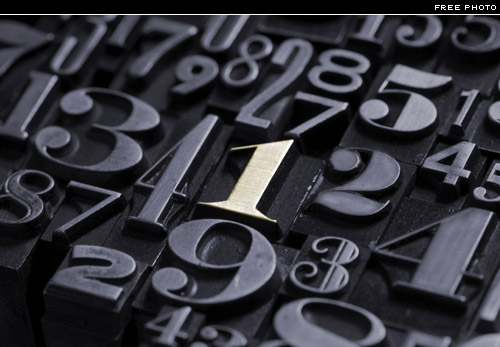
Oftentimes, those freebie photos that the stock photo people give away are quite frankly rubbish. This one from iStock is an exception:
I think you need an account to download it (it’s free), and you can download numerous versions up to 4288 × 2848 px. Thanks to Sye for letting me know about this one.
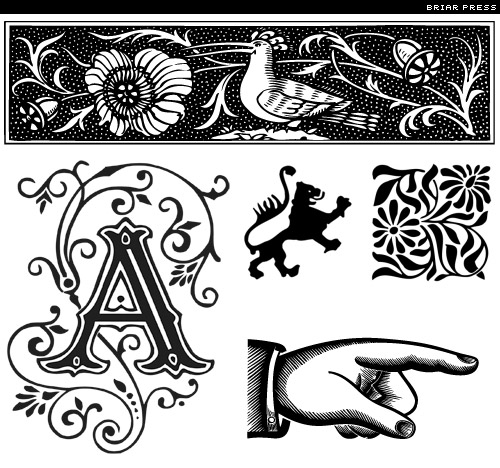
Some free ornaments from Briar Press that you can use for letterpress or whatever you want. Almost 600 free ones, in addition to tons of others for sale:
And a fun and lovely free font:
Also used to set today’s masthead. I love it. Just remember to use it big! Not such a big fan of the name—something a little more memorable than AIx Darbotzcumi might help.
From free to recylcled: these recycled or re-appropriated metal letters available through Urban Outfitters are great. I think I might have a go at making some myself, though these aren’t expensive:
Thanks, Megan at How.
The work of the very talented Alison Carmichael:
Be sure to check out her web site. Via Design for Mankind.
Stern Pro from P22 is available as a digital font and as metal type. The metal type at just $80 is a steal. It’s on my shopping list:
And a trailer for the new Making of Stern DVD here:
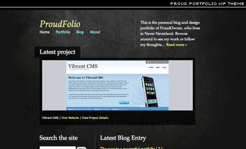
A very nice WordPress theme designed by the inimiatble Elliot Jay Stocks.
Named the Proud Portfolio theme—with good reason too.
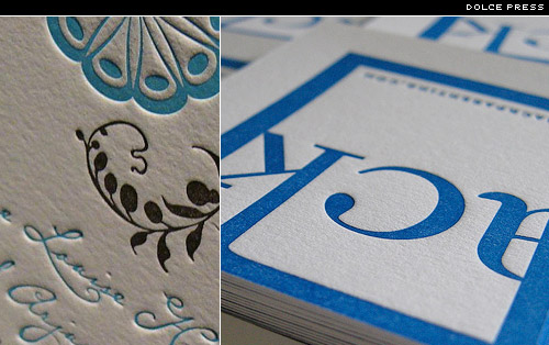
Some beautiful letterpress cards from Dolce Press:
Be sure to see the Dolce Press web site too.
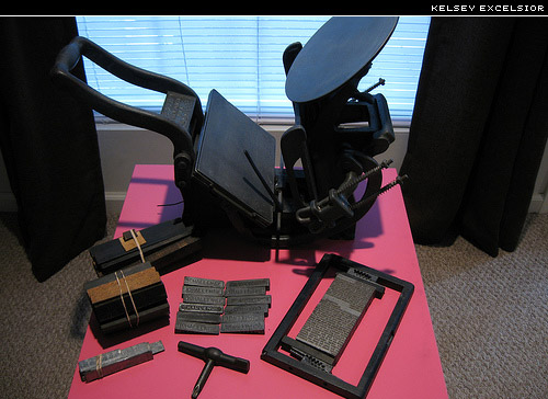
They sometimes have some presses and metal type for sale. This Kelsey Excelsior is up for grabs:
Something tells me it might cost rather a lot to ship to Japan.
You may have already seen this video, but it’s new to me, so here it is:
Thanks to Henrique.
This kind of experiment from Paula Torós is a great way to learn how to match type:
And besides it’s always fun to experiemnt with layout and with mixing and matching type.
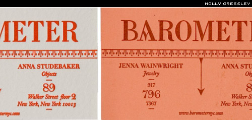
A gorgeous card designed by Holly Gressley of Rumors design collective, for Barmoeter:
Love that “A”.
Via Design Sponge.
A great little tool for making tiled backgrounds. Some great patterns that would make brilliant desktop wallpapers, or even backdrops for other type treatments. Let me know if you use them.
Via JosWeb.
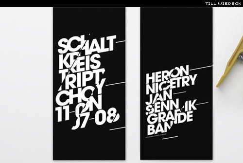
Some nice identity work by Till Wiedeck:
And some nice lettering by the same designer:
Sunday links
AltFontPrev—JavaScript bookmarklet lets you preview any site with the alternative fonts declared in its CSS , or one of your choosing.
Stop the proposed move into storage of the Type Archive.—thanks Elliot.
Vacation & Letterpress—Design Intellection
Free Fonts from LettError
An “a” of nails—for the love of type
This Cartoon Wrote a Swear Word….—(warning: strong language). Thanks, Manuel.
What the $%&’#—H&FJ on grawlix.
Type Tips
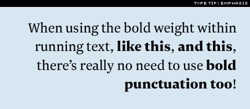
When boldface is used to emphasize words, it is usually best to leave the punctuation in the background…. It is the words, not the punctuation, that merit emphasis….—Robert Bringhurst
New Type
Though I don’t quite share Dan Reynold‘s enthusiasm for the swash caps (swash caps in a sans! Perhaps I’m just old-fashioned), Verena Gerlach‘s FF Chambers Sans is stunning:
Now that’s a sans with real character. Perhaps those swash caps will grow on me. You can test it and buy it from FontFont.
Coming up next is that contributed piece on Letterpress. Apologies that I didn’t post last week as intended. My mix-up. Have a great week!


