Sunday Type: garbage type
roman, italic, rotalic
August marks iLT’s first birthday, and I’d like to ask you all for suggestions on how we might celebrate. I have begun organising some prizes, so if you can think of a competition or whatever, then let me know in the comments below. Don’t be shy.
I’ve recently begun heading this post with a lovely photo of found type. Let’s stick with that. Here’s one from Simon Pascal Klein:
The image/photo blog is a newly created section of Simon’s blog called TypeNuts. Simon contacted me upon realising that I’d used the same name for the early iLT cartoons and an idea for a type news site that I’m still developing. So, if you can think of an alternative name, then let him know.
Bekka Palmer takes a look at garbage type—literally type constructed from garbage. Don’t try this in your living room:
Matt Sutter’s Octopus made entirely from Avenir, and called—well, could it be called anything else—the Typtopus—has found its way onto a t-shirt:
Some hyperbole in the title, but several nice posters in 40+ Killer Typographic Posters. This is one of my favourites:
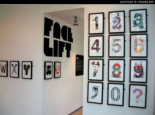
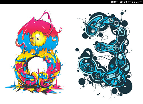
A while back I mentioned the Inkthis exhibition in Leicester. Here are some photos of the event:
The Flickr set is here. I’d love to organise this kind of event in Japan some day.
Discovered the work of Robert Bolesta. Here’s value Pack from way back in 2005:
Are there words that you consistently misread? Painter Christopher Wool and writer/musician Richard Hell teamed up to create Psychopts a collection of frequently misread word pairs:
Salve mistaken for slave. Via mediabistro. Would love a copy, though I think they’ve sold out.
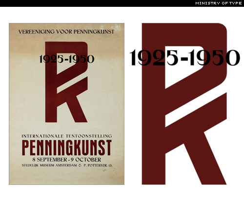
Aegir Hallmundur of Ministry of Type has been busy with beziers again. This time he has done a wonderful job of resurrecting this wonderful poster with its rather nice PK monogram.
Be sure to see Aegir’s stamps too:
He mentions printing these A3. I certainly hope so; they’d make beautiful posters. Inspiration from AceJet 170‘s post.
I mentioned the Konstfack Characters last month. A recent post on typographer.org led me to this video of the characters in action:
F is quite the dribbler; a little greedy though.
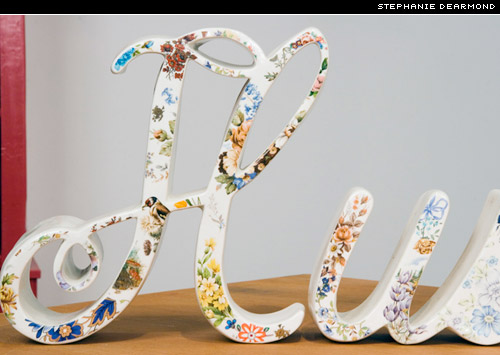
Some ceramic type from Stephanie DeArmond:
A couple of noteworthy book covers. On the left, Milk, designed by Barbara deWilde; on the right, Kerouac’s On the Road, designed by Jez Burrows for Penguin’s 2008 Design Award.

Love the intro to Debbie Millman‘s Design Matters Live video. What’s more, it’s an interview with none other than the hugely talented designer Marian Bantjes:
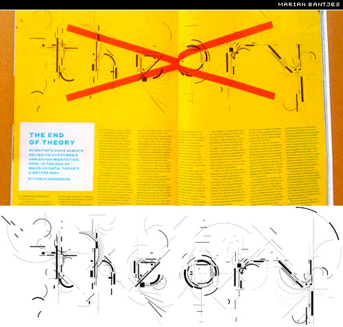
And a recent piece from Bantjes for Wired:
This piece on Wikipedia made me laugh a lot. Upon reflection, it’s not so funny (perhaps too much caffeine), but I still like it. Introducing, not an italic, not even an oblique, but … drum roll … the Rotalic:
Via itsnicethat.com.
Love these PoppTags, letterpressed gift cards to accompany your gift of wine:
Via swissmiss.
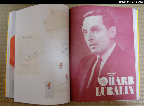
I just picked up the latest issue of idea (アイデア) magazine, which features the work of Herb Lubalin, Alan Fletcher, et. al. Content includes a great republished interview with Lublain (from 1969), an article by Helmut Schmid on the work of Karl Gerstner, and much more.
Spot the deliberate mistake in the last spread. Why isn’t idea magazine more popular outside of Japan? In time, I’ll upload some more spreads to my Flickr Idea set.
Matthew Raw’s Barrier Language Wall:
Sunday Links
Type badges from unconfessableideas
Graphic Design Museum Breda—photos
Better CSS Font Stacks—via Andy Rutledge
Down with Helvetica; design your own font—via How
Type Tips
Sometimes when setting type, you may need to set just a word or two with accented characters that your chosen font just doesn’t have. If you don’t have the accent, then search for a suitable one in another font, adjust baseline shift to ensure that it’s at the right height, then kern your letter and your borrowed accent together:
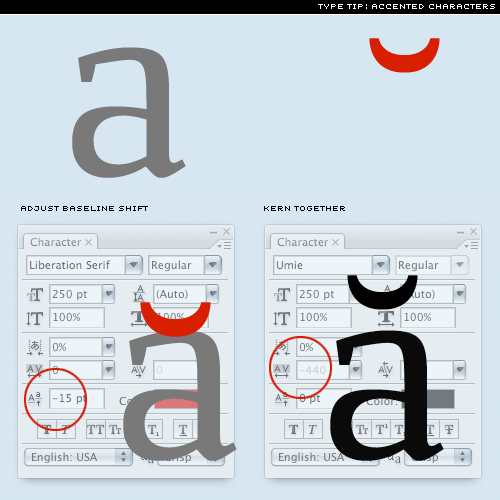
If you find that your text has numerous accented characters that don’t exist in your chosen font, then you’re probably using the wrong font. Good fonts should provide broad language support. Find one that can set all of your text.
There’s a wonderful line in Bringhurst’s The Elements of Typographic Style from the chapter on Analphabetic Symbols (chapter 5),
In the republic of typography, the lowliest, most incidental mark is also a citizen.
So, in honour of those oft-overlooked citizens, here are a few periods or full stops:
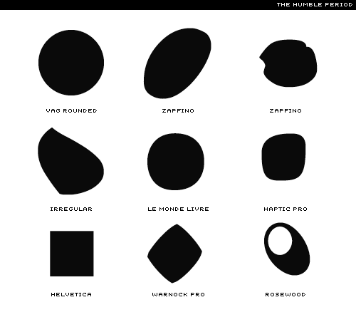
Though in many fonts, the humble period is circular (or very nearly so), there is ample room for bringing a little character to this incidental mark. Question: in one language the period is actually a letter of the alphabet. Which language?
Today’s Types
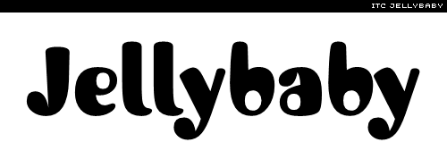
First, something fun. Timothy Donaldson’s ITC Jellybaby, curvy and bold with small offset counters:
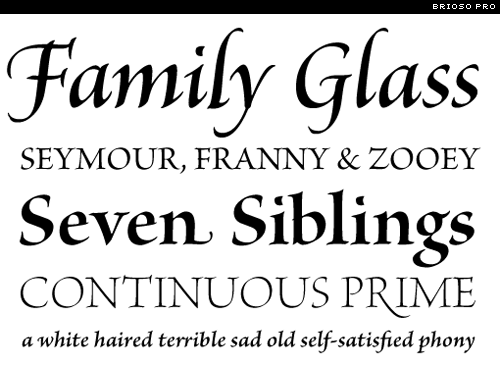
And Robert Slimbach’s roman script Brioso Pro:
Originally designed in 2004, it’s now available in all its OpenType glory.
Hope you’ve enjoyed this week’s Sunday Type. If you missed Jos Buivenga’s mid-week article, Anivers—birth of a typeface, then be sure to take a look. Have a great week.


