An Interview With Jos Buivenga
Face to Face
When it comes to type, some great things have come out of Arnhem in the Netherlands. Jos Buivenga is no exception. Art Director and type designer, well-known for his quality free fonts, Jos is quite a talent, and has quite a passion for type. After numerous requests from readers, I finally got around to interviewing the man behind exljbris.
Why do you design typefaces?
It has grown on me. It’s now more or less like breathing to me. I can’t help it. I just want to do it. It allows me to be highly involved–or even lose myself–in a creative process. That’s the most important thing in my life. I’ve had similar experiences with painting and writing short stories, but it doesn’t come close to designing type. I’ve taught myself and still have lots to learn but I hope to improve with every typeface I make.

How did you get started?
I started my first typeface Delicious in 1994 just out of admiration for type design(ers) and I was fascinated by how it would be to set a text with your own typeface. I can’t remember if I made sketches or not, but I do remember sitting behind my first Mac–an LC pizza box with a 12″ display–staring countless hours at non-aliased contours.
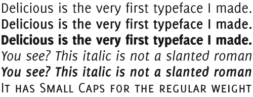
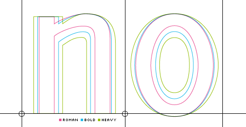
A challenge I set myself then was to try to keep the same metrics and kerning for all weights (upright and italic do differ). Also because most of the italic sans faces (in 1994) I knew were more or less slanted romans I wanted Delicious to have true italics.
What are the best and worst things about designing type?
The best thing is to be in this wonderful creative process where every decision brings you closer to the final thing. The worst things: things that hold you up like sometimes technique/software issues or misjudgements so that you have to redraw or change real substantial parts of your design.
Why do you give most of your typefaces away for free?
There wasn’t really a plan when I made my first typeface Delicious. Because I didn’t study type design, the real challenge was to explore all caveats and find proper solutions to come up with a reasonable looking, working font of my own. Selling it never crossed my mind … It just felt great when people liked it or wanted to use it. It was only after 10 years when I decided to make another face. Fontin still was a typographic exploration which I rather liked to share with people. rather than sell it to them–because I didn’t consider myself a real type designer. Shortly after I finished Fontin my fonts got listed at Vitaly Friedman’s “25 Best Free Quality Fonts” and that’s when things really took off. Many people got to know me and my free fonts and the responses were heart-warming.
Because I had a job and I didn’t have to earn money from my type design hobby, I found it very comfortable to give my fonts away. I could just do what I wanted. No need to create something like extra weights of more italics because of a foundry demanding them. No deadlines … I felt as free as my fonts.
What are you working on now, and what are your plans for the future?
At the moment I’m working on an italic version of Anivers, because it will be used together with the regular Anivers to set a book about free fonts.
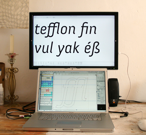
I’m also working on Museo Sans to accompany Museo.

Then there’s Calluna, my first serious attempt to do a text face.

Last but not least: DeliciousX and Fontin Serif still wait to be finally finished and I have to update Fontin (Semi) and Fontin Sans with extended language support. I’m also thinking of making a payed pro version of Fertigo. Often a new idea comes along (like Calluna when I was working on Museo) and I take a “break” to investigate if it’s worth continuing. It always comes as a natural thing and I never have to bother about what I shall do next. Sometimes I wish there were three of me to get all the things done that I want to do.
How do you design type? Sketches first? Or everything on screen?
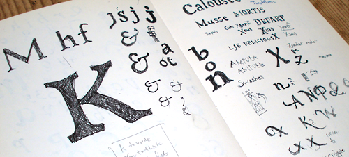
I sketch a lot. Most of the sketches I can’t use, but that doesn’t matter, because I really like doing it. Often I use drafts as a starting point for a new typeface, but the real process always takes place on screen.
Do you have favourite typefaces and type designers?
My favorite typefaces are the faces that had the biggest impact on me: FF Quadraat by Fred Smeijers and FF Legato by Evert Bloemsma. Evert (also from Arnhem as I am) showed me betas of FF Balance and FF Cocon and we talked about what drove him on each face. That made such a big impression on me that he’s still my favourite type designer.
You can see more of Jos’ typefaces on his web site and blog. And of course, ILT will keep you up-to-date on new releases from the exljbris foundry.


