
Why Bembo Sucks
By Kris Sowersby
At a recent panel discussion on New Zealand book design, I lambasted the overuse of Bembo in many New Zealand books. As more questions were asked than could be answered, I wrote this article to explain myself. Let me begin with a brief history.
Before digital typesetting and offset printing, there was the letterpress. A typeface was composed of fonts, one font for each size. These size-specific fonts consisted of individual letters made from metal alloy. Single letters were placed by hand to create words, words were aligned into sentences, sentences were stacked to make paragraphs, and these were inked and pressed into paper. As a printing process it is fairly basic. Woodcuts and potato stamps use a similar method.
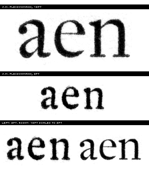
However, cutting a 7-point lowercase ‘g’ takes a lot more skill than making a smiley-face potato stamp! The old masters of typeface design spent decades perfecting their craft. Each font of type was designed to work at a specific size. For instance, when Bodoni needed a font for text size, he cut a font at 9 point. When he needed a larger size for headings, he cut another font at 36 point. The 9 point worked beautifully for text and 36 point worked for display. If one were to blow up the printed impression of the 9 point to the same size as the 36, the differences would be readily apparent. The 9 point has sturdier details: the serifs are thicker, the contrast is lower, and the spacing is more generous. The 36 point has much finer lines and the spacing is tighter. This is as much a technical consideration as an aesthetic one: the 9 point needs to be sturdier to withstand the printing process. If the details are too fine then the metal will quickly wear or serifs will break off when pressed into paper.
This practice takes on new meaning when we consider that there can never be a definitive Bodoni, Garamond, Jenson, or Fleischmann typeface, as their oeuvres consist of a multitude of single, size-specific fonts. It is like mashing up Othello, King Lear, Hamlet and a touch of The Tempest and publishing it as ‘The Shakespeare’.
Why is this relevant? Well, in the rush to adapt to digital typesetting technology, type foundries digitised classic typefaces. The nature of digital fonts is to use one outline and scale as desired. Typefaces went from being cut in a multitude of sizes to a single, all-encompassing outline. A digital typeface can be optimised for a few sizes, but hardly for all. Bembo, for instance, is a digital copy of a metal interpretation of an original typeface cut in 1495 – a copy of a copy. So, the process of digitisation poses a problem: which point size should be digitised?
This seemingly superfluous dilemma can only be truly understood when the original metal typefaces are seen in print. Oh, what a joyous sight! The subtle variation of letterform, the slight impression into the paper, the vibrant warmth of a page of text. It is not only beautiful, but an absolute delight to read. The effect of these typefaces is impossible to emulate with their insipid digital ghosts. Modern printing has become so perfect, so uniform and precise that the spirit of the original is crushed. It is like spending a lifetime slurping instant coffee and never experiencing a proper espresso.
As languages change, so do typefaces. These changes are not radical; they are subtle evolutions that address culture and technology. Modern typography requires modern typefaces, designed by the people of our time for the people of our time. There are cultural considerations as well. Is it appropriate to set contemporary Pasifika poetry in a typeface designed by a seventeenth-century Italian philanderer? What about using an eighteenth-century clanger for a twenty-first century New Zealand political polemic?
Are the ideals of the typeface designer compatible with those of the writer? It would be pedantic, of course, to match every nuance of the writing to the tone of the typeface. However, it is nice when some effort is made in the selection of typeface. Reading New Zealand books would be far less tiresome if the internal typography was much more considered. Just imagine if the same amount of effort went into choosing the typeface as there is for choosing the colour of the cover!
Clinging to the corpses of digital ‘classics’ is pointless, old fashioned and anachronistic – it will only ever lead to typography that is dull at worst and pedestrian at best. Ultimately, the point is to respect the reader. They will spend a lot of time reading the thing, so it is sensible to make that experience as comfortable and appropriate as possible.

Kris Sowersby is a professional type designer from New Zealand. You can see his typefaces at Village.


