Show some restraint
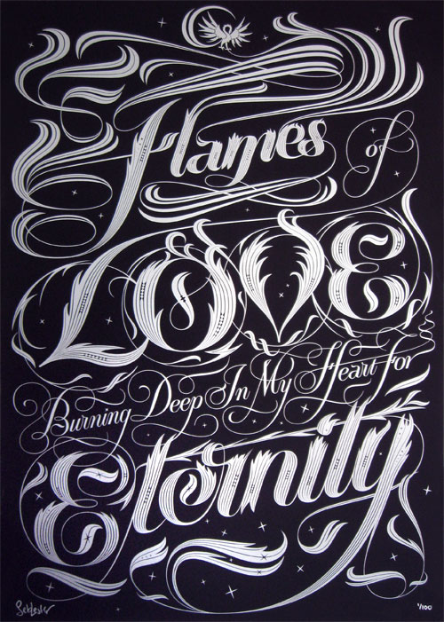
Let’s get right down to business, and start with something really beautiful. Seb Lester, who I’ve mentioned on these pages before, recently released a new poster. The picture below really doesn’t do it justice. The silver print on gorgeous Plike paper is absolutely stunning:
In fact, I don’t like to call this a poster. Flames is a work of art, deserving of a frame. Hand-pulled screen print, A2, metallic silver ink on black 240gsm Plike paper; a limited, signed edition of 100. And, you can now buy it from ILT. These won’t be around long, so hurry if you wish to own one. I’ll soon been posting more of Seb’s prints to the ILT shop. I’ll announce them via Twitter.
Love the work of artist Steve Lambert. Where signage meets art. Wonderful:
Like this piece by Luis Vicente Hernandez, from Madrid. Kind of Art Deco meets wood type:
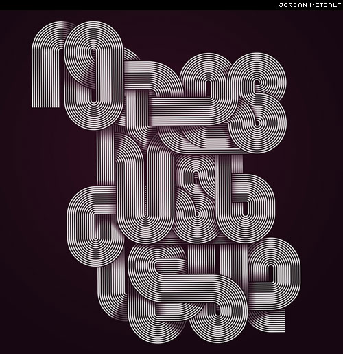
Like this woven geometric lettering from Jordan Metcalf:
Wear some glyph with one of these MyFonts t-shirts. Which would you wear?
Design Observer scores another hit with this great post on Printers’ marks:
In fact, some of my personal favourite printers’ marks are to be found in Swedish books. Perhaps I’ll write about that some day.
Your message in the sky with SkyTypers. The video on the home page shows how it’s done:
Just pretend you didn’t see the typeface used to set the captions.
What to do with all those old CDs? Well, you could try something like this:
Helvetica Neue Bold, but not as we know it. Sign constructed from 640 CDs.
Thanks, @steveavery.
Fire Type from You should like type too:
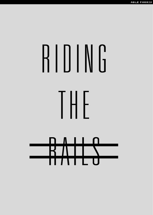
This is a great exercise. Take a movie, any movie, and create a poster for it; only using the title and the bare minimum of ornament. A wholly typographic poster:
If you decide to have a go, then be sure to show me.
This next one elicited a wow! These photos are stunning:
What’s even more exciting [deep, shallow breaths] is that you can buy the letters:
Must resist the urge, must resist …
Thanks to David Brown for the heads up. Also mentioned on the Ministry of Type.
Here’s something else I found via Ministry of Type. The Berlin Museum of Letters:
The World Digital Library is definitely worth taking a look at. Pan, zoom, download, enjoy:
Oddly enough, I discovered this Web site in my newspaper.
Really like the work of Japanese Commune Inc; especially this piece, and how it constructs kana from elements of the Latin alphabet:
I’ve seen this type of treatment before, but most make a pig’s ear of it.
Great Flickr set of covers from the Spanish magazine Nuevo Mundo:
Beautiful signage by fokusform:
Some nice branding/identity from Hook:
Just in case you haven’t seen the work of Alison Carmichael:
Smashing Magazine compiled a list of 30 typefaces for corporate design. I usually sigh when I see these lists; however, this is a good one. Here’s one of my favourites from the list:
I’ve been playing with the new Gotham Narrow, and I love it. If you’re a fan of Gotham (and who isn’t), then the new narrow is a welcome edition to the family. And, if you can’t stretch to buying all the new Gothams, then I’d recommend starting with Gotham Condensed.
New Faces
Lots of new typefaces released recently. Here are my top picks:
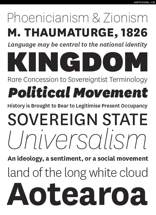
TDC2 2008 winner, National, from Kris Sowersby, now comes with light and thin weights, with respective italics. Fantastic:
Be sure to take a look at the PDF specimen. The Village specimens are excellent. Would love to see more foundries publishing such comprehensive specimens. A word of warning, however: if you print the specimen, you’ll then be consumed by an overwhelming desire to buy it.
Virtuosa, one of Hermann Zapf’s first typefaces gets an OpenType overhaul, and much more besides. Meet Virtuosa Classic:
From Fountain Type, the new Meadow, drawn by Swedish type designer Göran Söderström:
Catacumba, again from Fountain Type. This one designed by Rui Abreu. Comes with two distinctive titling sets:
Not convinced? Then watch this wonderful little video short from Rui:
Next up is a display face from James Puckett. The nomenclature set to reflect the present global economy. Meet Downturn:
It’s quirky in its intended unevenness, quite square, blocky, no-nonsense, industrial.
Matagrosso, a new rustic calligraphic script from Sudtipos:
I guess this next one shouldn’t be listed under new faces, as it’s unfinished, and therefore unreleased. But it coming along nicely. Read more about Nick Cooke’s work in progress over on Typophile.
Looking forward to its release.
Type links
Can Good Design Save Our Newspapers?
Real fonts on the Web
25 logos with hidden messages
Educational printing workshops in the home of Gutenberg
The romance of printing
Type Nesting — thanks Ivan.
The art of the grid
Slammer app — customizable grid overlays
Comic Sans Hairline — well, made me smile.
40 examples of typography in advertising design
Lots & lots of posters
Typography for Mobile User Interfaces
Arabic light calligraphy
MyFonts April rising stars
Font Police
The H&FJ Institute for Unapplied Mathematics
Web font embedding, points missing
Tal Leming on Web fonts
Letters, logos, & sign systems
Type Camp 2009 — Galiano & India
Jason Santa Maria interview on RBtL
Envelopes for Font Geeks:
OK, let’s take a breather. Got a few minutes (hours) to kill? Then try the type-themed Pong from Hype for Type:
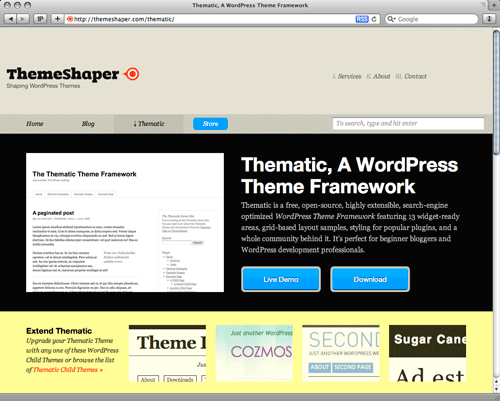
If you’re looking for a WordPress theme that honours your type, then look no further than Thematic:
In fact, it’s not so much a theme as a framework. Whenever I create a new blog, I now start with Thematic. Incredibly easy to work with, and requires minimal edits to get it working with your design.
Letterpress
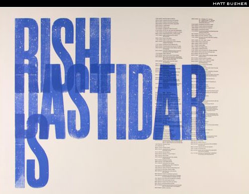
I have a big soft spot for this kind of over-printed wood type letterpress. This is a piece by Matt Busher from the London College of Communication.
And this piece is one of the very best examples of this method. The work of Nick Sherman:
For a veritable wood type feast be sure to check out Nick’s wood type Flickr set.
Parachute has a great interview with printer Justin Knopp of Typoretum:
Featured face
Here are two of my most recent purchases: first is a type that was originally commissioned by Nancy Harris Rouemy for the New York Times Magazine. Owing to popular demand, it’s now available for us mortals. It’s called Memoriam:
Gorgeous, Isn’t it.
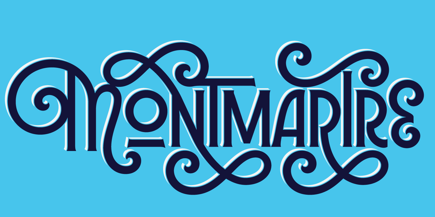
The second is described as an ornament font which happens to contain letterforms. Restraint, the font-child of Marian Bantjes and Ross Mills, is such a pleasure to play with.
What else can I say about Restraint? Buy it.
News & new
For Print Only (FPO) is s great new blog from Under Consideration:
Plenty of proof that print is alive and kicking.
FPO is a blog dedicated to both the visual stimulus and the detailing of the development and production of printed matter.
One to subscribe to.
While we’re on the topic, another great little site from Bryony and Armin is Wordit. A simple idea: they select a theme word each and every month, and invite us all to create an image about or around that chosen theme. This month’s (May’s) word is flow. Why not have a go.
Adobe launches a new type site:
Check out their Font Finder too.
WLT
Now serving more than 3000 type-related images, WLT is proving insanely popular. I have to limit the time I spend on the site; it’s quite addictive. I was going to list some of my favourites here, but this post is already quite long, so just click on over to WLT, and take a look for yourself. Remember, you can now submit your own recommendations via the Repositorium. Kari and I have lots of new features planned. I’d like to thank the contributors for all their posts. Remember, you can naviagate between pages using the left and right cursor keys!
OK, just one pick. This beautiful letterpress piece by the incredibly talented Jessica Hische:
Posted here on WLT. You can read more about Alison over at Creative Review.
Gargantuan give-away
You may have heard me mention on Twitter, the 40-prizes give-away. I have 25 prizes thus far. If you’d like to donate something, then please mail me at [email protected]. Why 40 prizes? To celebrate ILT’s 40,000 RSS subscribers. We’re not there yet, but as soon as we hit that number, then I’ll launch the give-away. More than anything, it’s an excuse to say thank you — to all of you. There are some really great prizes. More details coming soon.
And finally …
A few of you have asked whether WLT will replace the week in type. I hope the above answers that. I have several articles ready to post — a rare luxury. What shall I publish next. I’ll surprise you. Thanks for reading. Have a fantastic week.


