Sunday Type: smoking type
A Font a Day Keeps the Doctor Away?
It feels as though someone stole Wednesday and Thursday. Anyway, not much that can be done about that. Let’s get things rolling on a lighter note. Typophile, holds a great themed competition–or battle–each week. This week’s is one that anyone can have a go at:
Garamond and Zebrawood walk into a bar, they have a few drinks and one thing leads to another…. Create from scratch, the typographic love child of: Garamond and Zebrawood.
Just click on over to Typophile to get involved. And still on a lighter note, this rather unfortunate logo for the UK’s Office of Government Commerce. Be sure to rotate your logo designs before submitting to the client!
No comment. Via typographer.org.
Font Game Update
I’m pleased to announce that after a lot of hard work (on Kari’s part), the hugely popular Rather Difficult Font Game is now hosted on ILT.
Kari has some great plans for the game, including expanding the number of typefaces. Oh, and there’s an iPhone version too.
Next is a series of documents that outlines the development of Haas Unica (fundamentally a reworking of Helvetica):
Via SwissMiss.
While you’re waiting for the iLT t-shirts, you might like to try this one on for size:
The descending (weights) Helvetica Neue t-shirt. Thanks to Hamish—who I believe wears one.
Some visual stumulation in the form of these two good Flickr Photo Pools. The first is the Chinese Type Pool. Mostly signage and examples of calligraphy. Would be nice to see some more print examples.
The second, for me, is a little closer to home—the Japanese Type Pool:
Photo courtesy of スロbernat. One of the most interesting challenges in Japanese typography is combining Japanese type with Latin.
I’ve mentioned Michael Doret’s Metroscript before, but I’ll mention it again.
One, because it’s a beautiful script; two, because it’s on special offer (20% off until April 30, 2008). It also comes with one of the best PDF instruction manuals I’ve ever seen for a font (explaining how to use its OpenType features).
I really like the look of the newly-launched Newwork magazine:
I headed off to YouWorkForThem to order a copy, but they’ve sold out. Blast!
We’ve had type furniture, so I guess now it’s time for type rugs:
I might just cut-up my existing rug.
Of Cars and Type
Carlos Segura, founder of T26 type foundry has an interesting web site (especially for those who like cars and type): cartype.com is, in his own words, “A comprehensive study and collection of reviews and typographical applications of emblems, car company logos and car logos….”
Sunday Type Links
Be Humankind—Oxfam’s new ad campaign.
5 principles…of setting type on the Web—SM
Sugar sweet lettering—How blog
David Berlow, type designer—Easily Amused
McCain’s Optimum Look—Steven Heller
Jan Middendorp interviews Jim Parkinson
Elements of Design Applied to the Web—Astheria
Emigre has just released Slab and Sans Narrow additions to the Vista family by Xavier Dupré:
And while on the subject of Emigre, don’t forget the Essays republished on their web site. That reminds me, I received my copy of Slanted #05 the other day (I mentioned it last Sunday). Lovely magazine, some great specimens, a piece on Kris Sowersby, and lots of knocked-out Feijoa display (which I bought back in December). Kind of reminded me of Emigre magazine. I wonder if Slanted will allow us to republish the odd article here on iLT?
Web Typography
The Elements of Typographic Style Applied to the Web is a noble undertaking. There have been three recent entries, of which Add and delete vertical space in measured intervals is my favorite. It’s well worth starting from the beginning and reading through every single entry. The site is an invaluable resource for web typography, and a great example of how good text on screen can be. Richard Rutter deserves a medal.
Today’s Typeface
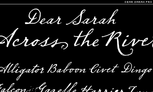
Dear Sarah Pro by Christian Robertson:
It even comes with ink blots, alternate–and swash–caps, small caps and ornaments.
I hope you’ve enjoyed today’s Sunday Type. See you soon for more interviews, typeface reviews and lots more. Next week, there will be a competition too. Enjoy your Sunday, and have a great week.


