
Sunday Type: Spaced-out Type
The Art of S PAC ING
Regular readers may well remember the lovely 1940s-style brush script, Kinescope, from the talented Mark Simonson. Mark’s latest offering is Filmotype Glenlake, a digital revival of a classic Filmotype font from the Fifties. And if you have no idea what Filmotype is, then head on over to the Filmotype page.
And here’s a little taster of Filmotype Glenlake:

FontShop has not long released its list of top ten types of 2007. Among them is of course FF Meta Serif, Stefan Hattenbach’s Anziano that I mentioned last week, and this absolutely beautiful didone from Jean François; she’s called Ambroise:

iCandy
I’m not going to dwell on this next item. I don’t have an iPhone, so it pains me to talk about them. Anyway, Veer has produced some lovely iPhone wallpapers; among them are a few type-themed ones, with Candy Script by Alejandro Paul used on the left, and I’m sure you can guess which type is used for the wallpaper on the right:
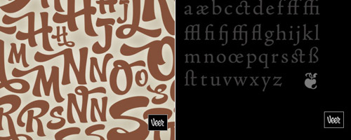
iLT iPhone wallpapers coming soon. If you’d like to make your own, then why not submit them here (320px × 480px)
Zoo type
Maybe you’ve already seen the book Bembo Zoo, but have you seen the web site; same principal as the book; pretty clever, I think. Just click the letters and enjoy.

Some nice type treatments here from Kollega:
And on a lighter note
The following book cover is not the the marriage of PhotoShop and the typographically challenged comedian, but is the real deal. And of all the people in the world to find it, Jonathan Hoefler of H&FJ did. Priceless:

Gemma over at For the Love of Type photographed this in her local book store. Spot the ‘deliberate’ mistake:

If you come across similar crimes against type, then be sure to send them in–so long as they’re not examples of my own typos ;)
Dan Reynolds needs you
Dear iLT readers, Johno has asked that I appeal directly for your aid. This year, I’m researching Indian newspapers, which typefaces are used, and how these work in print. Fellow students are conducting similar research: I’m just looking at Hindi newspapers (not other languages that use Devanagari), while a colleague is looking at Telugu newspapers. Other students are looking into Tamil, Gurmukhi, Oriya, and Malayalam, but not for newspapers. Perhaps this explains things a little better.
Links to newspaper websites are not what we are looking for—a website uses fonts installed on the reader’s browser. PDFs of newspapers are a good second-best… at least here correct fonts are displayed. If any of you out there are from India or happen to fervently collect daily Indian newspapers, do drop me a line at d.j.a.reynolds [you know what comes here] reading.ac.uk. Thanks!
Coming soon…
This one I’m very excited about: Alec Julien, the author of the popular So you want to create a font series, has made iLT’s first ever video tutorial. More about that next week. Next up is an article by type designer (and creator of Feijoa) Kris Sowersby; and then an interview with Jean François Porchez, type designer, former president of ATypi, and founder of the Porchez Foundry.
And finally
A big merci to Jean-Baptiste Levée for the Ambroise header. Here are a my font-picks for this week (Anaheim Script and Leitura Display):


…and it’s Sunday, so don’t work too hard.


