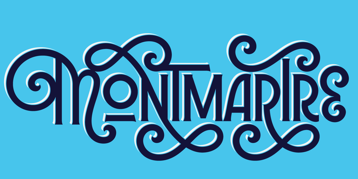
the week in type — Zócalo
Come on Marlene
Fast closing in on 2009. I can’t believe it. What happened to 2008? The very lucky winner of the Seb Lester poster is mentioned toward the end of this post. Thanks to everyone who entered. This week’s the week in type is a big one, so make sure you’re sitting comfortably. Enjoy.
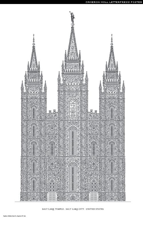
A beautiful new letterpress poster from Cameron Moll. I’ve ordered one:
There are two options, signed and unsigned. Can’t wait to receive mine. If you want one, hurry. I’m pretty sure they’ll soon be sold out soon. You can see more photos of the project over at Veer.
Some wonderful luggage labels, and some lovely custom type:
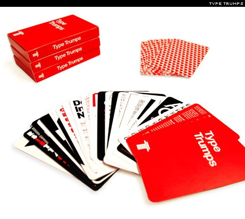
I’m a little late to the game in mentioning these but, just in case you missed them, here are Type Trumps from Face37:
Would make a fine Christmas present (that’s not a hint).
Some nice posters from the One Ton Show, held earlier this month in Shoreditch, UK:
A neater way to look at your RSS feeds. A skin of sorts for Google reader, Helvetireader:
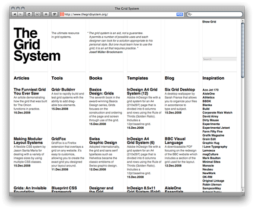
Had meant to mention this one least week. Here is Antonio Carusone’s (AisleOne) wonderful new grids resource, the Grid System:
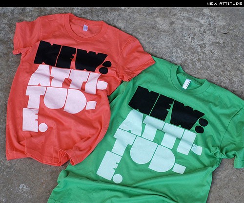
Big type, nice tee (not sure if it’s actually for sale):
Some nice numbers from Andrew Byrom:
New fonts
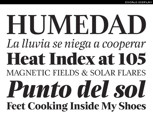
Lots of new typefaces this week. Let’s start with Zócalo Display from Font Bureau. Designed by Cyrus Highsmith:
Young Blood from Jeremy Dooley’s Insigne foundry:
Diane Script just released by Mark Simonson, and available at Font Haus:
You can read more about the development and inspiration for this gorgeous script here.
Back in August I interviewed Nikola Djurek of Typonine, and the designer behind the lovely Amalia. He’s just released another great text face, Marlene:
Be sure to take a look at the Marlene PDF specimen.
Geogrotesque, a sans family in seven weights from Emtype:
And the exceptional looking FF Mister K, designed by Julia Sysmäläinen:
Yesterday I received my copy of the TDC’s Typography #29. The cover is brilliant and the contents more so. This is definitely my pick of the month. A must have.
Really like this cover for Acido Surtido, designed by Marian Bantjes:
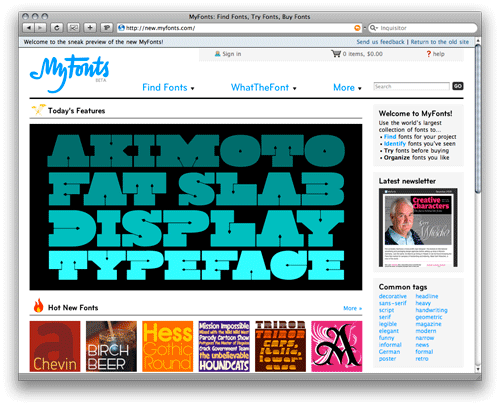
MyFonts has finally redesigned its site. Still in beta, but approximately 7 million times better than the old site, which was a hideous eyesore. The new site looks much, much better, and comes with lots of new features, and is generally so much nicer to use. Congrat’s to MyFonts. Oh, and the new logo is nice too:
Typesites has a great review by Joey Pfeifer of Wilson Miner’s Joseph Müller-Brockmann-inspired new Web site:
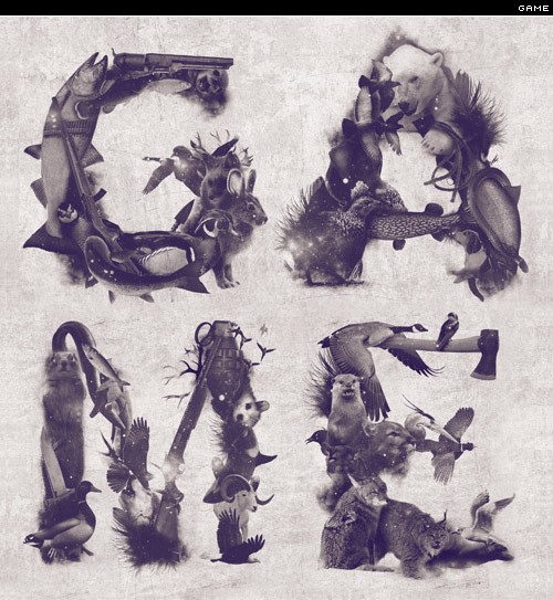
A slightly bizarre, but nonetheless interesting ‘type’ treatment:
Thanks, Jason.
And if you think that’s strange, then how about Amitis Pahlevan‘s ‘typeface’ constructed from fake eyelashes. I love it:
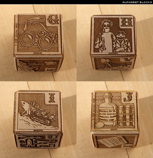
Some exquisite wood alphabet blocks:
Free font
Toypography from Jack Usine is really fun. Architectural shadows and shapes as type:
Events
I there’s one event I’d just love to go to, it’s the Typophile Film Fest. Entries for Film Fest 5 are open until Friday, March 13, 2009.
For more details, see Typophile.
Type links
Eco fonts save your ink
Importing text — Ilene Strizver
Typography inspiration showcase — thanks, Peter
MA/PgDip Typography at Salford Uni — thanks, Vlad
Paper-cut illustrations by Yulia Brodskaya
Houston Chronicle redesign
Typographic Gifts for Designers, Part 14
Video
Psycho Typo Graph:
http://vimeo.com/2405859?pg=embed&sec=2405859
Thanks, Yuki.
A wonderful introductionn to Arabic typography. Audio and slides, narrated by Titus Nemeth, a former Reading student:
http://www.veoh.com/videos/v16951258rHSrkqSH
Many more hosted on River Valley TV. Definitely worth clicking through to.
Some great spreads from SEED magazine:
Fantastic Flickr set from Berlin Type:
Note how the umlaut sits inside the ‘o’ in the word “Böttger”.
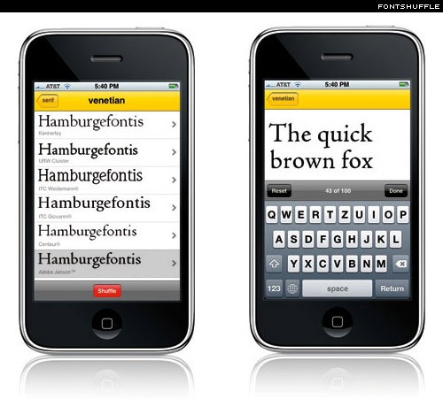
FontShuffle is a free iPhone app from FontShop. Personally, I can’t understand the point, but perhaps I’m being a little harsh. Others have said they find it very useful. Feedback, please.
However, I do think there’s a lot of potential for this kind of app. Just needs a little more work, and a larger library of type.
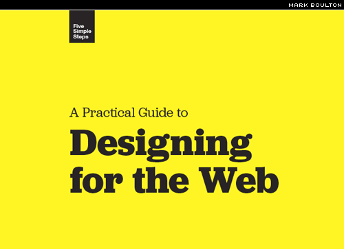
Nice and simple cover for Mark Boulton’s upcoming title, A Practical Guide to Designing for the Web (detail shown):
And nice to see Joshua Darden’s Jubilat on the cover. Love it. You can even download a free sample chapter.
Like these numbered stools over at Design Sponge:
Though not sure where they come from.
This week’s type is …
Mason from the immensely talented Jonathan Barnbrook.
As used rather nicely here:
News
Some great news on the plugin front. Hamish, author of the typogrify plugin for WordPress and Jeff King of the recent WP-hyphenate plugin have decided to collaborate on a single plugin that does it all. Can’t wait to see that.
And the winner is …
Almost 150 entries to the Seb Lester competition. Of those I received about 30 correct entries. The question was, How many stylistic sets are there in the OpenType version of Soho Gothic? Many answered the number of weights and/or styles, but there are, in fact, 5 stylistic sets:
Stylistic Set 1: Semi-slab letterforms in upper- and lowercase
Stylistic Set 2: Simplified forms for lowercase a, u & y
Stylistic Set 3: Simplified forms for lowercase u & y only
Stylistic Set 4: Semi-slab letterforms in the lowercase only
Stylistic Set 5: Semi-slab letterforms in the lowercase i & l only
The answer can be found in the Soho Gothic PDF specimen.
The randomly selected winner from the pool of correct entries is Florian Hardwig. Congratulations, Florian.
A couple of new desktop wallpapers.
More iLT desktop wallpapers here. There are also some great iPhone wallpapers over at Poolga:
I’ve added a small new feature to the comments. If you register with iLT, and complete the extra fields, then other readers can visit your Flickr [FL], Twitter [TW], and FaceBook [FB] pages. It’s also pretty useful for me in getting to know you better.
You can signup here if you want.
Hope that’s enough to keep you going. Enjoy the rest of the week; and a big thank you to those who regularly send in links of interest. Keep them coming.


