Sunday Type: incubator type
Coffee Hot, Tea Cold
Who says House don’t make metal type. This looks like metal to me; though larger than your average type, and weighing in at 8kg. I love it. Unfortunately it’s sold out! [Have since heard from the Houses’s mouth that the Cast Iron Ampersands, pictured, are now available]. There are, however, a number of cast aluminium ones left. But I want need this one:
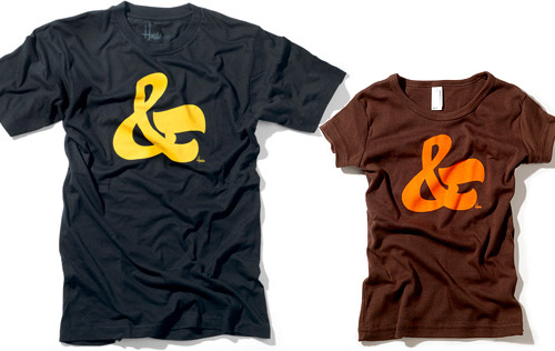
And one of the best type tees I’ve ever seen:
Also from House Industries, of course.
New Type
Looks like Jos Buivenga is on a roll. Hot on the heels of Museo and an extended Anivers, he’s released an updated version of his very popular Fertigo. Fertigo Pro includes wider language support, redrawn glyps, and a number of ornaments, in addition to some major tweaking on the metrics and kerning front; and, on top of all that it costs…nothing. Download, use, enjoy.
Congratulations to the two classes of 2008 from both Reading and the Hague. I received a great poster showcasing the types created by students on the Type and Media course (nightmare to find anything on the site, unfortunately). Thanks Mathieu for the great poster. I’ll post some scans of it soon. And you can take a peek at Dan Reynolds’ (Reading) Martel. More details to come soon.
Will you be at TypeCon 2008? So who would like to report on the event for iLT? Send me a mail if you’d like to do so.
TypeCon begins today! The full program schedule is here, and details of workshops here. Wish they had some live streaming video events or podcasts. I shall definitely try to get along next year.
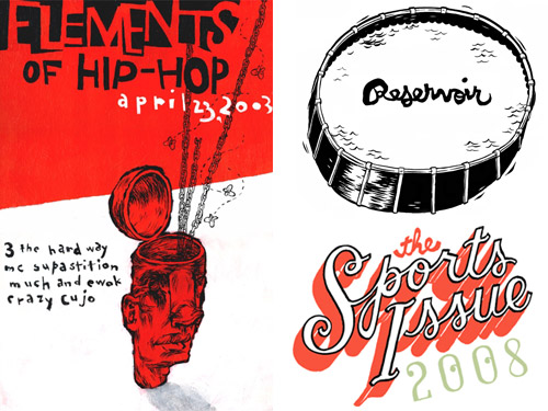
Wonderful ‘poster’ from talented illustrator and graphic designer, Frank Chimero:
And just one more of Frank’s pieces:
Be sure to check out his other work on Flickr and on his web site makemakemake.org.
I’d love to have a poster of this design from Tim Fishlock:
Via the brilliant It‘s Nice That.
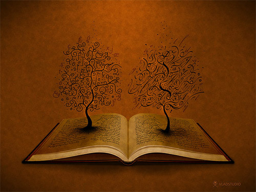
A nice wallpaper to adorn your desktop:
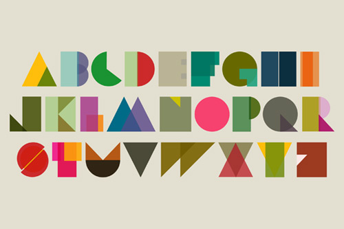
Thanks for the link, kristarella on twitter. And, though this has been done a lot before, this one by Jenny Beorkrem is just perfect:
Jose Rodriguez’s Type Is Art is a wonderful little project I found through a piece in the Buffalo News:
Make your own art with parts of letterforms. Each element is show at the bottom (e.g. shoulder, tail, bar, ascender, et. al.), and can be dragged, scaled and rotated on your typographic canvas. Enjoy.
I’ve mentioned the work of Craig Ward several times before, but somehow missed this gem, found via Designer Daily:
Some good lettering from Andrew DeGraff:
Via designformankind.com.
Sunday Links
Workarounds for Win ATM (and MMs) on Vista
A Brief History of Avant Garde
Magazine Inspiration—Veerle
Quark for InDesign users—part one; part two
Typesites’ review of Monocle
H&FJ—the smallest type in the world
What does a type designer’s handwriting say about his or her type? In my opinion, absolutely nothing. Nevertheless, it’s interesting to see:
I’m no type designer, but here’s a sample of my handwriting:
Why don’t you show me yours (send to [email protected]). Thanks Andy & Miguel.
A nice signage Flickr set. particularly like this weathered script:
Like this photo from Kris Johnson:

The Typophile annual t-shirt design ‘battle’ was a particularly good one this year, and I’m a big fan of the winning entry from Rajpurohit from Ahmedabad, India:
The Incubator from the Village type foundry looks like a great idea. They’ll be showcasing (and selling, of course) work by new and talented type designers. Its launch marks Village’s three-year anniversary. Happy birthday to everyone at Village.
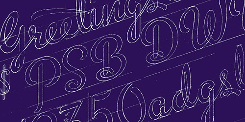
Love these sketches for Michael Doret’s wonderful Metroscript. Be sure to take a look at the MyFonts In Your Face newsletter.
Today’s Type
FP Dancer Pro, a sans serif with some real character—by Danish designer Morten Olsen:
Love the black weight “X”:
Today’s masthead is set in FP Dancer Pro light and bold.
Coming Up
iLT’s first birthday is fast approaching (August 7th). If you have any ideas as to how we might celebrate it (or rather celebrate type), then let me know. An article on Letterpress is coming up, and that interview with the designer of one of my recent favourite serifs. Apologies that this week’s Sunday Type was (even) later than usual. Thanks for reading. See you all again midweek.


