New releases, fresh new fonts! — episode 2

July 14, 2023
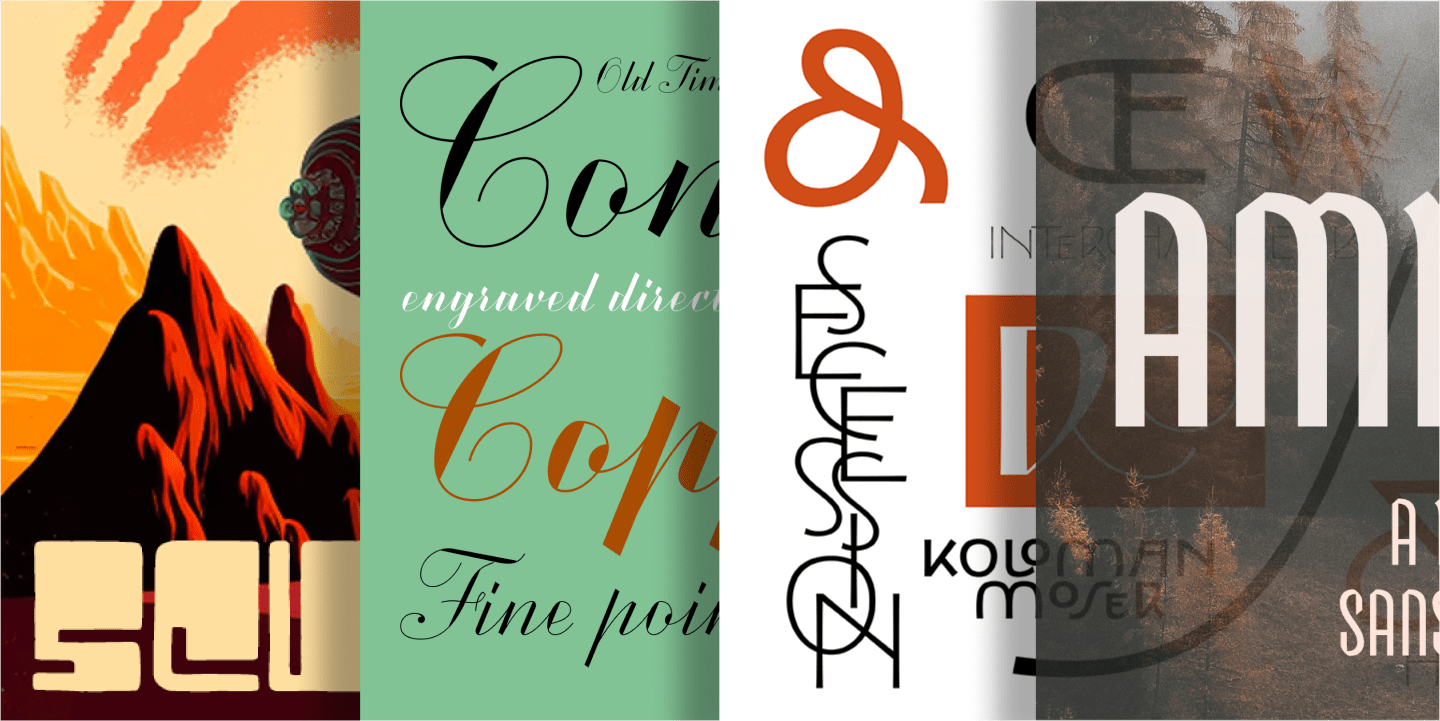
In case you missed part one, catch up here. Today we have four more fantastic font families that are definitely worth checking out. Let’s jump straight in…

Tag: new fonts
In case you missed part one, catch up here. Today we have four more fantastic font families that are definitely worth checking out. Let’s jump straight in… We have some great new typefaces to tell you about! From blocky and fun display families like Scusi to eccentric scripts like Exentrica (we love the name), to the elegant high contrast of Copperscript — oh, and a tall slim gem called Amberwood. We’re always excited to tell you about the launch of great new additions to the ILT Font Store. Here are some recent releases we thought you’d like to hear about. And don’t forget they’re all available as webfonts too. Time to meet the new kids on the block: A quick heads up about a great new release from Huy!Fonts. Rotulo is a huge new sans serif family that comes in 90, yes ninety styles. If you prefer varaible fonts, then this is your lucky day because Rotulo also comes in a single variable font with all three axes — width, weight, and slant — baked in. For our first Font Fashion Week, type designer extraordinaire, Mark Simonson, spoke about his new typeface Proxima Sera, the long-awaited companion to the world-famous Proxima Nova. Here you can watch the video or read the illustrated transcription below. In last week’s newsletter we looked at some of the fantastic fonts released during out first Font Fashion Week. In this second part, we introduce you to six families that we’re sure you’ll want to get to know better. Without further ado … drum roll… In a landscape filled with thousands of typefaces, Bodoni Egyptian Mono is an unexpected design that mixes together wildly divergent DNAs. We interviewed its designer, Nick Shinn of Shinntype. Schotis Display is the companion to Schotis Text and is meant to be used in headlines, in subheadings, and other large size settings. Its design is inspired by 19th-century Scotch Romans, but has a thoroughly contemporary look.
New releases, fresh new fonts! — episode 2
July 14, 2023
New releases, fresh new fonts! — episode 1
 July 13, 2023
Hot New Fonts: spring 2023
 March 23, 2023
Hot New Fonts: Rotulo
 March 4, 2023
What serif typeface would go well with Proxima Nova?
May 20, 2022
Fonts to Fall in Love With
 April 20, 2022
Bodoni Egyptian Mono
 April 8, 2022
Schotis Display font family
 April 7, 2022


