
This Month in Typography
Welcome to this month’s roundup of type-related info and entertainment. Today, we remember typography legend Hermann Zapf, hear from Nadine Chahine (who worked with Zapf), talk about dyslexia, discuss the future of typography on the Web, peruse famous bookplates, visit the Herb Lubalin Study Center of Design and Typography, watch the beauty of engraving in action, revisit NASA’s graphics standards, talk about collaboration, make fun of Jeb Bush’s logo, celebrate the typewriter, ponder the exclamation comma (no, that’s not a typo), and much more!
Remembering Hermann Zapf

In case you missed the news, Hermann Zapf, world-renowned type designer, died on June 4. Here, MyFonts.com puts together a tribute to the man, by talking with some designers who worked with him, including Akira Kobayashi, Nadine Chahine, Jovica Veljovic, and Ferdinand Ulrich. I remember coming across Linotype Zapfino in my typographic infancy, not knowing of the man whose name was attached to the typeface, thinking “wow, well, whoever designed this is one serious calligrapher.” Understatement of my life.
TypeCon Registration is Open!

This year’s TypeCon, in Denver, Colorado, is accepting registrations. The program is chock full of interesting presentations and workshops that promise to be terrifically interesting. TypeCon is an annual conference presented by the non-profit Society of Typographic Aficionados. If you’re a SOTA member, registration is less expensive. FYI.
Arabic Type Designer Nadine Chahine

Chahine has been wedding Arabic type with Latin type ever since her studies at University of Reading. She is currently the Arabic type specialist for Monotype, having created (among many other typefaces) Frutiger Arabic, Neue Helvetica Arabic, Univers Next Arabic, Palatino Arabic, and the new Zapfino Arabic. Adobe talks with Chahine here about her process, the differences between Latin and Arabic type, and her PhD research, trying to understand and quantify legibility with a focus on automotive interfaces.
The Beauty of Engraving
A brief but lovely look behind the scenes at a printing press doing engraving work. If your interest is piqued, go check out the accompanying website: thebeautyofengraving.com.
Visiting the Herb Lubalin Study Center of Design and Typography

The Herb Lubalin Study Center, located in NYC’s Cooper Union, archives Lubalin’s vast collection of design work. The collection also includes other famous designers’ work, such as Paul Rand and Massimo Vignelli. In this AIGA post, Justin Zhuang reports on his visit to the Center. My next trip to NYC is going to include a visit here!
Typography on the Web
John Daggett talks about the current state and the future of web typography in a presentation at the CSS Day conference (which was on July 12).
An Alphabet of Organic Type

I love the Public Domain Review. There’s always something fascinating to be found there. Today’s gem: A series of amazing prints titled Libellus Novus Elementorum Latinorum. They were designed by the Polish goldsmith Jan Christian Bierpfaff and engraved by fellow-countryman Jeremias Falck, sometime in the 17th Century. I dare someone to turn these prints into an actual font. Consider the gauntlet thrown.
Type Nite in New York City
https://www.youtube.com/watch?v=i70fakWzshw
First of all, who knew that “.nyc” was an available top-level domain? That out of the way… Here’s a video recording of the recent talks given at Type Nite, at the legendary Strand Bookstore in New York. The theme of the evening was “Mess-Ups & Do-Overs”, and designers Tobias Frere-Jones, Peter Mendelsund, Abbott Miller, and Ellen Lupton each talked about memorable design mistakes they’ve made.
Paul Bacon is Dead
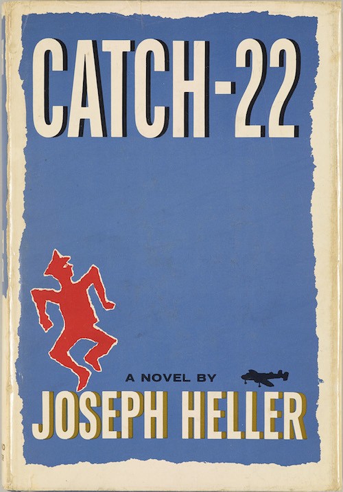
Designer Paul Bacon, who created beautiful and influential book jackets and album covers, died recently at the age of 91. Some of his most notable book jackets included Catch 22, One Flew Over the Cuckoo’s Nest, Rosemary’s Baby, and Slaughterhouse-Five. Album covers included work for jazz greats Thelonious Monk, Bud Powell, and Milt Jackson. The New York Times here spoke with the inimitable Chip Kidd, and got this great passage: “The graphic designer Chip Kidd said that Mr. Bacon’s visual take on Jaws — a stark black cover with the outline of a massive shark rising from the bottom and a female swimmer floating above — was an especially powerful influence on his own work. He noted that it shows “just how much you can entice the reader on the content by using minimal form.'”
A Font That Emulates a Dyslexic Experience

We’ve reported before on the claim that typography can solve some large societal problem, like a font to help dyslexics read better. Well, here’s a font that makes reading more difficult for us non-dyslexics. (And dyslexics too, I imagine!) Designer Daniel Britton‘s goal is to raise awareness and promote education regarding the condition.
3-D Typography By Hand
Ink, paper, and a straight edge. Beauty ensues.
Bookplates of 31 Famous Men

Bookplates — those (often) wonderful labels on the inside covers of books, often saying “Ex Libris” and claiming ownership of said book. I stumbled across a ridiculous and ridiculously cool bookplate recently, and it made me wonder if there were any good online collections of bookplates to be found. Silly question. There are a million of them. This blog post details 31 of them, from the libraries of such folk as George Washington, Paul Revere, Eli Whitney, Charles Dickens, Lewis Carroll, and H.G. Wells.
Typomorphic
One of the more interesting ways to create a typeface, courtesy of Gergő Tamás Farkas! For more information, check out his Behance page.
Which Unicode Character Should Represent the English Apostrophe?
I love a strong thesis! Ted Clancy offers this strong thesis, regarding Unicode and the apostrophe: “The Unicode committee is very clear that U+2019 (RIGHT SINGLE QUOTATION MARK) should represent the English apostrophe… This is very, very wrong. The character you should use to represent the English apostrophe is U+02BC (MODIFIER LETTER APOSTROPHE). I’m here to tell you why.” The article is very persuasive and well-reasoned.
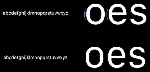
Helvetica versus Neue Helvetica
If you’ve ever wondered what’s different in Neue Helvetica from its famous ancestor, check out this simple but brilliantly animated video that shows exactly what has changed from one version to the next. This sort of analysis is genuinely informative, and fascinating to those of you who are haunted by typographic minutiae.
House Heath Stencil Clock

Looking for some home decor with typographic flare? Hang this House Industries clock on your wall, and be the talk of the town.
NASA Graphics Standards
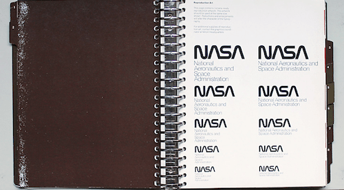
Here’s a Flickr photo album with shots of NASA’s Graphics Standards Manual from 37 years ago, including guidelines on logo usage and typography. (Helvetica and Times were to be used for accompanying type.) You can read more about it here.
Erik Spiekermann Interview

It seems as if someone’s interviewing the man every month. This month, multi-media outfit Monocle (specifically, their radio division) speaks with type maven Spiekermann about his career in typography. This is the inaugural episode of “Big Interviews”, wherein Monocle features in-depth interviews with inspirational names from global politics, business, culture and design.
CO LAB: Collaborative Design Survey

CO LAB: A Collaborative Design Survey is a new book featuring artistic projects done by small teams. One of the projects featured is the wonderful Questa Project — a typeface superfamily developed in tandem by eminent designers Martin Majoor and Jos Buivenga. The book itself is a very interesting creation, featuring stark black and red illustrations and angular text boxes. You can read the interview with Majoor and Buivenga here.
The Internet Hates Jeb Bush’s New Logo
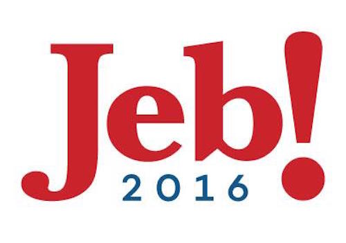
I’m reminded of the old joke: How many designers does it take to screw in a lightbulb? A million and one. One to screw in the lightbulb, and a million to stand around and say “I coulda done it better.” So American presidential hopeful Jeb Bush unveiled his new logo, and the internet unveiled its hatred of it. Scroll down in the linked article for some humorous renditions and uses of Bush’s logo. And check out this humorous piece (that is funny because it’s probably true) about how the logo might have been developed.
FountScout App Released

Last month, we mentioned that MyFonts.com had a new app in the works: FontScout. Basically it’s a specialized portal to their website, available for iPad, that lets you browse their font collection and create font albums. I’m iPad-poor, but if anyone gives this a try, let me know your experience.
Apple Explains the Extended San Francisco Type Family
We’ve talked a couple of times already about Apple’s new type family, San Francisco, being used for the Apple Watch, and for upcoming versions of iOS and OS X. You can read here all about the fine points of what makes San Francisco, um, tick. (Sorry.) You can watch a video presentation on the subject, but only if you’re browsing with Safari. (Sheesh, Apple, really? Get over your proprietary self!)
77 Ways to Design the Letter ‘M’
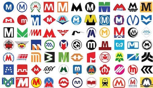
77 examples of how mass transit agencies around the world deal with designing the ubiquitous ‘M’ that represents most cities’ Metro systems. Designers pull out every trick in their arsenals to make their ‘M’s stand out.
Stereotype Plate of A Mouse’s Tale

Yes, the Oxford University Press is on Tumblr! And they present here a photo of a “stereotype plate” — type that is set and then turned into a metal plate, used for unusual page designs, like “The Mouse’s Tale” in Lewis Carroll’s Alice in Wonderland.
Universal Typography

Type manager for Typekit Tim Brown here curates a collection of presentations, information, and links about typography. He has recently spruced up this website, and introduces it with a series of questions: Can typography be universal? Can it work for everyone and still look good? How can we practice? What should we study? Which fonts and tools work best? Should designers and developers work together on this?
Key Enthusiasts Gather at a Burlington Type-In

In my hometown of Burlington, Vermont, in the tundra of the US’ Northeast, a local cafe was filled with the click-clack of typewriter keys pushing metal arms against paper. The event was a “Type-In”, where people shared their adoration of the vintage machines. Check out the related Vermont Vintage Typewriter blog, if you’d like to get more immersed in the vintageness of it all.
Walker Evans’ Photos of 1960s Trains
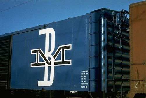
Here’s a nice imgur collection of photos by Walker Evans, featuring typography on the sides of trains in the 1960s.
New Font Family: Indie

A lovely new font family from script master Maximiliano Sproviero. Indie is a brush script with five family members, including an interesting all-caps font that is only loosely related to the rest of the family, but integrates beautifully with it.
Infini Free Font Family
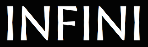
Created by French designer Sandrine Nugue, the Infini font family comes with four family members (Roman, Italic, Bold, and Pictograms, plus webfonts), and is free and licensed under Creative Commons (BY-ND). (If your French is rusty, click on the “Télécharger” link on the Infini home page to download the fonts. It’s a cool typeface, with flared lines and a great presence on the page.
Ligatures & Coding

Coders are used to living without typographic niceties. They work with monospaced fonts, wherein, for instance, an “m” unceremoniously takes up as much horizontal space as an “i”, because function is way more important than form in a world where a misplaced semicolon can bring a computer to a grinding halt. Well, Andreas Larsen wants to bring some form back alongside the function of programming fonts. His Monoid includes ligatures to make the code more readable. (The fonts Fira Code and Hasklig also have programmers’ ligatures, if you’re looking for comparisons.)
On Font Weight

The folks over at Bigelow & Holmes have taken an extremely close look at the numerical and historical ins and outs of font weight, and they present their findings here. Required reading for any font designers out there, but also an extremely interesting read for anyone enthralled with typographic nuance. My favorite passage is this: “weights that are ‘definitely bolder’ than normal weight are around 1.5 times normal to 1.3 times normal… What about the ‘just-noticeable difference’ or JND used by psychophysicists? How small a difference in typeface weight is just barely noticeable to users or readers? In a small scale study we found that the just-noticeable weight difference for a lower-case sans serif typeface was approximately 3%. Some subjects didn’t detect that small a difference, but more of them did. This accords fairly well with our industrial experience. When our studio developed a minimally darker ‘bold’ weight of Lucida Grande… the increased darkness was roughly 4%. The small weight increase was just enough that interface designers could notice and prefer the difference, but not so much that average users noticed anything amiss.”
Typeface Mechanics: Optical Weight

As a type designer, it’s a weird moment of epiphany when you realize that even the most “perfect” geometric shapes in type aren’t really perfect after all. There are all sorts of subtle but important tweaks that need to be made in order to create a balanced typeface — for instance, a horizontal bar will look heavier than a vertical bar with the same width, and so most fonts will have crossbars that are slightly thinner than their corresponding stems. In this article, font-master Tobias Frere-Jones takes us through the crucial minutiae of designing type while considering such problems of optical weight. (In case you’re interested to learn more, Karen Cheng’s book Designing Type is a masterpiece of detailing such issues.)
Pondering the Exclamation Comma

It has happened to all of us. You’re writing a sentence in an agitated voice that requires an exclamation point, and you realize to your dismay! that the sentence isn’t done yet. Enter the exclamation comma. The Grammarly blog reports on this short-lived punctuation mark, and how it died an anonymous death. Spoiler alert: The mark was invented in 1992, was promoted for three years, and then put out to pasture. Anyone up for creating a new movement for the exclamation comma’s adoption?
GlyphCollector App
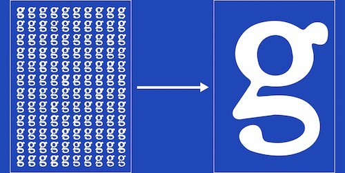
Revival type designers rejoice! Gabor Kerekes has come up with a fascinating OS X application that takes all of the instances of a character from a scanned page, and generates an image of the average of all of those scanned characters. This could be very helpful to someone developing a typeface revival from scanned images. I haven’t tried it yet, but will report back when I do.
FontExplorer X Version 5 Released
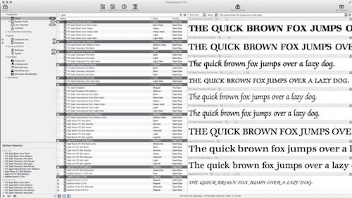
I gave up using software to wrangle and organize all of my fonts years ago. It just seemed that none of the apps out there at the time were just what I needed — either too arcane, or too invasive, or too ungainly. But I guess people are still trying… Long live the adventurous spirit! FontExplorer X has just released version 5 of its font curating software. It’s for Mac, has plugins for Adobe Creative Cloud, and integrates with font shops, including MyFonts.com, Linotype.com, and Fonts.com. I’d be curious to hear for folks what they think of it…
Edited by Alec Julien.


