Watchmen watchtype
Later than usual, but it’s here. I’ve been devoting some considerable time to several ILT-related projects, so a little behind on posting here. I hope to tell you more about those projects in the near future; if I can get around the coding problems. OK, so let’s start with something fun:
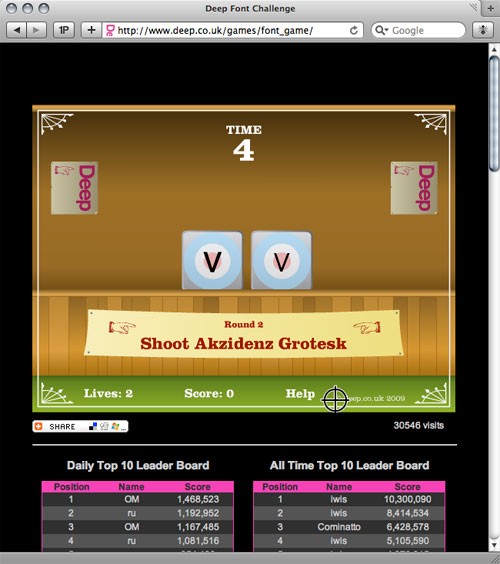
An addictive and challenging font game, the Deep Font Challange:
Some of the samples are a little too small (well, that’s my excuse for not achieving the high score), but it is fun.
What does the Soprano’s logo and the Watchmen logotype have in common?
Read LetterCult’s interview with Corey Holms to discover the answer.
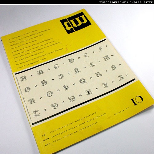
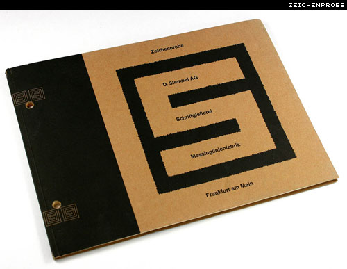
Berlintypes has some really wonderful Flickr sets, including photos of covers of Typografische Monatsblätter and Specimen books, and lots more:
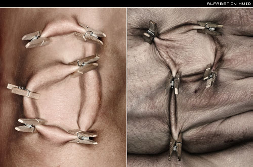
Skin type. Ouch:
via @arroncupid.
More fun in this poster:
Thanks, @inspirationbit.
Dexterity with a pair of scissors and incredible patience. The work of Aoyama Hina:
More photos on Aoyama’s Flickr.
Thanks to Jack at Horrorwood for the link.
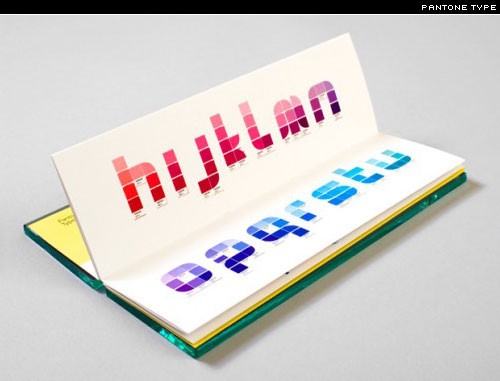
You can get Pantone just-about-everything these days; so, why not a Pantone typeface:
Letterpress
Nice cards printed on coaster board (think beer mats) for Jeff Cerise:
Thanks, @jeremyjaymes.
Type links
Spiekermann on the Rupee (audio)
India seeks rupee status symbol
Bond book covers
Tips for using scripts
Creative uses for paragraph rules — InDesign
Wood type photos
French vocabulary shower curtain
Establishing a good relationship with your printer
RBtL design podcast, episode 5
50 Stunning Photoshop Text Effect Tutorials:
This must have taken an age to compile. The Periodic table of typefaces:
Web typography
Have seen the CSS text-shadow property abused a lot of late. Here’s an example of it used to good effect:
And the code:
text-shadow: #bcbcbc 0 1px 1px;

color: #171717;
Works best when the colour of the shadow contrasts with both the text colour and background colour. FireFox users will have to wait until 3.1 for text-shadow support. Thanks to all those on twitter for enlightening me.
Video type
FontShop did it with FF Trixie. I’m surprised more foundries/resellers aren’t taking advantage of video in promoting their fonts. Here’s another promo video for Agostina:
Some interesting work — especially if you’re into 3D type — from SerialCut:
Love this kind of experimentation. Take Univers, rotate it, model it, and you have Univers Revolved:
It never ceases to amaze me, what people do with type. More experimentation, please.
Thanks to Andy Sherman for the heads up.
Tipografia Paraguay (t’py) is a collective of designers interested in the development, study, and promotion of type and typography:
Only available in Spanish right now. Perhaps they’ll add Guaraní and English later?
Events
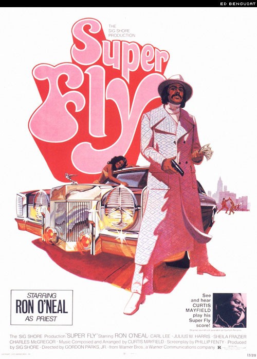
The TDC holds some great events, and really has me wishing I lived closer to NY. An evening with Ed Benguiat.
The Louvain and Roman Irish Types of the Irish Franciscans
March 2009 Thursday 12th March – 7.30 p.m.
Location: Dublin, Ireland [map]
By Dr. Dermot McGuinne
… an illustrated account of the 17th century printing types prepared for use in the Irish language publications of the early Irish Franciscans working in exile in Europe and their influence on later designs.
Robothon 2009 has passed, but there’s some good coverage over at youshouldliketypetoo.com:
Recognise anyone?
Featured face
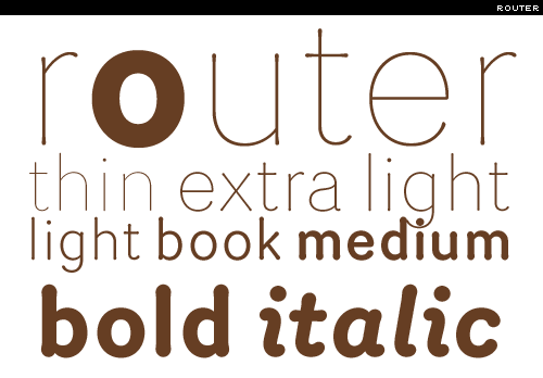
Router by Jeremy Mickel, and available only at Village:
And Village is now on Twitter: @vllg
New type
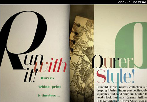
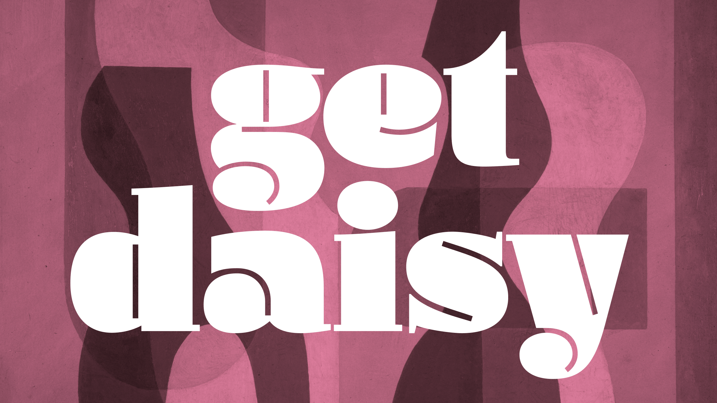
Jeanne Moderno from Steve Mehallo. An interesting blend of Bodoni italic, two spoons of Fat Face, and a dash of something else:
I’ve also used Jeanne Moderno to set this article’s masthead.
Muscle from TypeTrust:
Download the Muscle PDF specimen.
Opal from Hannes von Döhren, and available from Linotype:
Like those gargantuanly exaggerated ink-traps. At display sizes it’s a nice feature, though I’m not sure about them when it comes to extended text. Interesting in that it comes with a Script — could be used as an alternative to the italic (though for shorter stretches of text, I think).
The woefully inadequate PDF specimen is here. Come on Linotype! Nice type deserves a nice specimen.
Euroglory 2 from Stefan Hattenbach:
Desktop wallpaper
Something to brighten up your desktop. A wallpaper set in Ale Paul’s beautiful Kewl Script:
And finally …
Hello to the host of new ILT followers on twitter. And, thanks for reading. Have an especially great week.


