Sunday Type: tomate type
No Underwear Mon Amour
If you missed the interview with Ludwig Übele, then be sure to check it out. For excerpts of all the interviews on ILT, then simply click right … here. Until I can wrap my work schedule around iLT, then Sunday Type will still be published once weekly, but that could be any day. In fact, I can’t remember the last time I actually posted Sunday Type on a Sunday. Well, that’s quite enough preamble; on with the show.
First up is something new from one of my favourite young designers, Gemma O’Brien:
Quote of the week
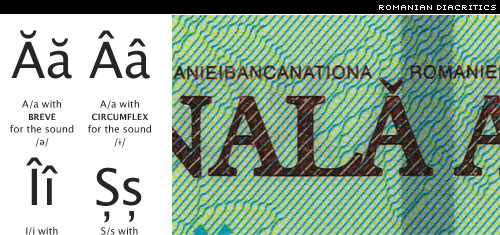
Short explanation: Because wearing no underwear is preferable to wearing it on the outside, over the trousers.
And that in an article on the current state of diacritics in Romanian.
New type, fresh fonts
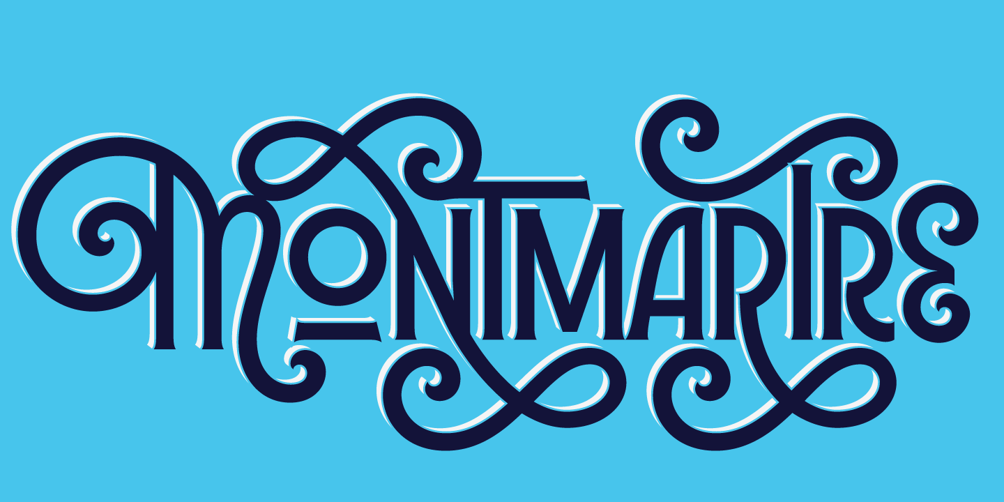
Lots of new releases this week, but my pick is Tomate, a gorgeously voluptuous brush script from ReType in the Netherlands.
Designed by Ramiro Espinoza; aimed at packaging. I’d start eating breakfast cereal if it came adorned with Tomate. Also used for today’s masthead, of course.
Web Fonts
Don’t quite understand what’s going on with web fonts and font-face, and wondering what WEFT and EOT is. Then read for and against standardizing font embedding.
via Jon Tan.
Another type in motion video:
http://jp.youtube.com/watch?v=hTlrSYbCbHE
Thanks, Miguel.
2009 is fast approaching (can’t believe it), and the FieldNotes calendars are now in stock. They’re much sought-after, so hurry while stocks last
Fraktur mon Amour
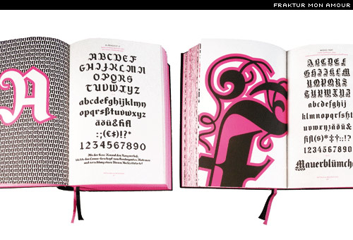
I mentioned the first edition of Fraktur Mon Amour by Judith Schalansky a little while back. Owing to demand, Princeton Architectural Press (a publisher of some mighty fine titles), has produced an expanded second edition. I received mine in the post this morning. I’ve never been a huge fan of Fraktur / Blackletter, but after a few minutes swimming through the delights of this gorgeous book, you might say I’m a new convert.
Something that occurred to me while flipping through its pages was the potential for these types to be used in design—not necessarily as text—but as ornamentation, for patterns. So taking the cap R from Manfred Klein’s Ornamental Initials (page 434–5), duplicating and rotating, we can easily create some rather lovely patterns. Mine was assembled in something of a hurry, but I’m sure you get the idea—and see the potential:
Fraktur Mon Amour comes with a CD of 137 fonts. This is definitely my book recommendation of the month.
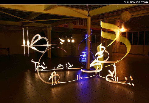
Some incredible light-type images from Julien Breton. Beautifully controlled:
In addition to work on his web site Kaalam, Julien has a wonderful Flickr set.
Thanks to David Březina for the link.
The my favouroite Letters flickr pool now has more than 200 members, and over one-hundred submissions. Be sure to share your favourite letters. Perhaps there’s a smart coder out there who could turn these submissions into words? This is sitting on my desktop right now:
Designed by Hamish (same guy who created the WordPress typogrify plugin). You can download and use as your desktop wallpaper!
And while on the subject of Jos Buivenga’s Museo, here’s a moving type that makes good use of Museo’s bendy serifs:
http://jp.youtube.com/watch?v=8gpqoV-6LTIRemember that three weights of Museo are free.
We hear a lot about Penguin book covers, but Faber & Faber has some wonderful covers too:
Check out the Faber Flickr page.
Like this poster from Béla Frank, aka Fabergraph, the minimalist:
Type Republic has launched a gorgeous new web site to compliment their fine types:
And get ready for the titling version of Carmen, Carmen Fiesta—coming soon!
Looking for a fresh new Baskerville? look no further than StormType’s Baskerville 10 Pro:
More posters
There have been some great Obama posters. Here are a couple of my favourites:
and from Jonathan Hoefler:
You can read more on the FontFeed’s Artists for Obama.
Win a book!
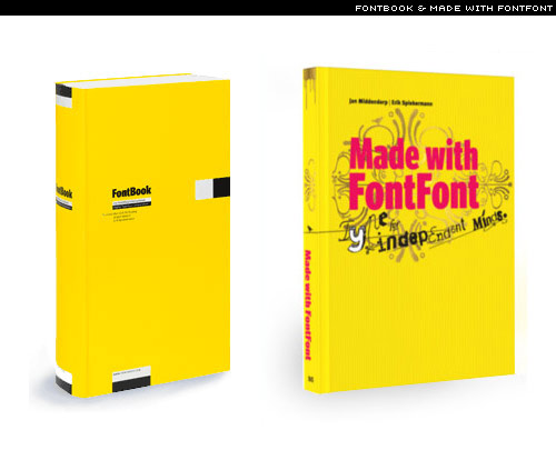
FontShop has generously donated not only a copy of Made with FontFont, but a copy of the type book, FontBook.
I’m not one to exaggerate, but you could well think of your life in terms of BFB (Before FontBook) and AFB (After FontBook). Once you get your sticky mitts on a copy, you won’t want to let go. I even have friends, with zero interest in type, who still spend ages leafing through it, the silence punctuated with the likes of “ooh, I like that one!”. I’ll stop rambling now, but you can read my review of Made with FontFont for more on that title.
I will post the competition details in the next post (the links one; explanation below). So, I need creative competition ideas. I was thinking of a poster of some kind (need a theme), that could later be screen-printed. Ideas in the comments below, please.
When I feel that Sunday Type is a little too big to publish as a single article, I’ll be splitting it in two. The Sunday Links part will have its own page. I’ll publish that one tomorrow (it will appear in your feed reader, but not on the home page). Let me know what you think of this idea.
Have a great week (what’s left of it).


