
An interview with Jean François Porchez
You’ll see his typefaces on the Paris Métro, gracing the pages of France’s premier newspaper, Le Monde, in magazines and books; even Beyoncé uses them. He was awarded the Prix Charles Peignot for excellence in type design, was president of ATypI, designed one of the best modern-day type revivals, and…. Well, there’s so much more that can be said by way of introducing this great talent of type, but I think John D. Berry sums him up best when he writes, he is one hell of a type designer.
Why and how did you get started in type design?
It was during my time at graphic design school (1987–89). At the time, I felt that there was an opportunity to do something different in a field that was already full of illustrators, graphic designers and so on. And remember that this decision was made before the ‘computer age’, making it all the more unusual.
Frutiger and Zapf, my two heroes at that time, helped me to understand what type design is. In my second year at graphic design school, I started my first real type design, mostly lettering, and soon started to do freelance work while still at design school. During my third year, I began work on Angie which later won the Morisawa Award in Japan.
I learned to draw typefaces by hand on tracing paper (1988), then moved on to digitization with Ikarus (1992), making minor modifications on screen. Next, I began to use Bézier Curves in illustrator and Fontographer; and shortly after, circa 1994, I began to design directly on screen without any prior drawings on paper.
What do you like most about type design?
Which part of the design process do you enjoy the most?
I have great difficulty designing fonts without a function, a brief. I can’t create new forms, simply for the pleasure of those forms. In fact, it’s more the reverse: the function or brief inspires me to search for new forms, Indeed, there are exceptions, and that’s no doubt why I make so few rough drafts. What I mean is that, generally speaking, the concept comes to me upon lengthy reflection in my head, rather than from a couple of hastily drawn sketches on paper. For example (and remember that I learned type design from calligraphy and drawing on paper), I wanted to experiment with a new way of designing typefaces: so with Anisette (1996) I started from a central line to an outline.

The difference between the Thin and Black weights is considerable; the interpolation/blend doesn’t work well in all cases. Anisette is a good example of discovering the limits of a technology, to better understand how to work; to be able to apply what you learn when you again reach the limits of technology, and adapt your designs accordingly.
Moreover, I always imagined one day that the lowercase would be added to the original double caps width Anisette, but without doing any research. The morning after the completion of Ambroise, in May/June 2001, I started to create some forms directly on screen. Less than a month later, the family appeared ready for sale on the web site. It takes a long time to develop the idea intellectually. The design process is only a small part of the finished product. Type design, then, is an intellectual rather than a manual job; and the tools have no direct influence on the forms; it’s more about what your own brain, culture and influences and reading brings to it that really makes the difference.
Sometimes there is some personal inspiration, but most often it is more a question of problem solving than simply inspiration. Typefaces have a strong function: to be read. And more and more their connotations (the typefaces) help designers to create efficient, communicable documents for such varied applications as corporate identity, newspapers and magazines. Typefaces are major players in these ‘games’.

Whether I create my own brief, or it’s supplied by the client, it’s by following it that I can create new things; the more restrictions I have, the more creative I will be. The revivals, in some respects, are an exception, but nevertheless it is still a matter of problem solving, albeit with some historical considerations.
What do you like least about type design?
Probably kerning despite its importance for the finished product. It doesn’t take so long, but it is really boring and repetitive. It’s sad that the true design, the drawing of the letterforms takes perhaps 20%(?) of the total time in typeface design.

And it’s probably the best part, especially during the early days of a project, when the forms begin to appear on screen.
Which work of other type designers do you like?
For dead guys, for a long time, Claude Garamond and his ‘friends’. Of contemporary type designers, I admire several of them for various reasons. Matthew Carter comes to mind first because for years he came through most of the new technologies with great talent. He is a model in the sense that he demonstrated very well what a type designer should be–resolving new type problems without losing type’s roots. Long ago Hermann Zapf wrote that new technology demands new typefaces. Matthew Carter showed us that, with the help of the type designer, old typefaces can survive any new technology. It’s admirable to be able to design Galliard, Verdana or Walker as good examples of different animals; the first as a skillful revival from Granjon type; Verdana as an incredibly legible type for use on screen; and fun to use Walker, with its snap-on serifs. We should also recall that Matthew Carter, like Sumner Stone and several others were the guys who launched independent type foundries, doing freelance custom fonts for clients (early 1990-93).
More recently, there are many young competitors creating formidable types: Xavier Dupré‘s recent designs are amazing; he demonstrates great freedom without abandoning sound references. Christian Schwartz’s new designs are fascinating by their ability to adapt to many different situations. I’m glad to see other serious type designers from all over the world; for example, the recent boom in non-Latin typeface design from the Hague and Reading, type designers from Latin America, together with the Khatt network and the Typographic Matchmaking project.
Of your own types, which are you most pleased with?
With no real surprise, the last big project. I will say, that I’m not particularly proud of anything. Different aspects of projects help me to discover new things; they help me to think more about a particular aspect of typeface design. There are many past projects that pushed me to change my habits without losing my original focus. Designing typefaces for clients is very interesting because it furnishes one with the opportunity to do something that one might otherwise not have attempted.
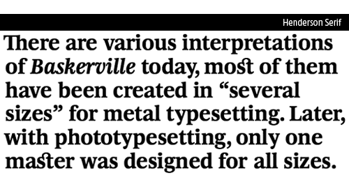
For example, Henderson Sans, created in 2006. I had never envisaged designing a Transitional Sanserif until I was asked to do a Sans version from a sort of Baskerville interpretation–Henderson Serif. Before there was Humanistic Sans versus Grotesque Sans competition. It’s easy enough to imagine a Sans built on handwritten forms using historical roots, strange forms like those found in Renaissance type, more or less standardized depending on the aims of the designer; the forms and details used in Humanist serif typefaces, extrapolated to a Sanserif version, in order to bring a very particular colour to the Humanist Sans. It’s also easy to compare the various Grotesque Sans like Univers and Helvetica, and fun to mock Arial as a bad cover version of Helvetica, etc. However, what’s not so clear is what is a Sanserif that is not built and controlled like Grotesques, built as a system, but something already more controlled like Romain du Roi or Baskerville…compared to Caslon or Garamond. With Baskerville and Romain du Roi this sort of system begins to emerge, though traces of the humanist type are still visible. By the time we move on to Didot, that influence has all but disappeared, and when we think of Sanserif versions then we are into the Grotesques.In fact, there are already a few Sans from this category beginning to emerge, like the recent and very good National by Kris Sowersby, mentioned on iLT last December.
What advice would you give to aspiring type designers?
Practise calligraphy and read a lot on type history. Then draw and draw every day. Don’t copy others, but try to be yourself; use your own cultural resources and background to create new trends in type design. You are unique. When the above is achieved, the next steps are (and these are equally applicable to life in general):
• Respect tradition;
• Clear analysis of the problem, because as designers our work is problem solving;
• Finally, utmost respect for the user/reader.
What is your proudest achievement?
Sabon Next created in 2002 for Linotype is a revival of Sabon, which in turn is a revival of Garamond, created by Jan Tschichold in the 60s. It was a fascinating challenge to try to understand the effects that technological limitations imposed on the design; and to attempt to disentangle this from the actual design decisions of the master himself, Jan Tschichold. It was a challenge too because of Sabon’s Garamond roots, a style that many of us consider the golden age of type design. I started from the original drawings for the Stempel version and extended the family to six weights, their accompanying italics, small caps, old style figures, alternates and so on.
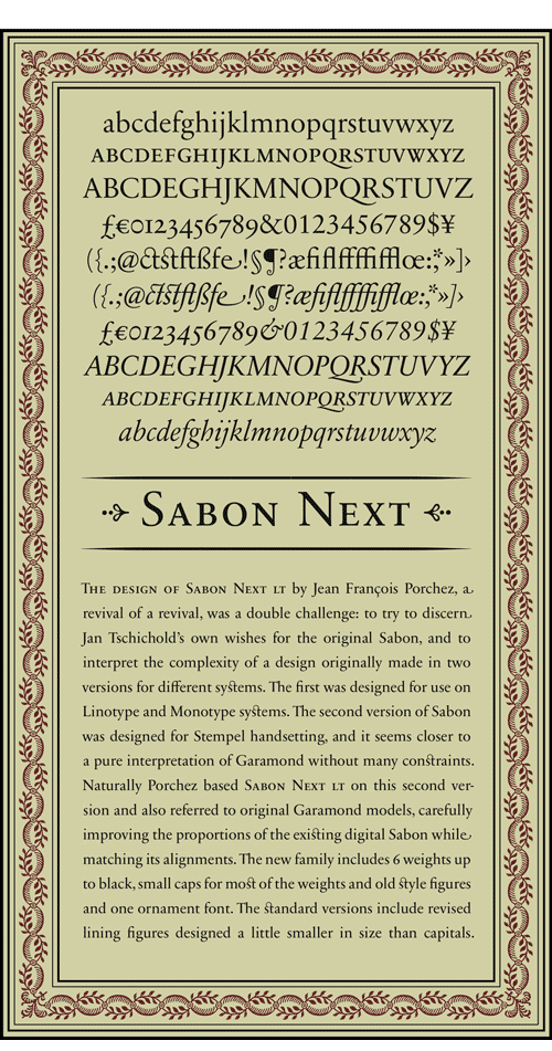
In early 2006, I then extended the initial family of 2002 into an OpenType version, with various additional features. This new version was finally published by Linotype last December! (2007). In 2002, under my direction, an extensive type specimen was produced in three languages, accompanied by a study of Jan Tschihold written specially for us by Christopher Burke, the author of the very good Paul Renner (designer of Futura) book. In fact, during this project, I tried to reclaim what the big foundries, like Linotype, lost during the seventies and eighties–something that small foundries do every day now: publish good specimens with comprehensive content, not simply a few commercial visuals.
Constructing a story around a typeface is important to me, and that’s why I loved what happened before the 2nd World War, with publications like the Fleuron in the UK, Arts et métiers graphiques in France, or the amazing specimens from ATF in the US. How can one appreciate a typeface without knowing something about it?
What plans do you have for the future? Are you working on a new typeface?
To stop typeface design and finally start my own cider farm in Normandy.
More seriously, I dream of one day being as I was in my early days, without too much work to do and thus with plenty of time on my hands for personal ideas and projects. It can be a little frustrating sometimes, though it’s not a major issue, as commissioned work is fantastic — because like any designer, I like to solve design problems. From time to time I work on a still unfinished Sanserif I began in 1999. I’m also trying to finish another Sanserif for Linotype — started in 2003. Right now we’re working on some OpenType conversions of existing typefaces, like Le Monde, together with a very recent project commissioned by a design agency. So, yes, as usual, I’m working on a new typeface.
You can learn more about Jean François Porchez at Porchez Typofonderie.
Further Reading: Dot-font: Talking About Fonts, John D. Berry. 2006.


