
Sunday Type: Mel Gibson Type
The Serifless Roman
Welcome to another edition of Sunday Type. I hope that everyone had a good week. It’s been an especially busy week, with more than the usual number of emails through iLT. Kris Sowersby’s Why Bembo Sucks article was incredibly popular. There are some more great articles to come from Kris.
Let’s get started with a great new type from Carl Crossgrove. It’s a ‘modulated sans serif’ by the name of Beorcana (pronounced: byor-KON-ah):

For more information and a PDF sample, see Carl’s Beorcana web site. You can find out more about Carl and his typefaces on Terrestrial Design. Here’s one of my personal favourites, Origami:

Difficult to classify in conventional schemes, Beorcana could be described as a serifless roman, as it retains the proportions and contrast of Renaissance Roman typefaces. It could also be described as a modulated or calligraphic sans, as it has no proper serifs, just swellings and taperings. In that sense it is a hybrid…
iPhone wallpapers
Last week I mentioned some of the new Veer iPhone wallpapers. I’ve created some of my own. Ferl free to download them. And of course, you can submit your own.

Where art meets type
Everything You Thought We’d Forgotten is a series of text-based interactive works. Some very novel and interesting ideas:
http://uk.youtube.com/watch?v=w7hE9w1GjrYThanks to Robert for the link.
TypeNuts
Some time ago I wrote that I’m developing a type-related news web site. It’s nearing completion; mostly just the details of the design to iron out.

There are myriad type-related news items out there, and not space enough to mention them all here, as iLT is geared toward longer articles–so typenuts.com was born. You’ll be able to submit and vote for news items; I’m hoping that it will become a great resource and archive of type-related news. So long as the news is related to type, it will be in there, so new font releases, etc will be there too and you’ll be able to subscribe to all or to specific channels of your choice. I’ll let you all know when I launch.
Free Font
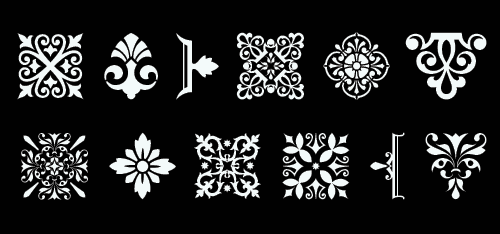
Recently I mentioned Stefan Hattenbach’s beautiful Anziano. I especially like the small caps, and you can now download them for free. But be warned: use them and you’ll fall in love with them.

If you decide to buy it, there are numerous wonderfully drawn ornaments included. Here is a small taster:
And on a lighter note…
In the comments to my FontBook review, I paraphrased Mel Gibson’s words in BraveHeart. Hamish, kindly watched the entire movie again and took this screen grab:

In fact, I was so thoroughly impressed by Hamish’s work, that I thought I’d make a competition out of it. Here’s what you have to do:
Preferably choose a movie that most are familiar with (though it’s not obligatory), and find a role for FontBook. I can either choose a winner, or you can vote on them; your decision. I’m trying to work one into Casablanca. The winner will receive a copy of Robert Bringhurst’s The Elements of Typographic Style. Just mail your entries to jboardley{at}gmail{dot}com, mentioning FontBook in the subject line.
Miscellaneous links
1. A PDF article on .net magazine: Better Web Typography.
2. Smashing Magazine’s incredible January Roundup with several type-related entries. I especially like the Better Ordered Lists item.
3. Some time ago, Emigre promised that as their stock of back issues sold out, they’d re-publish some of the content on their web site. I like this one: The Art of Type Founding.
Competition results
During my review of FontBook I asked if you could identify the three types I used in the header. 86 correct entries went into the hat and out came Miha, a design student from Slovenia. Miha wins a copy of Helmut Schmid’s Typography Today.
The winning answers: FF Meta Serif black italic; Officina bold, and Scala Sans regular. Thanks to everyone for their submissions. Interestingly no-one chose the correct weight for FF Meta Serif italic, but it’s difficult to tell when it’s reversed out (light on dark).
Coming up…
A great interview with the man behind the Porchez Typofonderie and designer of Le Monde, Sabon Next and Ambroise, Jean François Porchez; and some more great articles from Kris Sowersby. Alec Julien has also been working hard on a series of video tutorials. They’ll be posted soon; I think you’re going to like them.
And finally
Thanks to everyone for their continued support of iLT. We’ve now passed one million page views. It really is great to receive your emails and to read your comments. That reminds me: February 8th marks iLT’s six-month birthday–how time flies! Have a great Sunday, folks.


