The year 2023 was, as usual, a busy one for ILT. We celebrated two years as a font distributor, grew the ILT family to more than 100 foundries, and expanded our ILT Academy. Now is a good time to look back on some of our favorite releases of 2023. To keep the list manageable, we’ve limited the list to twelve. Throughout 2023, there were many more great releases, that aren’t on this list, but rest assured, we’ll continue to highlight those in the coming weeks and months. So, without further ado, and in no particular order, here are twelve of our favorite new font families of 2023. Enjoy!
 Art Grootfontein
 Art Grootfontein
Super-fun new family recommended any place you need that retro-future look. Also comes with some pretty cool layer font options, including, dots, halftones and outlines. Letraflex was also recently featured in Steven Heller’s Font of the Month.
 Roch Modrzejewski ROHH
Glycerin is a stunning new shapeshifter family available as static and variable fonts. In the lightest weights, Glycerin is monoline — in the heaviest weights, the increased contrast brings out its slightly playful but strong personality.
 Ricardo Esteves Outras Fontes
One of ILT’s best-selling Humanist Sans, Ponta Text is highly recommended for long-form texts in books and magazines, in both print and on screen. With its subtle details and elegant sharp corners, Ponta Text will add a touch of sophistication to any design.
 François Robert Delve Fonts
Behold your name in lights with the dotty and dazzling Baudot, a bold and brilliant new layer-font family from Delve Fonts. We particularly like that you can either use the standalone fonts or build them up with layers to great effect. Recommended wherever you want to illuminate your message — great for animations too, from blinking neon signs to scrolling ticker-tapes.
 Sandra García Tipastype
Sandra García’s Sandhouse is a tightly spaced bubble font that is both playful and purposeful. Tiny counters and organic details and deep, probing ink-traps introduce yet more warmth and charm into this accomplished single-font display family.
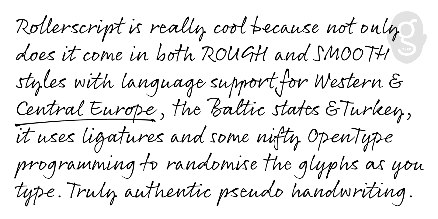
 Nick Cooke G-Type
Exentrica is the result of that Viennese inspiration, merging the various design strands into one striking type family with myriad extra stylistic variations for increased variety. Further versatility is achieved with both Monoline and Contrast versions of each weight, from Thin to Medium. A Variable version is bundled free with the family pack, and comes with easy-to-use weight and contrast axes.
 Simon Walker Beasts of England
Beasts of England has a reputation for eye-catching display faces. Acorn continues this tradition and perhaps asks what would happen if you injected some passion and pizazz into a Neo-grotesque design? Acorn is the answer — with it’s unexpected and almost script-like organic touches, Acorn is a unique and uniquely modern sans serif, and a library must-have.
 Peter Malutzki, Lena Schmidt Spirit & Bones
Peter Malutzki’s anthropomorphic alphabet (1981) has been beautifully reimagined as a layer-font family by Lena Schmidt from Spirit & Bones foundry. A novel and charming display typeface, Malutzki Initials is available in three styles.
 Moritz Kleinsorge Identity Letters
A gorgeous Geometric superfamily in 3 widths, plus a brilliantly realized Bauhaus version. With almost 1400 characters per style, you can use Flink Neue as your workhorse Geometric Sans Serif, or when you’re after that cool, clean, stark Brutalist vibe, simply crack open the Bauhaus styles!
 Francis Chouquet Francis Chouquet
Scusi is a bold display font family based on Italian movie posters from the 60s and 70s, especially those of the brilliant Sandro Symeoni. Although Scusi is based on Symeoni’s hand-letterings, Francis Chouquet took the font in his own direction, producing a retro-sci-fi family loves to be set big. Scusi was also featured by Steven Heller in his Font of the Month. Scusi comes in two styles, with the second, Bruto, a sharp-cornered straight-edged version of softer, rounder Scusi.
 Alanna Munro Alanna Munro Type Design
Alanna Munro’s tall, thin all-caps display face. Ribbon-like strokes with a lovely calligraphic twist. We recommend Amberwood for titles and book covers, especially where you wish to elicit those cool fantasy vibes. Whether you’re designing a fairy tale book cover, crafting a fantasy logo, or creating eye-catching packaging for food or drink, Amberwood will add a touch of “ye olde awesome” to your designs.
 Missy Meyer Missy Meyer Fonts
A vintage-meets-modern vibe, Whiskey Tango is a warm, fun and playful retro-style, tall and narrow sans serif font that comes with a ton of alternates and ligatures. Also includes small caps, broad language support, and covers Greek and Cyrillic scripts too.

And here’s a very small selection of some standout or notable glyphs from the above list of favorite fonts of 2023. Which is your favorite? Follow us on Instagram and threads for daily doses of great glyphs