
15 Great Examples of Web Typography
The List: Q1 2008
What better way to start the year than with a little typographic inspiration. Last year I published 15 Excellent Examples of Web Typography, and owing to its popularity and people’s sateless appetite for lists, here are another 15. I’ve decided to make this a regular feature and will publish this list every quarter (3 months [for those living on Mars, that’s every 5.7 months]).
Some of the designs are here for their simplicity, and they demonstrate that sometimes less really is more. Others made it onto the list simply because they use text well, or they demonstrate how the grid should be used. Although I’m sure that a number of these sites are very accessible and validate against HTML99 and the like, they exist here not because of that and not because they are pretty (though sometimes they are), but because of their treatment of text–their typography. Well, here they are (in no particular order). Enjoy.
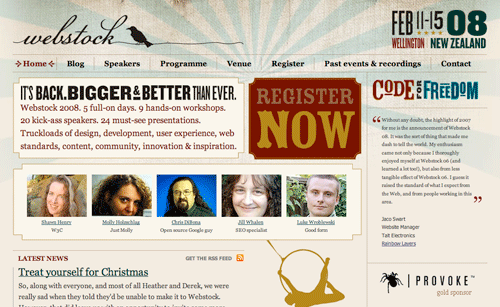
Webstock–mixing it up:
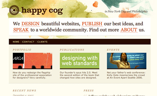
Happy Cog–note how the main menu items are incorporated in the opening paragraph:
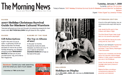
The Morning News–transferring that magazine or newspaper look to the screen is sometimes disastrous. This one gets it right:
SpiekermannPartners–this is how you use a grid (note: no footers):

Rainfall Daffinson–the not-so-invisible grid:

Porchez Typofonderie–typetastique:

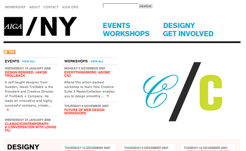
AIGA NY–clean and simple:
Fray–a nice slab of serif:

Cameron i/o–just text. I’m rarely a fan of light text on a dark background, but…

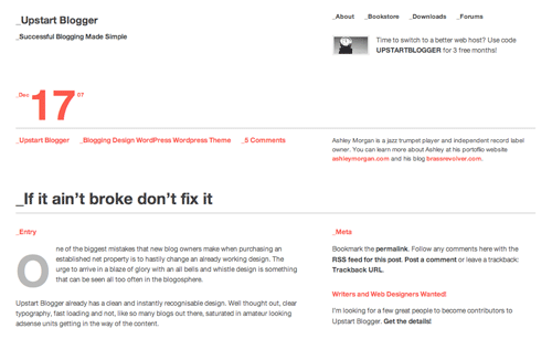
Upstart Blogger–web typography gone Swiss. A white-space feast:
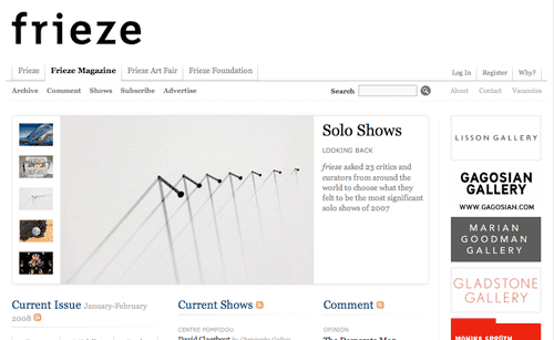
Frieze–I’m sure you’ll recognise the logo font:
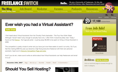
Freelance Switch–organised and structured:
Monday by Noon–another simple one, and fluid to boot:

A Brief Message–nice use of sIFR:

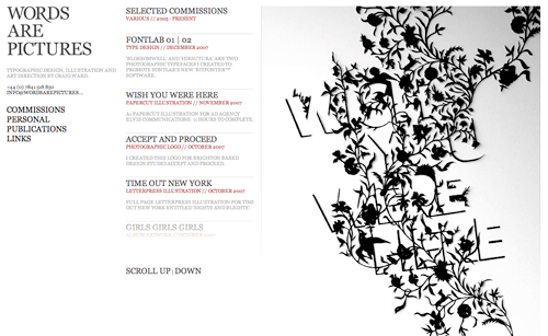
Words are Pictures–nice text and gorgeous illustration; shame about the silly scrolling thing:
What do you think?
And who can name the font used in the header for this article?

Subscribe to i love typography.


