Type Matters
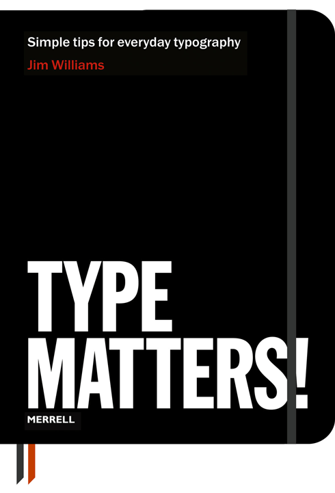
Jim Williams is a senior lecturer at Staffordshire University, where he compiled an excellent series of student handouts about typography. In 2010 the handouts were featured on Creative Review’s blog which generated interest from publishers. The handouts have now been published in book form as Type Matters. Williams is well qualified to write this title; he has worked as a typographer and designer since 1982 and has taught design at Staffordshire University for eighteen years.
Type Matters is printed in black and red on a substantial cream stock, and bound in a faux leather cover to resemble a field notebook. It would fit in fine at a digital design studio or a letterpress shop. This format lends itself to gift-giving when you need a present for an editor who thrives on the AP or Chicago style manuals.
Type Matters is unpretentious, unassuming, and reductive. Explanations rely heavily on elegant typographic diagrams that dominate most pages. Quotes from older typesetting manuals provide the text for the diagrams, set in a variety of classic types. Combined with the black and red printing and cream paper the book takes on the feel of a vintage type specimen. Readers are expected to study the diagrams, and some concepts, like x-height, are only introduced via a diagram. Once the book has been read it will make a great reference tool for students and designers alike, especially those less inclined to read lengthier, more comprehensive texts.

Occasionally Type Matters is too brief. Superfamilies, typefaces having a serif and sans, are left out of the explanation of families. Figures are defined only as being oldstyle or lining; tabular and proportional figures are not directly explained. En dashes are shown as roughly the width of the letter n, with the accurate definition of half of an em appearing only later in the glossary. Williams refers to the typefaces he uses by the names of the fonts, rather than the name of design. Bitstream knockoff fonts are often used, and called by their Bitstream names. This may lead readers to believe that Univers is called Zurich, Helvetica is Swiss 921, and Stempel Garamond is Original Garamond.

The book covers some topics that are either odd or just obscure; for example, “Cogent alignment” — ragged type with long lines justified, a habit of the British firm Cogent Elliot in the 1980s. Also shown is letterspacing lowercase within a block of text to create emphasis, described as a technique from medieval printing. Neither of these is described as typical or contemporary, but it seems odd to bring them up at all. On the other hand, Type Matters might be one of the only introductory text that explains how slight horizontal scaling of text can be employed to improve justification, a topic rarely covered in books that dismiss any scaling as a “type crime”.

Accompanying the main text is a list of proofreaders’ marks, a glossary, and a list of more books on typography. These little appendices add some value both for students and as a desk reference for working designers.
Type Matters is a solid addition to the field of introductory texts on the subject of typography. It is not perfect, but the innovative presentation and short text makes it a great option for design students. And it may be the best gift around for friends and coworkers in need of a quick education in typography.
Type Matters!
ISBN 978-1-8589-4567-5
Jim Williams
Merrell
James studied graphic design at the Corcoran College of Art and Design in Washington, DC. He developed a love of typography at the Corcoran and wrote a thesis about the development of versatile typefaces as branding devices. After graduating with honors James decided to pursue type design full-time. In 2009 he started Dunwich Type Founders in New York City.


