
Sunday Type: sponge type
The Passionate Printer
First up we have a type feast from one of the world’s most popular ‘interiors’ blogs, Design Sponge. Included in the list are some of those we’ve mentioned here before, but there are numerous other examples of ‘living with type’, such as these large reclaimed metal letters. Imagine some of these in your living room:

There’s even chocolate Scrabble,

though I’m not sure how long a game would last.
You could say that Mark Simonson is on something of a roll. I mentioned his Filmotype Glenlake a couple of weeks ago; well Mark has another lovely script for you. This one’s a 1940s-inspired brush script called Lakeside, accompanied by all the OpenType features we’ve come to expect from a Simonson font.

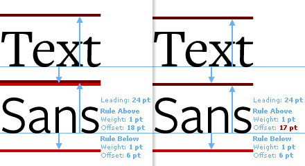
Next is a great little tutorial on Paragraph Styles:
Hamish, author of the wonderful WordPress Typogrify plugin, has an article that will be of special interest to just about anyone who writes code. In The Typography of Code, he considers five typefaces for programmers. Bitstream Vera Sans Mono (free and Open Source) is probably my favourite, though the newer DejaVu, based on Vera Sans’ design, with a much larger character set is definitely worth taking a look at.
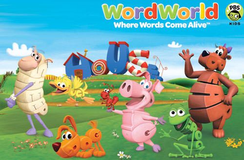
Some Type for Kids
Jairo sent me this link after watching the kids program WordWorld. I don’t have any children myself, but I did watch an entire episode (for research purposes of course):
LivePen is an interesting tool for those who like to draw letterforms in Adobe Illustrator. I haven’t used it yet, as the Mac version isn’t ready. However, it is currently available for Windows + CS2.
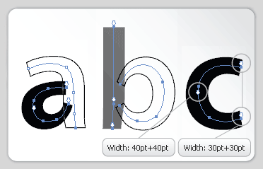
If you do use it, then be sure to let me know what you think. You can try it out for free.
And some gorgeous letter-pressed posters from the talented Douglas Wilson, printed on a variety of substrates, including old maps. Well worth taking a look:

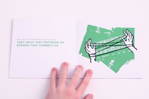
I’m also a fan of Frank Chimero‘s work:
Miscellaneous links
For iLT’s French-speaking readers, this is a good little site, with some type-related posts: Zone d’information opaque.
iLT PodCasts?
This is an idea I’ve been toying with, and thanks to Alec Julien, a regular iLT contributor, it could become a reality. We have two videos to get you started. The first is a tutorial on how to create discretionary ligatures in FontLab:
and the second I’ll post mid-week. I’ll create a new section of the site specially for these videos, and although it’s unlikely you’ll see my mug on any of these videos, I do have some interesting ideas for PodCasts, so stay tuned. I will also add these videos to iTunes, so you can subscribe to them. (right now silly iTunes won’t let me setup an account because although my address is in Japan, my credit card is British. And I can’t sign-up for iTunes US or UK, because my credit card’s address is in Japan–stupid really. If anyone from Apple is reading this, please get it sorted.)
A little light relief
First is this license plate from typenut Duncan:

and this light-hearted type dating game from Amanda.
And I absolutely love this this video from a very impassioned printer. Thanks to the ATypI Mailing list for this one:
http://uk.youtube.com/watch?v=VpAuDrs5ocgSunday Font
And today’s font is PowerStation from the Umbrella Type:

I hope that’s enough to keep you going until mid-week. Some really great stuff to come, so stay tuned.
It was really tough choosing a winner for the FontBook in a movie competition. All the entries were great, but the winner is Christian Neumann, who wins a copy of Bringhurst’s The Elements of Typographic Style. All of your entries have been popping up all over the web.
Oh, and if you missed the interview with Jean François Porchez, be sure to take a look–great insights from an even greater type designer. And talking of great type designers, coming up we have those articles from Kris Sowersby, so stay tuned and have a great Sunday (what’s left of it), and I’ll see you all again mid-week.
![]()


