Choosing the best typeface for a particular job is a commitment — a gamble, too — that cannot be made in a vacuum. With so many current display type options in the world, the decision on which font to select cannot be made without testing it out. But I don’t need to tell you: You are the typographic pros.

There are so many styles that are readable and have eye-catching appeal. But my decision underscores a current interest in the question: “What typeface will represent the early 2000s (in the way that say, Lubalin’s Avant Garde represents the mid-1970s)? For this the accolade goes to Astronef Super Condensed, Astronef Super Normal, Astronef Super Wide designed by Jean François Porchez.


It is not a retro-futurist design but rather symbolically intones past and present. It retains some classic elements while emphasizing more contemporary traits: The contrast between fat and thin lines; the cap W, M and N, for instance. There are also a few novel forms such as the cap P and Q (mind your Ps and Qs, as the saying goes), that each have sensuously appealing and unconventional curves.

My favorite member of the Astronef family? Super Condensed is a tad anemic. Super Wide is fun to test drive but harder to maneuver because the letters seem bloated, reminiscent of monster truck wheels. My foot to the pedal is for Super Normal; it works great for headlines, subheads and even as a potential wordmark that has a P & Q in the name. And there’s nothing wrong with normal.
| Font of the Month: ASTRONEF SUPER | |
|---|---|
| Designer: Jean François Porchez | Foundry: Typofonderie |
| Three styles: Condensed, Normal, Wide | |
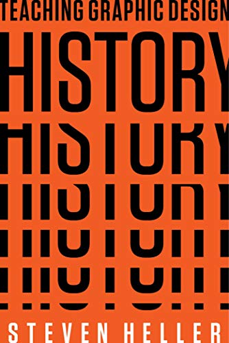
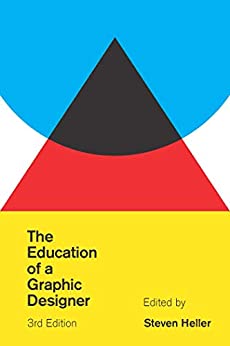
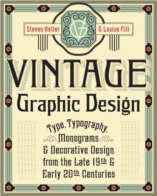
 Steven Heller is nothing short of a legend in the design community. Award-winning graphic designer, author and editor of hundreds of books (yes, 100s!) and one of the world’s foremost authorities on graphic design history; and arguably its best design commentator. Follow Steven on the must-read The Daily Heller and read his latest book, Type Speaks.