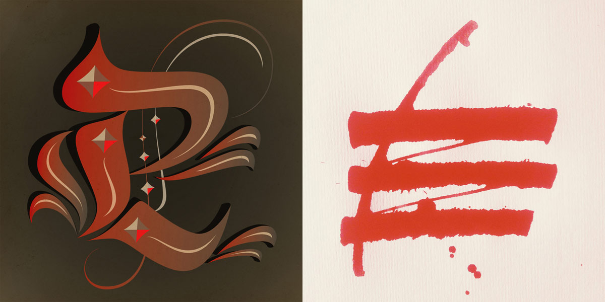
Despite the frequently ill-defined line between Lettering and Calligraphy, they have always been separate disciplines. Lettering vs Calligraphy, a new project from Berliners Martina Flor and Giuseppe Salerno, seeks to bring together both the craft of drawing letters and the art of writing, but at the same time emphasize and celebrate their differences.
Their initiative is an online visual dialogue between a letterer (Flor) and a calligrapher (Salerno). They simultaneously draw/write a letter daily in response to a keyword supplied by a moderator. Visitor to the site are invited to vote for their favorites, and guest specialists (moderators) are invited to select the letter that, in their opinion, is the best.

Many of the moderators, who referee these competitions, are type-related professionals or calligraphy artists from all over the world. Some are writers and bloggers like Jan Middendorp, Nina Stössinger, or Stephen Coles; others are calligraphers or letterers like Paco Calles, Nate Williams, and Thiago Reginato, to name just a few.
Flor & Salerno — Letterer & Calligrapher
Though now based in Berlin, Martina Flor grew up in Buenos Aires and graduated from the Type & Media Masters program in the Netherlands. Her specialization in type design and lettering is the combination of her talents as both a designer and illustrator. Martina draws letters by hand or digitally, and then works at improving them through various refinements and variations.
Unlike Martina’s process, Giuseppe Salerno’s technique requires writing a letter or a word repeatedly until finding just the right composition. Being a self-taught calligrapher from the age of 15, Salerno grew up in the Italian city of Torino where he also studied Graphic Design. After moving to Valencia he founded the design studio Resistenza together with Paco Gonzalez, also a close collaborator on the LVSC project.

The battle that Flor and Salerno pull together online owes a great deal to Typostammtisch, the periodical Type-themed meetings organized by Ivo Gabrowitsch at Max und Moritz in Kreuzberg, Berlin. It’s where they first met. During these early encounters, they developed an interest for one another”s work, followed by an exchange of knowledge and critiques that were mutually beneficial.
Since then, Martina and Giuseppe have been collaborating and, though they are opponents in the virtual world, they are ‘co-workers’, colleagues, and friends. Via the Lettering vs Calligraphy ‘battleground’ they push and inspire each other to do better — and the results are there for all to see.
Lettering & Calligraphy — Drawing & Writing
LVSC is not only an online recreational project but also a tool to understanding how each performs, and highlights the differences of both techniques. While there are several blogs deal specifically with lettering or calligraphy, letteringvscalligraphy.com marries both disciplines in a rather visual way. The site permits side by side comparisons of both technical approaches within a single image, and is both educational and fun.

Whereas lettering is based on draftsmanship, the art of drawing letters in creating a unique customised typographic image, calligraphy achieves the same through penmanship or writing, using unique strokes that cannot be reproduced without suffering variations. The rhythm achieved by the speed of the tool in calligraphy is emulated by the tension of extreme points when drawing a letter.

Despite the different nature of both techniques they can also perform similarly and we have see them come together many times through history as part of the same design process: in Roman inscriptions, handwritten letters with a brush directly on the stone that would be later carved, or in the medieval illuminated manuscripts where calligraphic text and capitals are complemented with illustrative decorations.
The first phase of the project will be concluded with a complete Latin alphabet (uppercase, lowercase, and numerals), including a set of characters from other scripts such as Cyrillic and Arabic. In March 2013, Mota Italic, a Berlin gallery that showcases type, letters, and typography in art and design will host the first Lettering vs Calligraphy exhibition. The novel concept will take the form of a workshop in February at the traditional Berliner workspace Betahaus, where the participants will explore the two technical approaches as combinatory tools within the same design process.
In the future, rival guests will be invited to participate and prove their skills via the online battleground. As a result, letteringvscalligraphy.com will amass a large library of letter forms, while at the same time showcasing the work of artists from across the globe — hopefully developing it into a place not only to share knowledge but also as an inspirational source and playground for designers, letterers, and calligraphers.
previous: A firm turn toward the objective: Josef Müller-Brockmann 1948–1981