For our first Font Fashion Week, type designer extraordinaire, Mark Simonson, spoke about his new typeface Proxima Sera, the long-awaited companion to the world-famous Proxima Nova. Here you can watch the video or read the illustrated transcription below.
In all the time I’d spent working on Proxima Nova (and its earlier incarnation, Proxima Sans), I had never really thought much about this. It’s not that I never combined serif and sans serif faces in my work as a graphic designer. It was more like, figure it out yourself. Try different things. See what works and what doesn’t. That’s one of the skills you learn when working with type. You might come up with something completely different than I would. And as a type designer, I didn’t really think it was my problem. Maybe it’s just me, but I don’t like to tell people how a typeface I designed should be used. I like to be surprised.
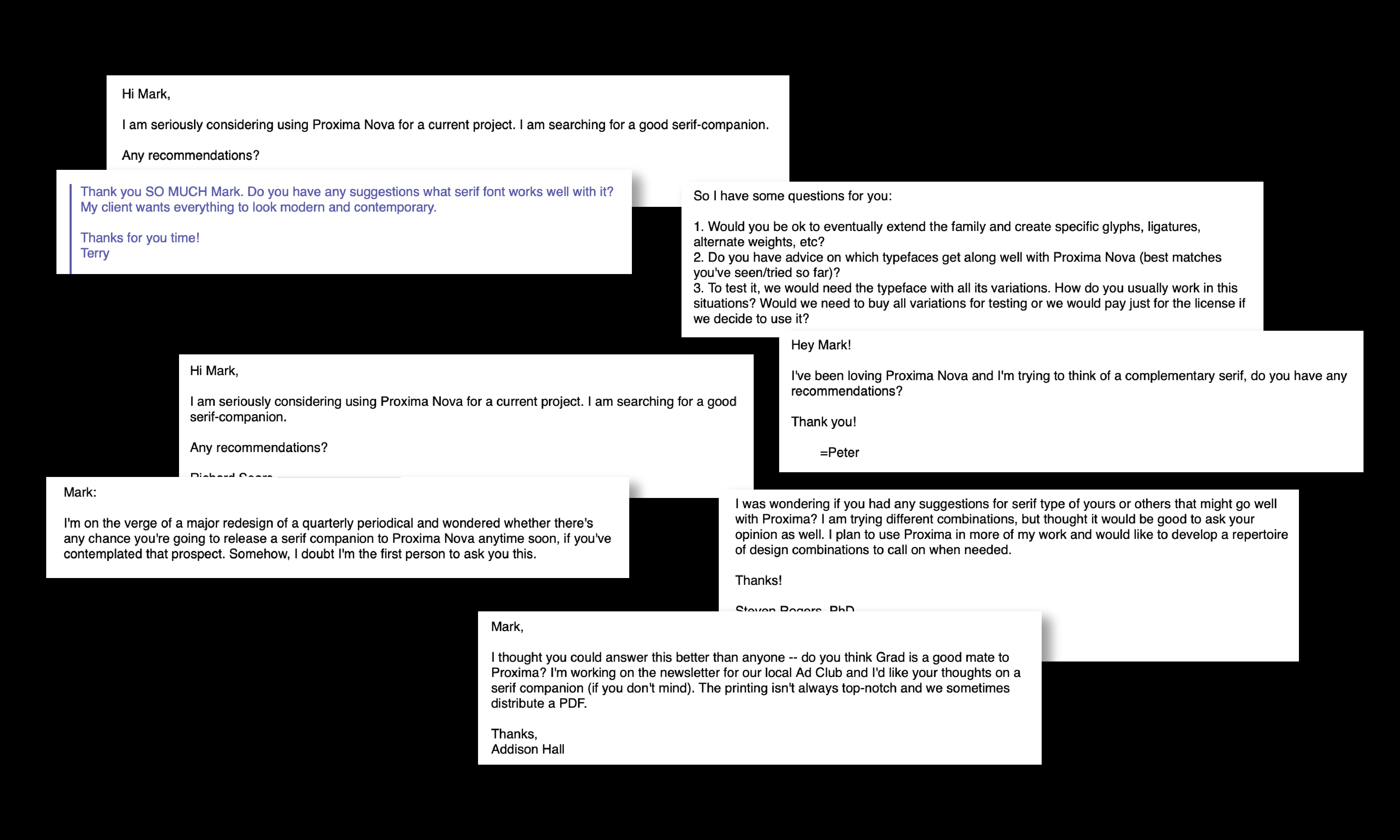
But, that didn’t seem to be the answer they wanted to hear, so I tried to think what I might use myself. Something modern (as opposed to old style) with a fairly large x-height. Probably something rather plain and straightforward.
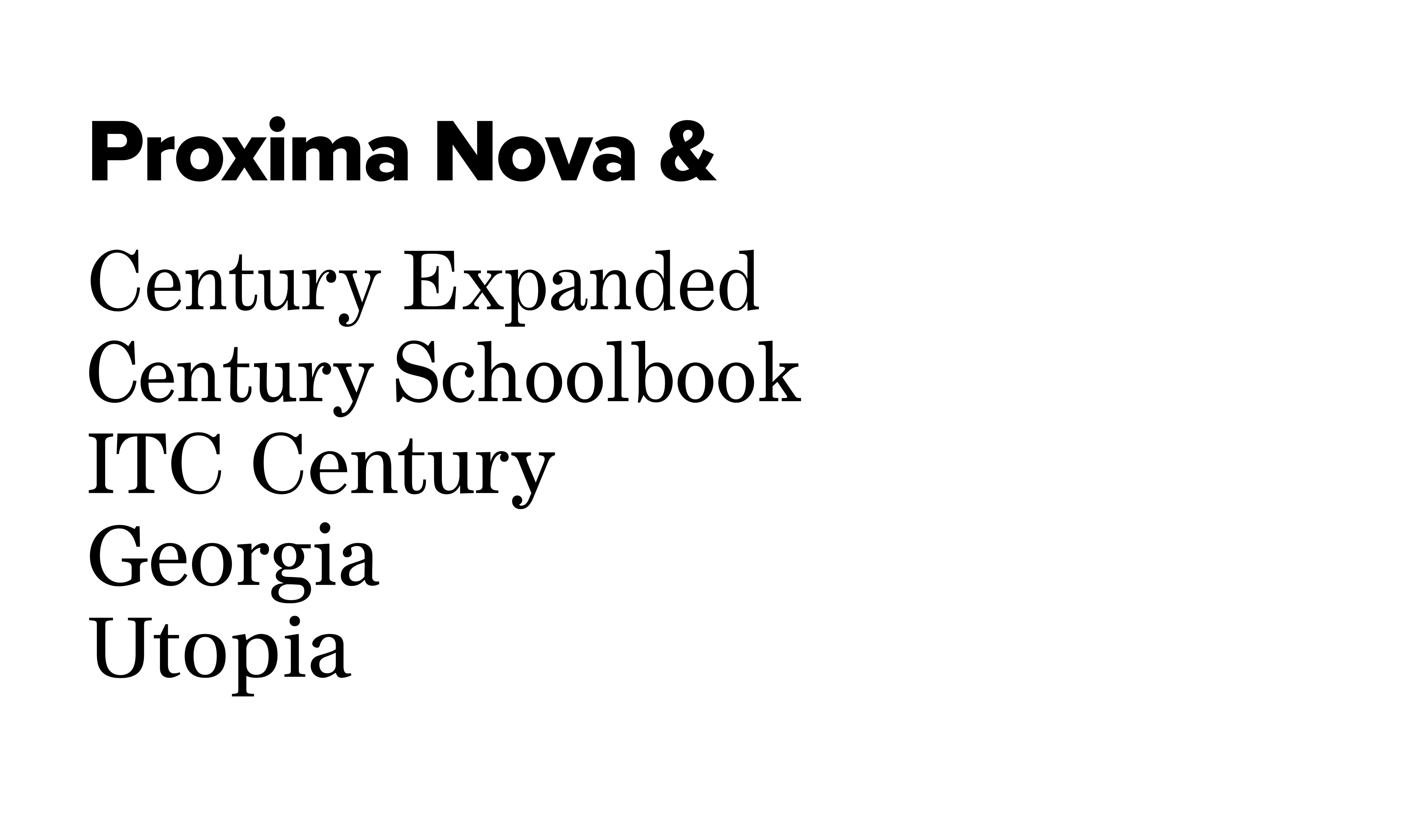
One of the Century’s would work. I’ve used Century Schoolbook with it a few times. Or maybe Georgia or Utopia, or really, any of the many modern moderns.
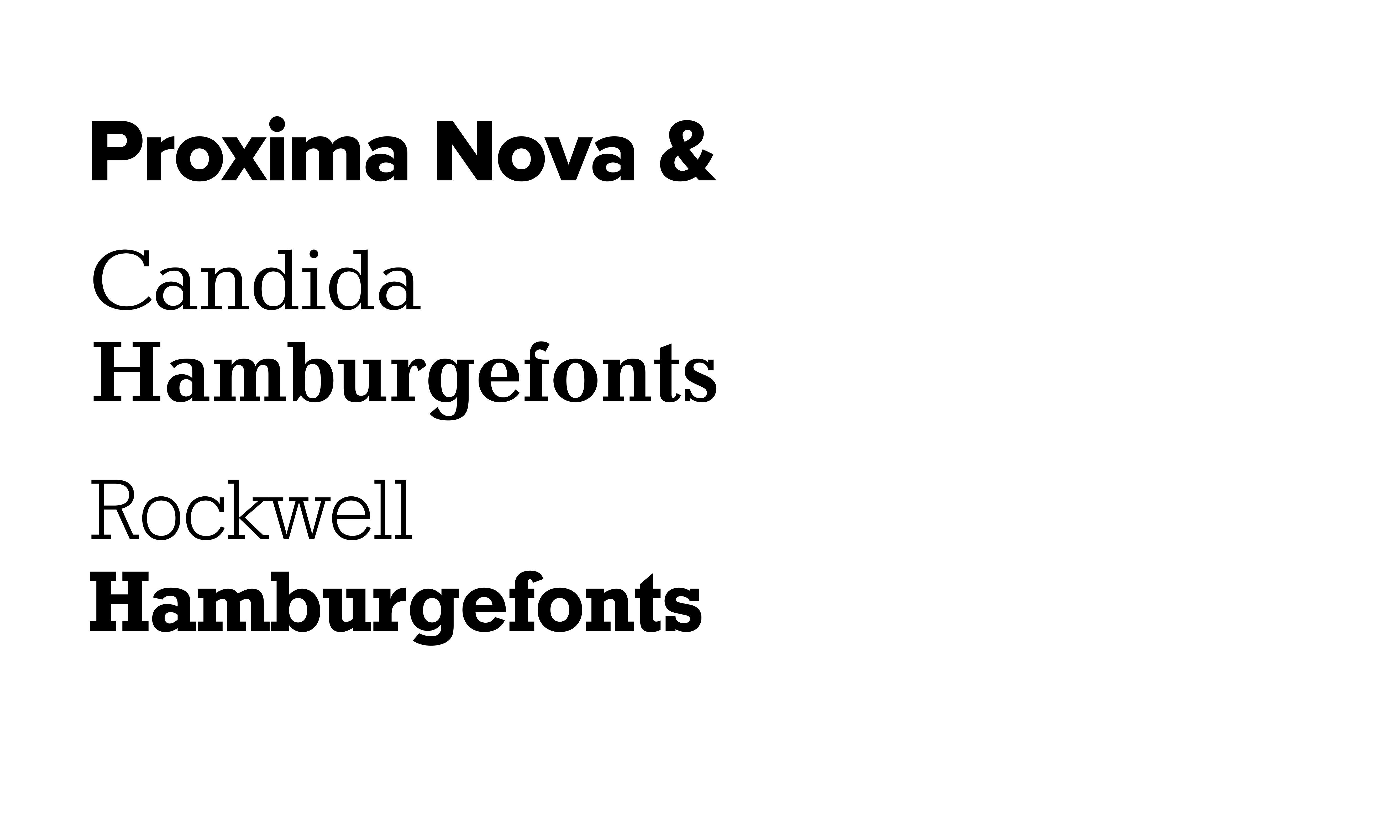
Two others I sometimes suggested were Candida and Rockwell. They actually share some structural similarities with Proxima Nova, so there is a certain logic to it. However, Candida is pretty obscure and funky, and only has few styles. Rockwell is a slab serif, which is great if you want a slab serif, but maybe not the best choice for text, and a slab serif is probably not what most people are thinking when they ask. They’re thinking of a normal serif typeface. Like Times or Century or whatever.
One way around this dilemma would be to create a serif version of Proxima Nova or some sort of serif companion face. A serif typeface meant to be paired with it. This idea has been on my drawing board for a long time. I would work on it off an on, but wasn’t able to come up with a satisfying solution until fairly recently.
In my discussion here, I’m going to leave out cases like Lucas DeGroot’s The Sans and The Serif, which where conceived together as a superfamily. If I had conceived of Proxima Nova as the sans serif component of a superfamily from the start, it would probably have turned out very differently. Since it already existed for years (especially if you count my earlier Proxima Sans) and was not conceived that way, I had to take a different approach.
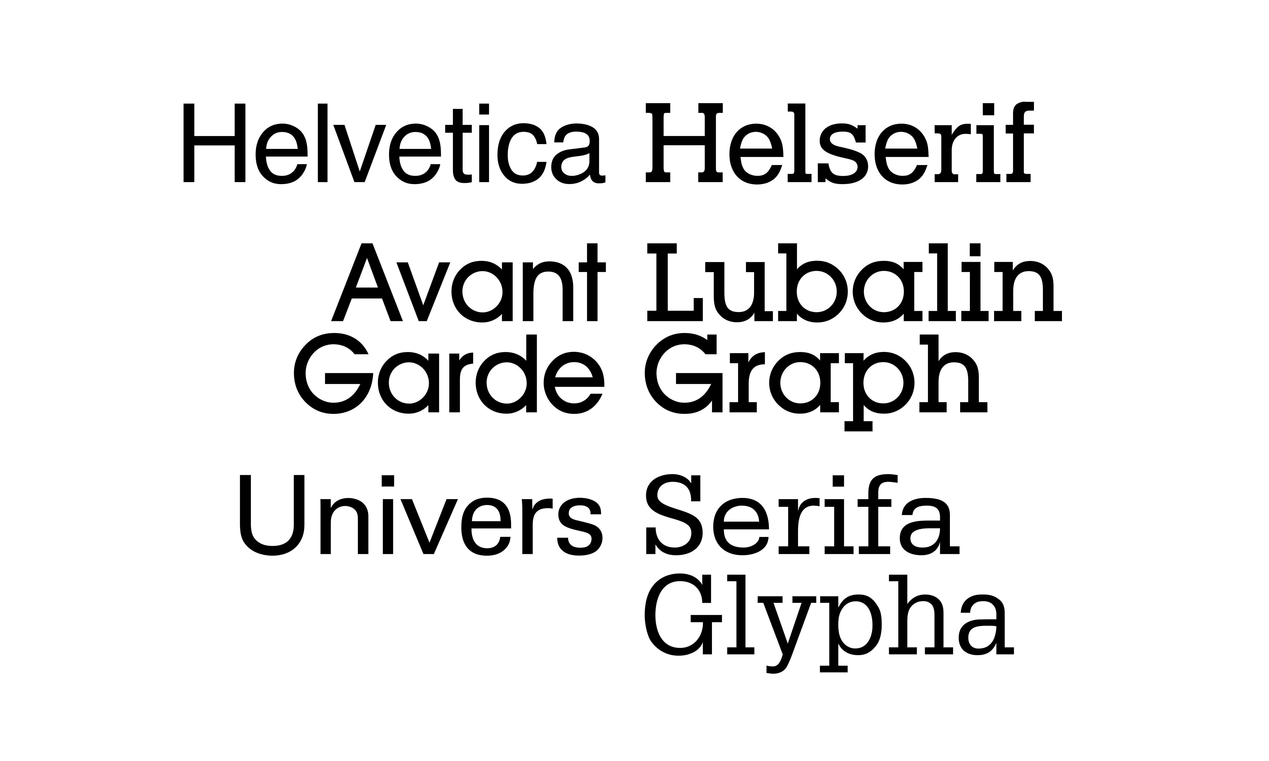
This sort of thing has been done before, as with Helvetica and the (unauthorized) Helserif (created by Phil Martin). I don’t think this works very well for various reasons. And I’ve never seen Helserif in use outside of specimen books.
Then there is Avant Garde and Lubalin Graph. Both by the same designer, Herb Lubalin. But when was the last time you saw them used together? I can’t think of any examples.
A similar case is Univers and Serifa and later Glypha, two different attempts to add serifs to Univers. Again, all three were designed by the same designer Adrian Frutiger, but I don’t think I’ve ever seen either used with Univers, even though they are both well done and share the same underlying structure.
In all these cases, they are going from a sans serif font to a slab serif font. At the same time, they do not feel like they were meant to be used together, not in the way people usually pair sans serif and serif typefaces, anyway. Slab serifs are really kind of a separate category of serif typeface, mostly used for display.
Another approach would be a related but structurally different serif face.
Sometimes this happens organically, rather than as part of a plan, as with Morris Fuller Benton’s Century faces, and News Gothic, Franklin Gothic, and Alternate Gothic. They form a de facto superfamily, the result of the same designer creating different kinds of typefaces. They seem to share the same design DNA and they look good together.

The same can be said for many of the faces of Adrian Frutiger. He intentionally stuck to a consistent underlying skeleton in his many type designs.
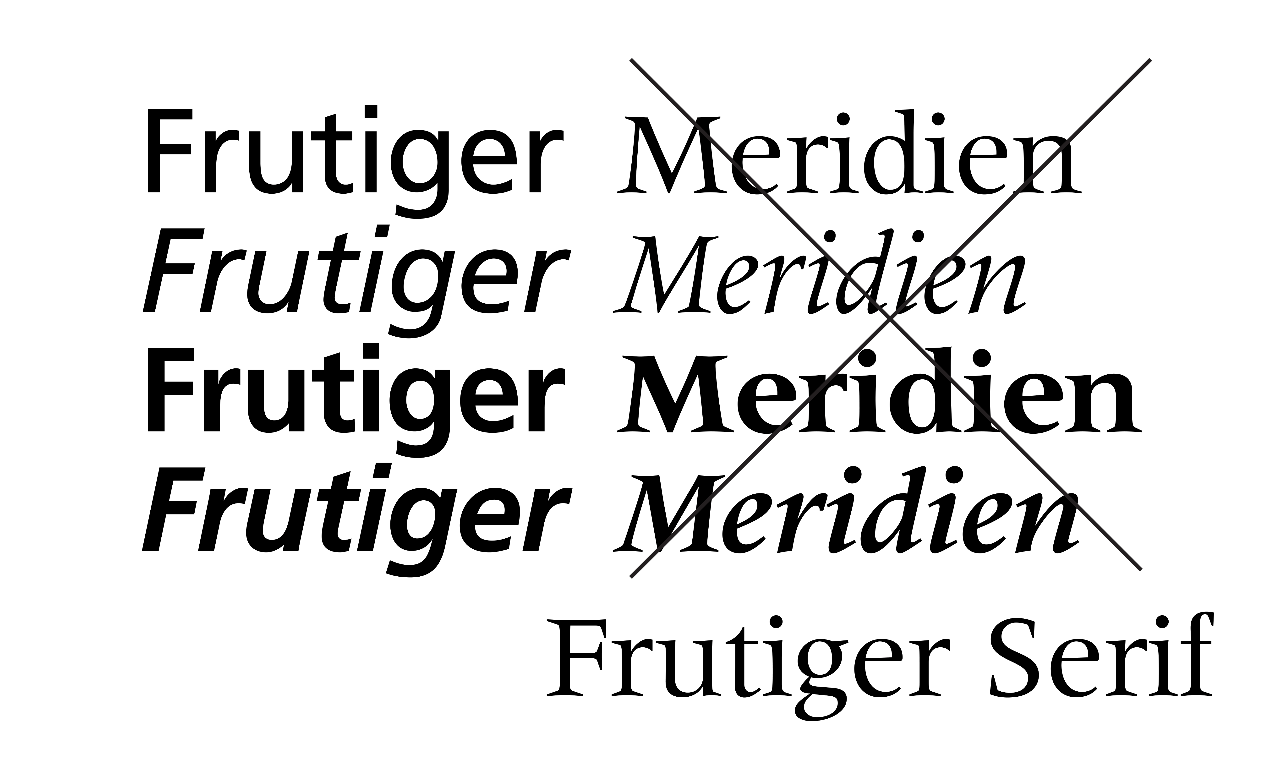
In fact, Monotype renamed his Meridien as Frutiger Serif, bringing it into the more popular Frutiger family through marriage, so to speak.
A third approach is somewhere between these two, structurally similar, but not just adding serifs to a sans.
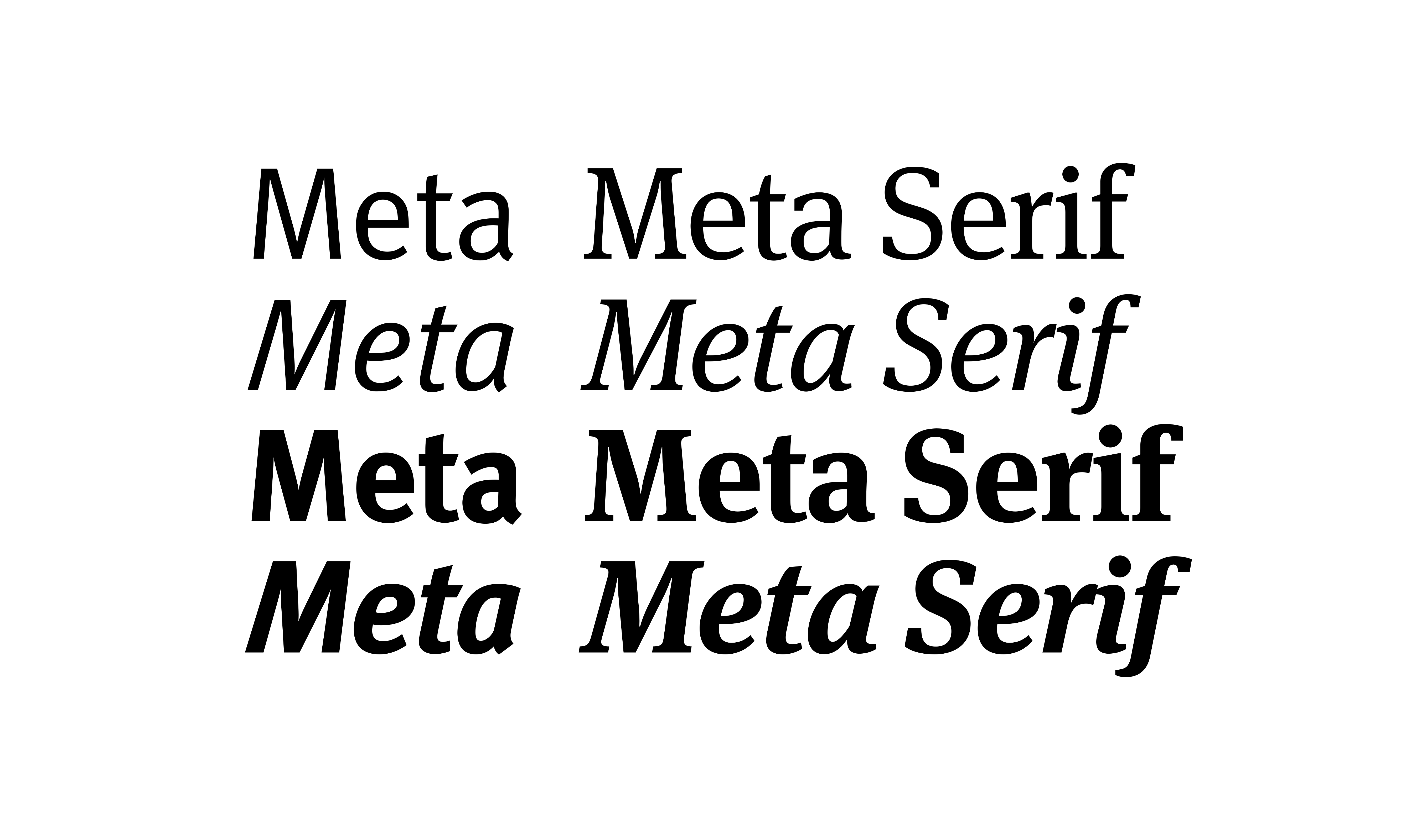
One such case is Erik Spiekermann’s Meta (from 1991) and Meta Serif, designed years later by Spiekermann, Christian Schwartz, and Kris Sowersby. It shares much of the underlying structure of Meta, but is not simply Meta with serifs attached. The modulation — that is the stroke contrast— is more typical of serif typefaces. It looks like it was designed from the start as a serif typeface. But the overall proportions and underlying letterform skeletons are the same as Meta.
My first attempt at a Proxima “Serif” was to try to do something similar, changing the modulation of Proxima Nova to give it more contrast, and then working in serifs. Well… It’s basically Candida.
It’s interesting, and I might finish it someday, but it’s probably not what people are looking for as a serif companion to Proxima Nova. It’s a bit of an oddball. It’s not particularly appealing to me, at least in the form in which I left it back in 2012 when I last worked on it, which you can see here. So I set it aside, and with it idea of a “Proxima Serif” companion.
But then, about two years ago, I had an epiphany. Instead of morphing or reworking Proxima Nova into a serif typeface, what if I just made a good, basic serif typeface, designed to work really well with Proxima Nova? Similar to the way Morris Fuller Benton’s Century’s play nice with his News and Franklin and Alternate Gothics?
I have a lot of unfinished font ideas, going back to the seventies, and was thinking about one of them in particular. And that’s when it hit me.
To give you some context, Proxima goes back to an idea I had in the early eighties. I tried to imagine a sans serif face that was a hybrid of my favorite existing sans serifs — combining the geometric feel of faces like Gill, Futura, Kabel, Avant Garde, but with the proportions of gothics like Helvetica, Akzidenz, and News Gothic.
This is idea would eventually become Proxima Nova. A hybrid of a bunch of my favorite sans serifs. A remix, as they call it now.
A year or two earlier—1979 actually—I had similar idea for a serif typeface, a hybrid of my favorites—Plantin, Times, Baskerville, Century Expanded and Schoolbook, but with the proportions of Helvetica.
The name I gave it at the time was “Metropolis”. As you can perhaps see, it has a little of each of these other serif typefaces in it. My plan was to submit this to ITC, the big typeface publisher back then,
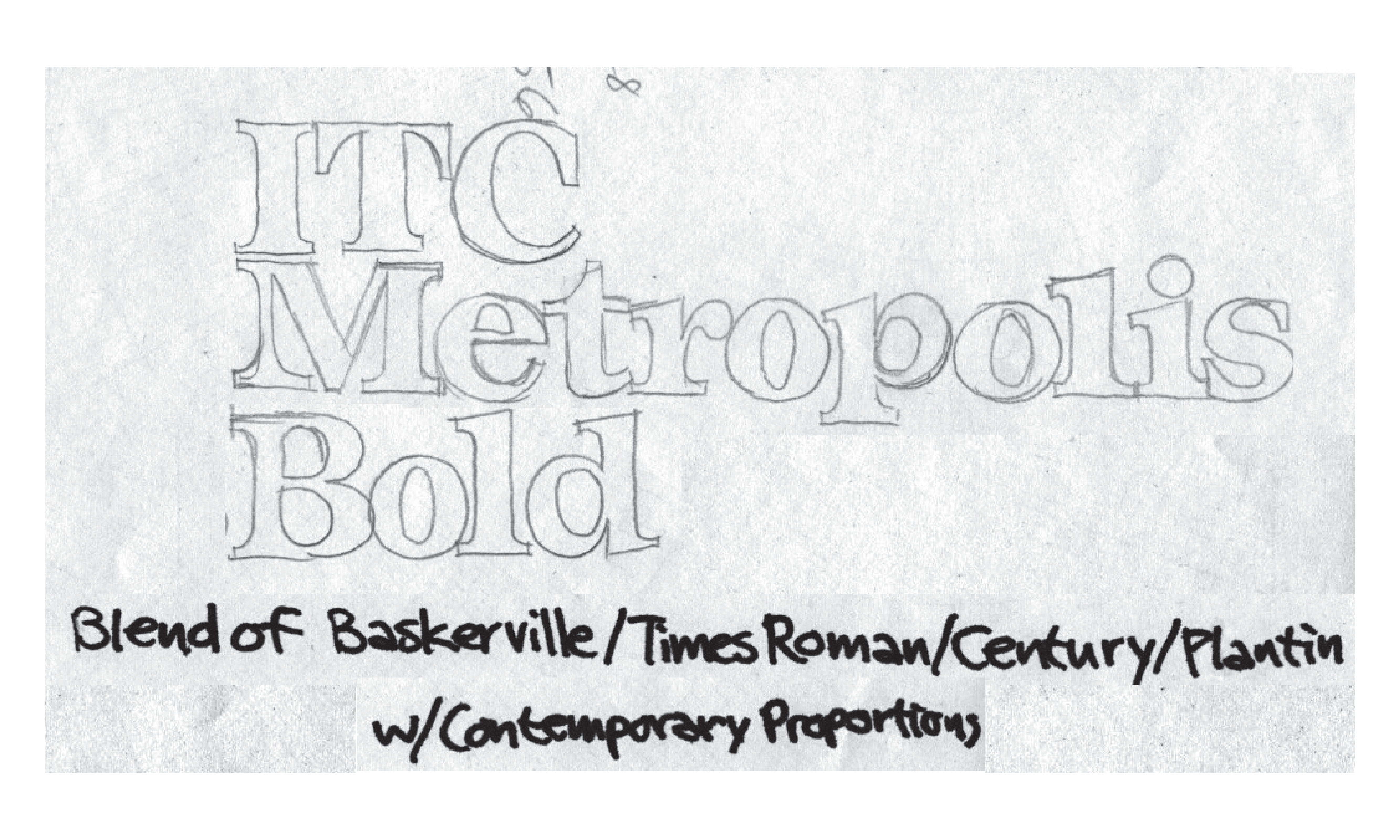
…but I never got much further than these sketches.

Some of the ideas in it look naive to me now, but I’ve always had a fondness for the way it looked, even in this crude state.

While I was starting to make digital fonts in the early nineties, I digitized the some of the characters from the 1979 sketches, expanding on them a bit, just to see if it was worth picking up again. At the time, it didn’t seem that promising. I also was just starting to make digital fonts (I hadn’t published any yet), and I had other font ideas I was more interested in working on.
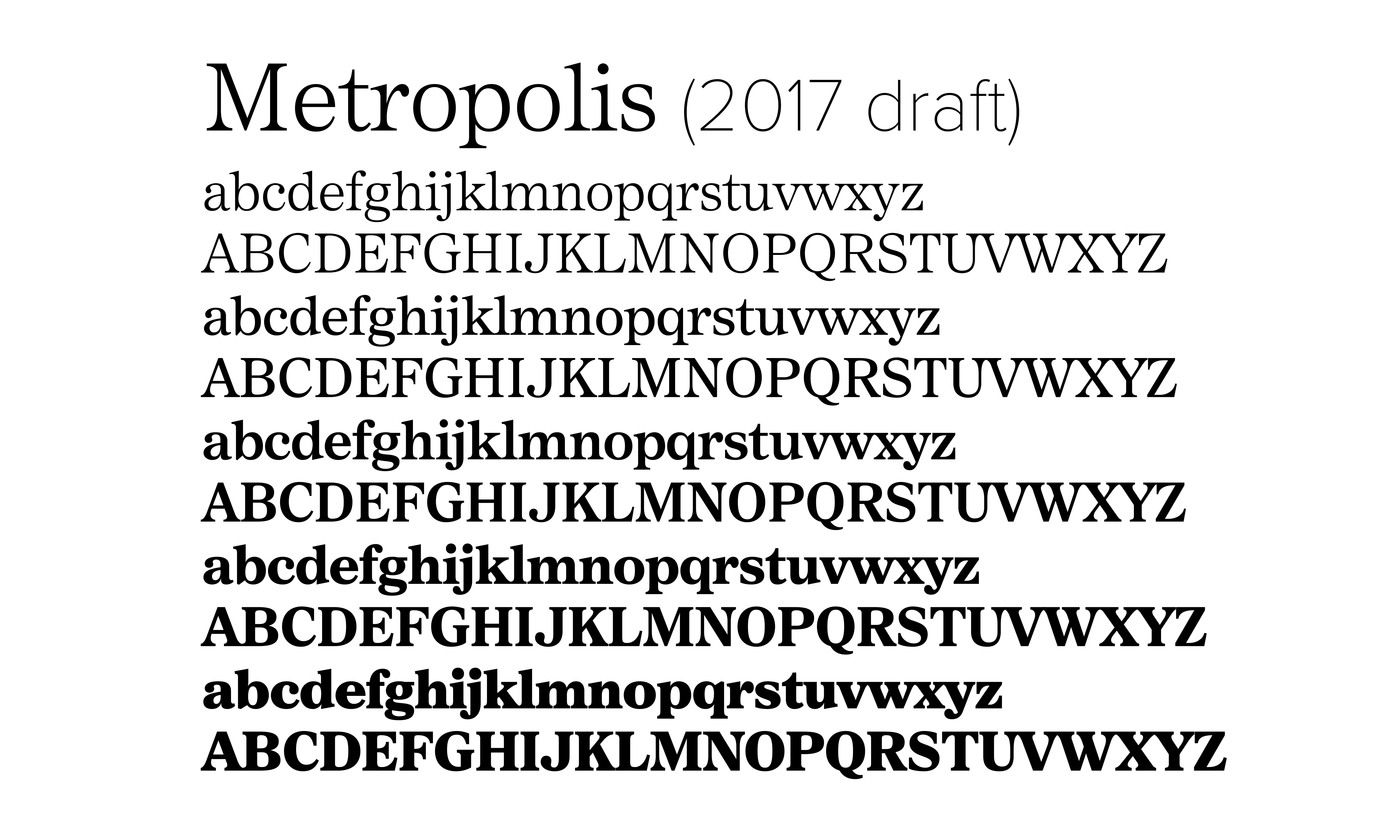
More recently, in 2017, I went through a period where I did quick drafts of several dozen of my old back burner font concepts going back to the seventies. I’d spend a few days on each one, then move on to the next. One of them was Metropolis. I did a draft of the roman in a range of weights. This time, with a couple more decades of experience, I made some changes to improve it, and it was suddenly looking like a viable design. But, again, I set it aside because, well, I was just doing drafts and needed to go on to the next one.
By the way, most of my recent releases, like Parkside, Etna, and Acme Gothic, came out of drafts I made during this 2017 back burner project.
The epiphany I had in 2020 was this: Could this early idea of mine, “Metropolis”, be reworked into a companion for Proxima Nova? The idea made sense to me, since it was, like Proxima Nova, a hybrid concept, and from around the same time in my life, but a serif face instead of a sans serif.
Certain things would need to be changed so it would harmonize better with Proxima Nova, feel more like they belonged together. Things like the proportions, weight, and construction details.
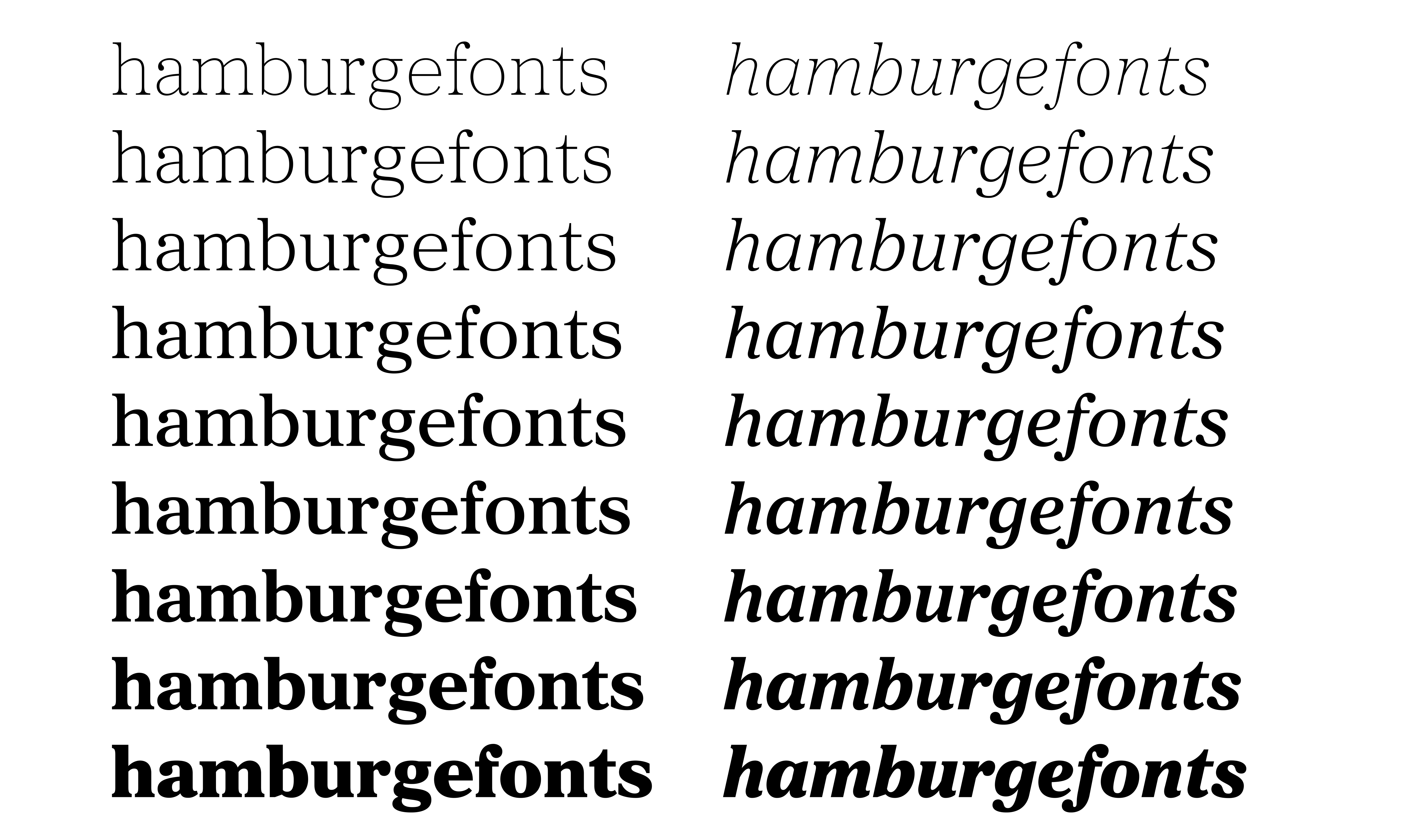
If you compare the lowercase with Proxima Nova, you can see that Metropolis has a smaller x-height and narrower proportions. The forms are more closed and the joins are more tapered. There are a lot more angular forms in the letters.
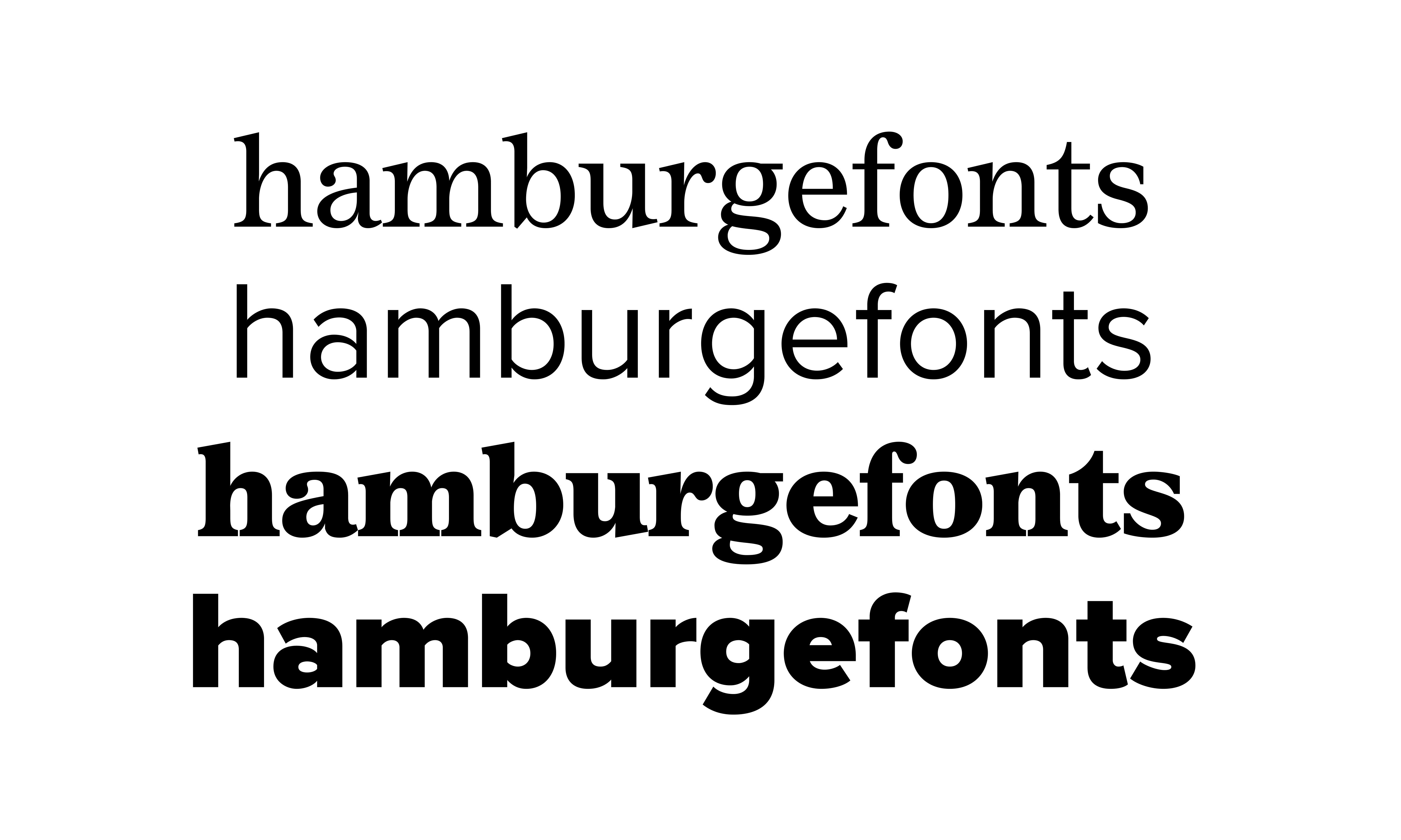
The first step was to increase the x-height and change the stroke joins in the lowercase. I also flattened the top and bottom serifs on the lowercase.

Right away, it’s starting to feel more related.
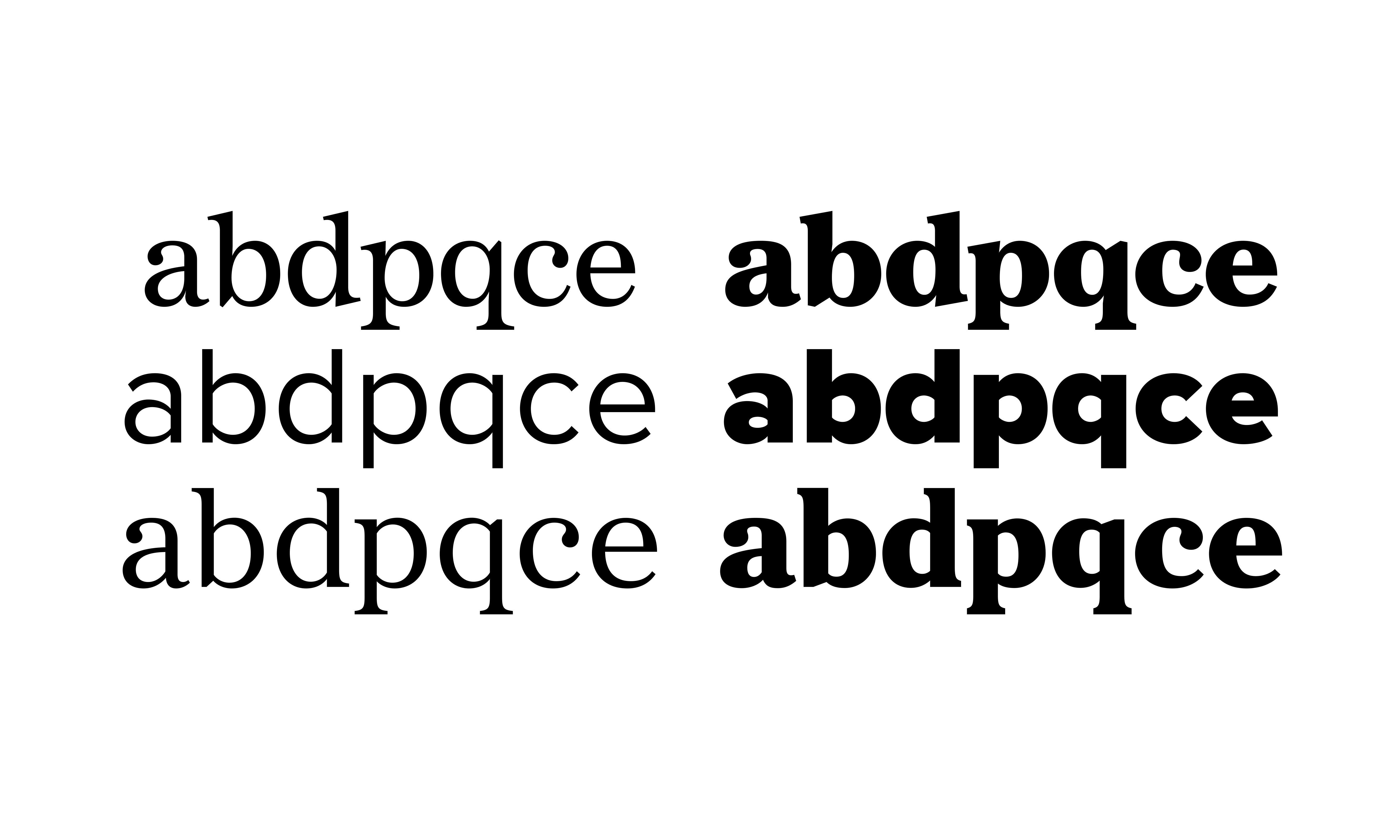
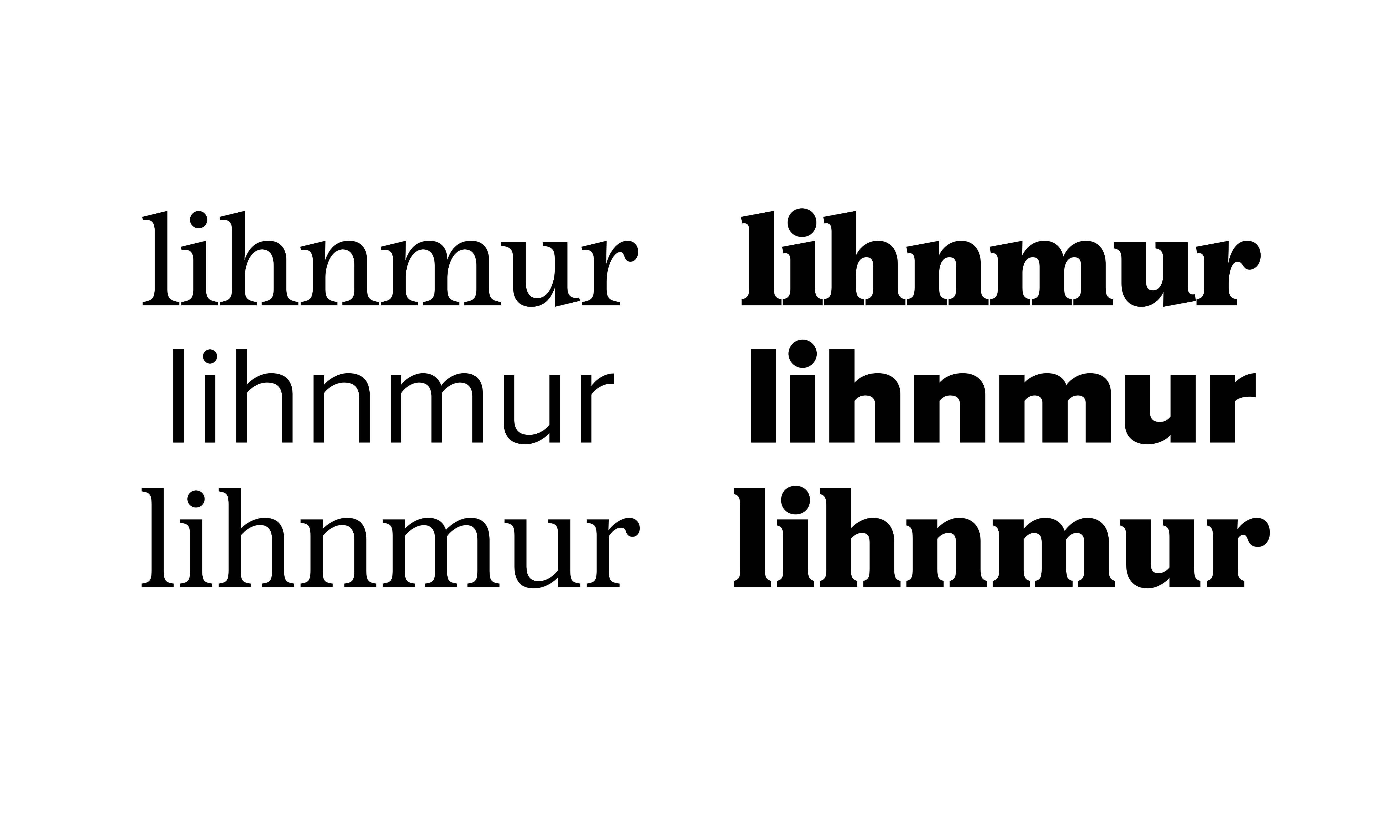
Next was to do the same with the joins for the bowls of the round letters


and to open up the aperture of letters like e and c.

I made the bowl of the a a little flatter, but not the pot-belly style from Proxima Nova. That style of a doesn’t really exist as an idiom in serif typefaces the way it does in sans serifs, so I didn’t carry that detail over, and it would have caused problems fitting under the ball terminal in the bolder weights. But I did try to keep the same open feel.

The ball terminals led to another difference: Taller lowercase ascenders. If I’d kept the ascenders the same as Proxima Nova, the ball terminal on the lowercase f would not have enough space in the bolder weights. So I made them a little taller. I also made the f and j narrower in keeping with Proxima Nova.
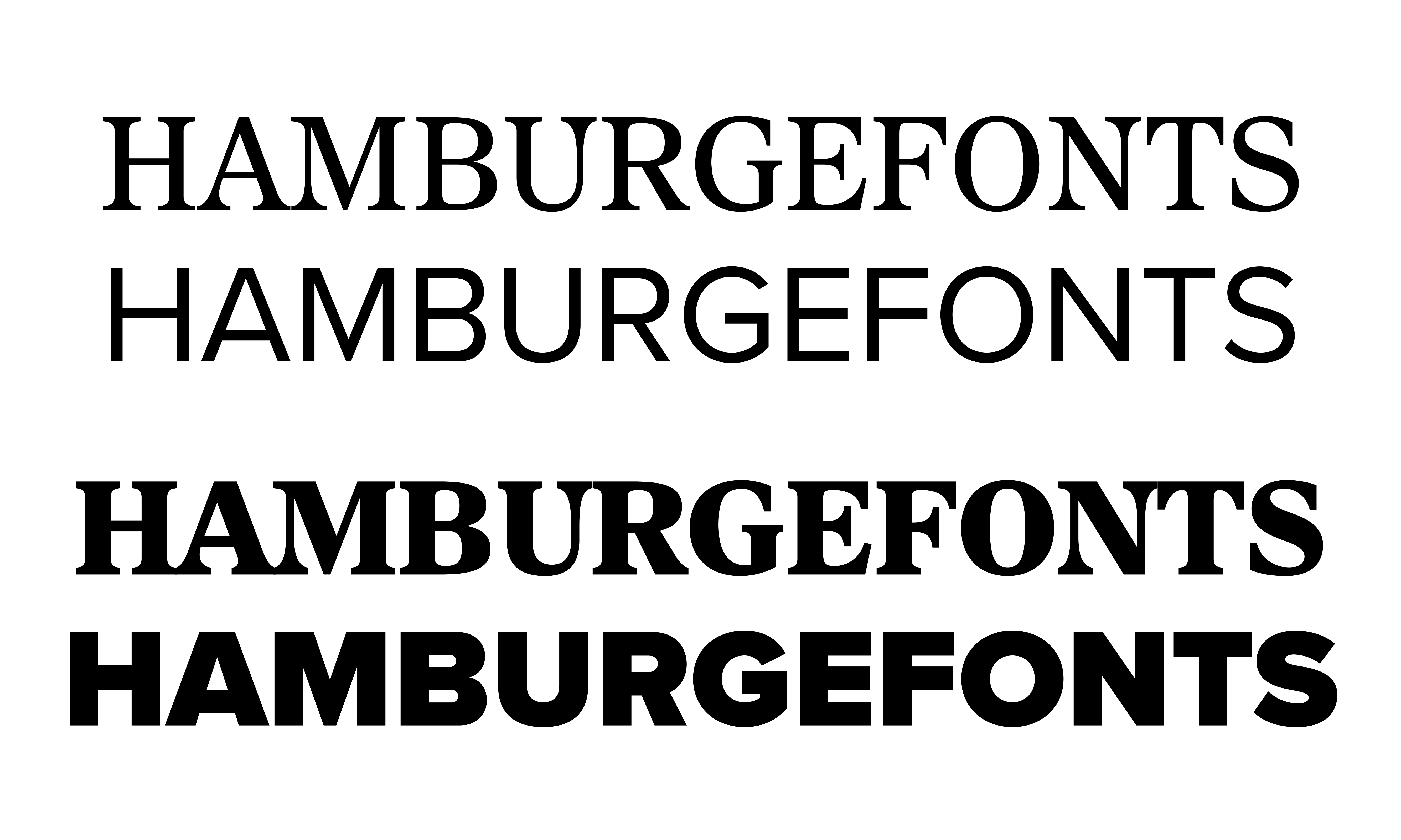
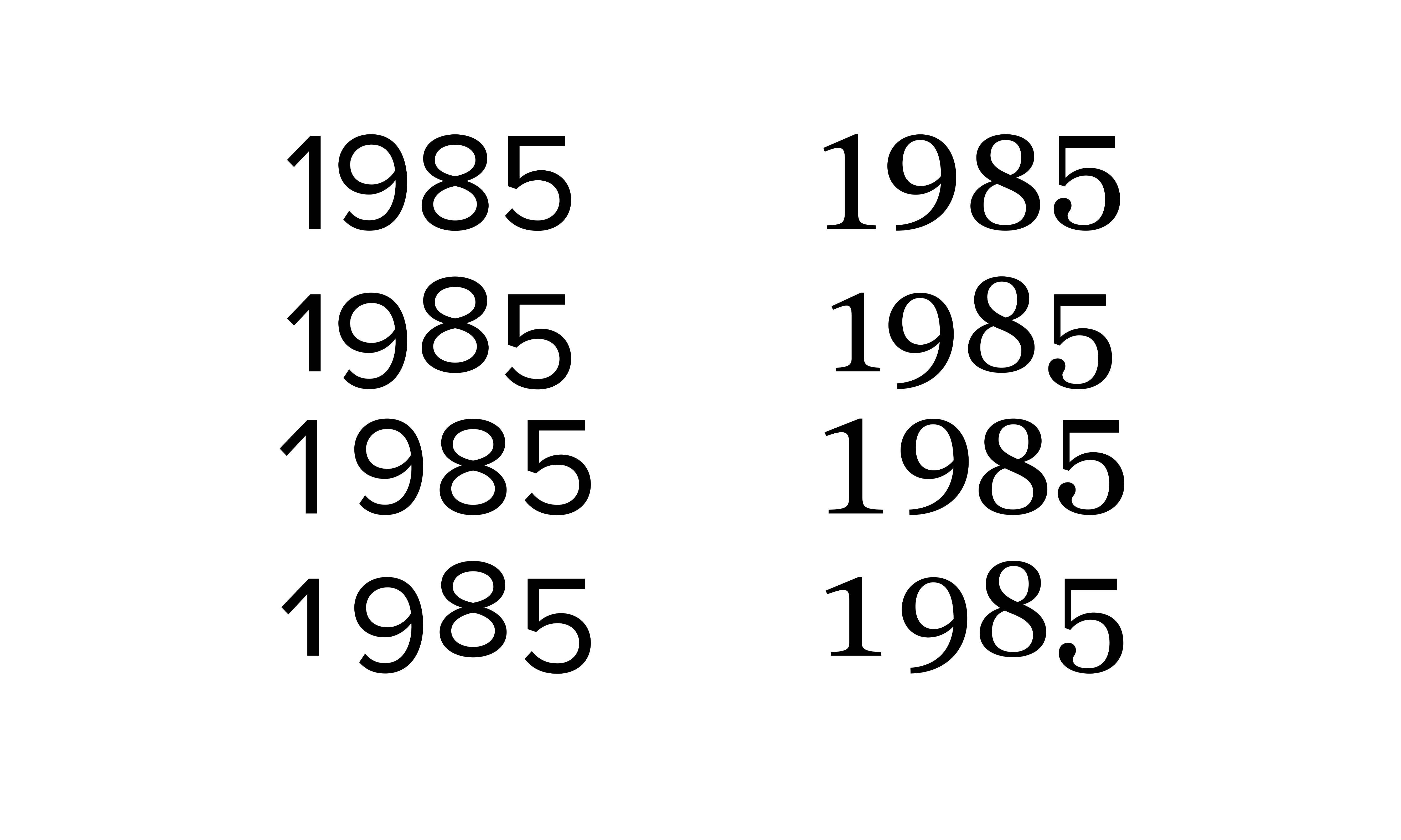
For the caps, the changes were less dramatic.

The proportions are rounder and squarer.
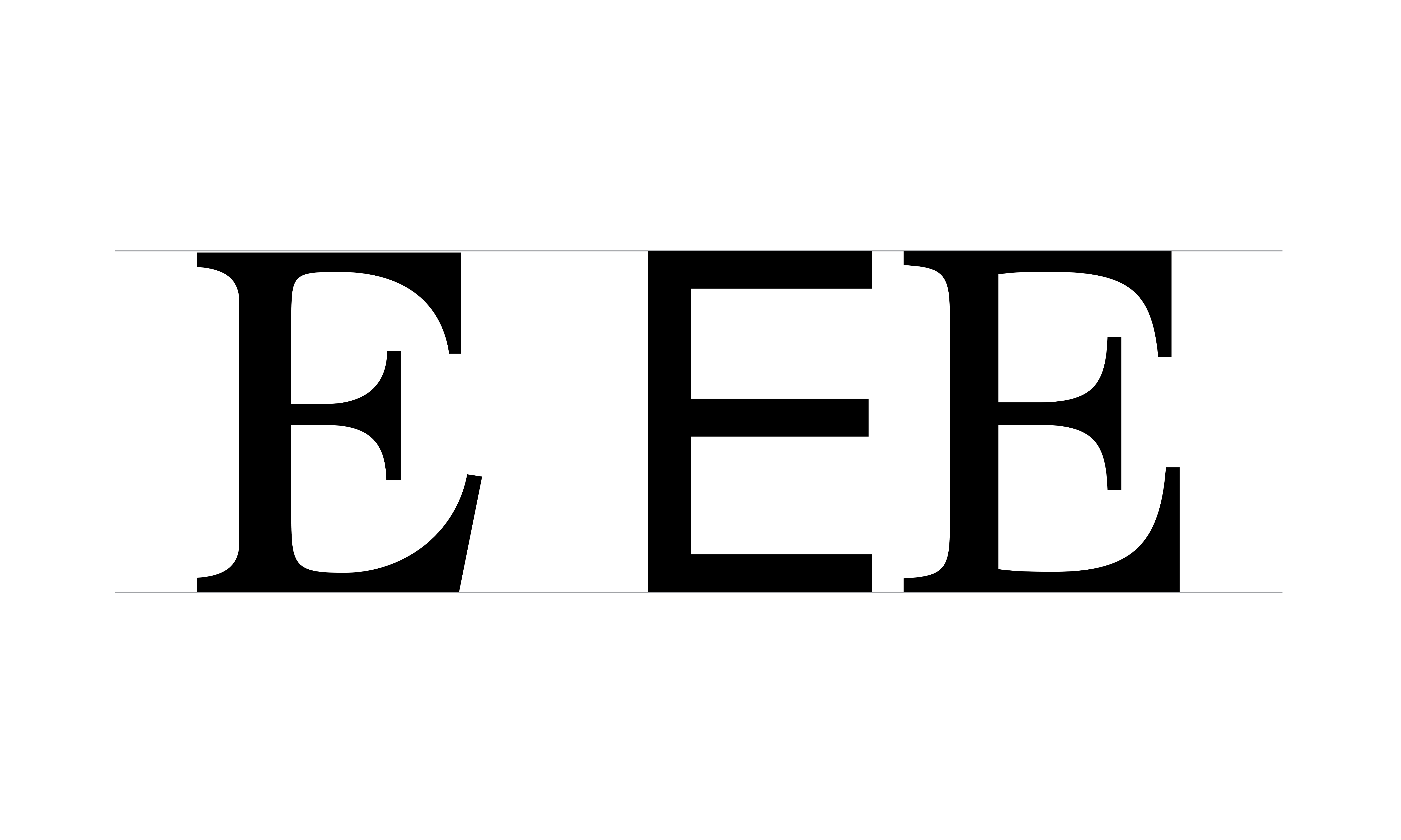
I flattened the angled serifs on the arms of letters like E.

And you can see the effect on the C with the rounder, wider proportions.

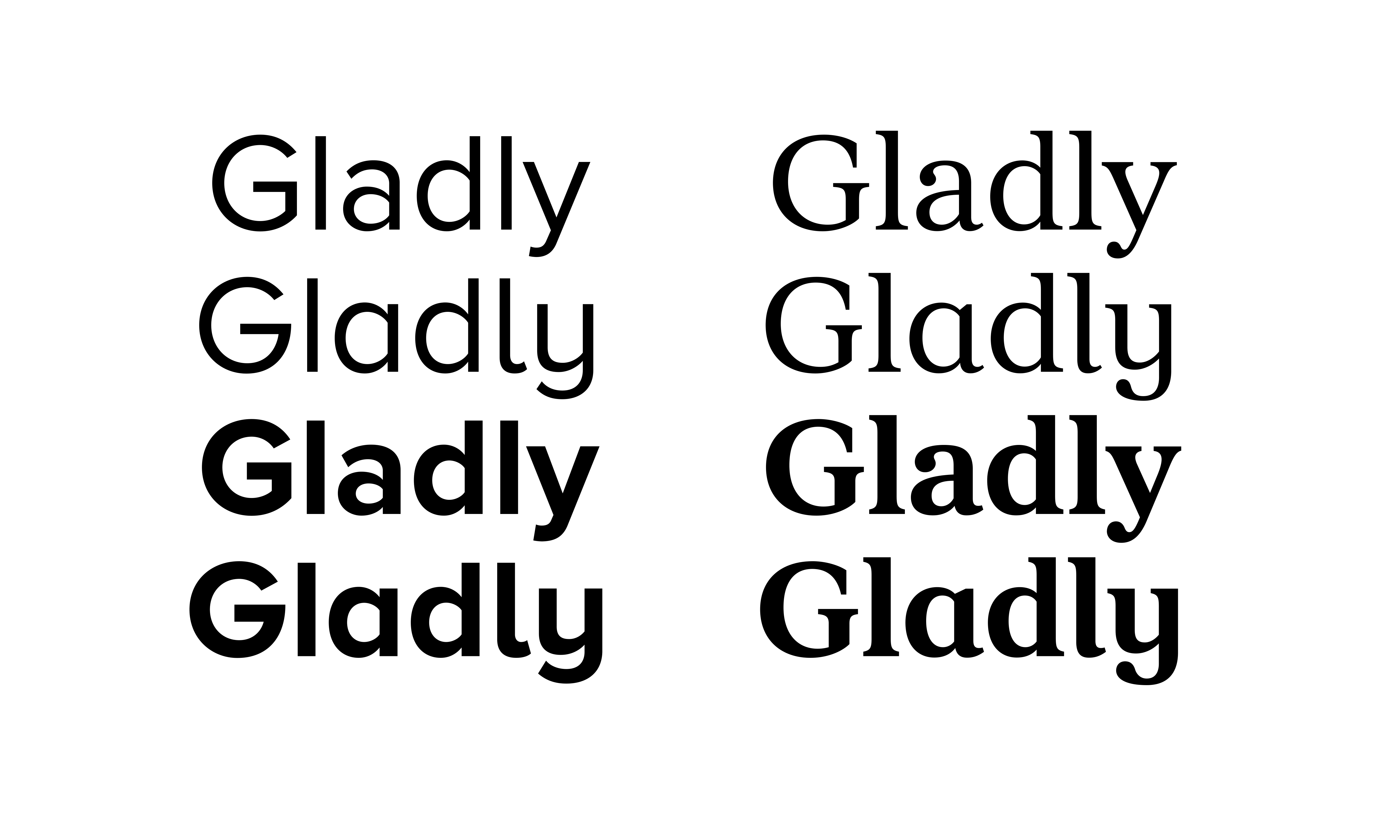
The italic in Metropolis was less developed — just three letters — r, n, and s. It was a lot more angular and less cursive than typical serif italics. I pretty much started over, picking up the design changes I made in the roman and adding more cursive forms, for instance on the lowercase s.
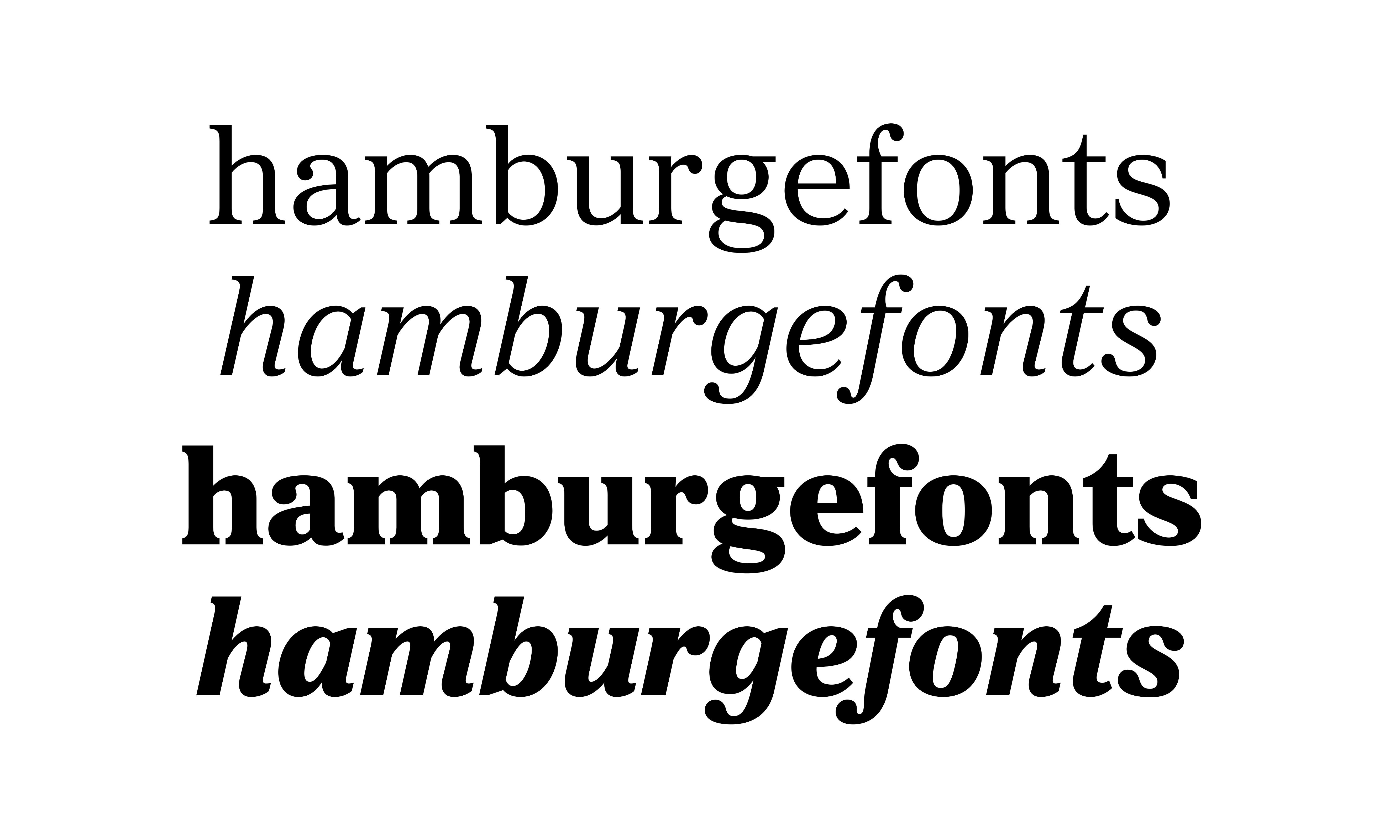
Here you can see the final form of the lowercase in both roman and italic.

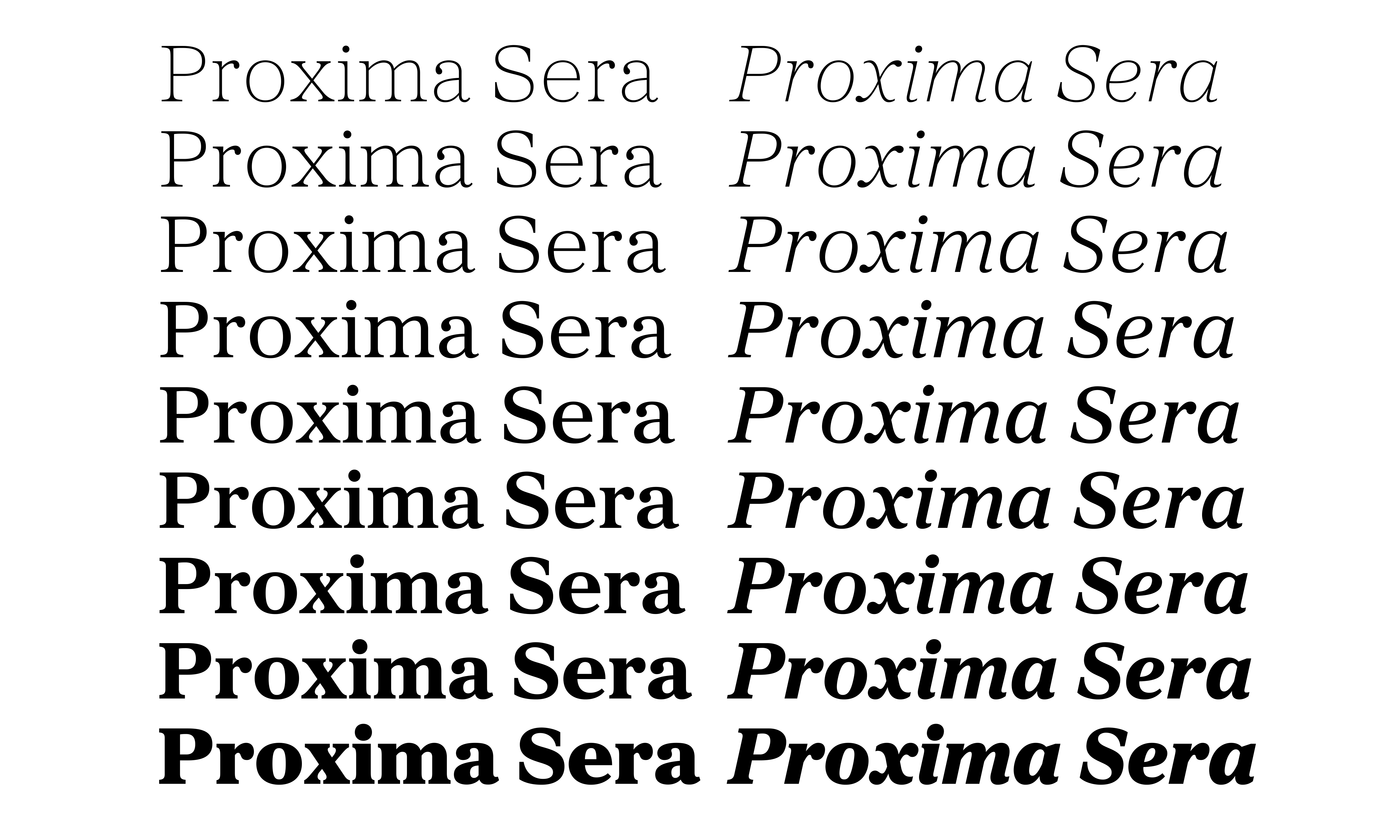
I extended the range of weights to match Proxima Nova. Note however that this new font has nine weights, including Extralight, between Thin and Light. This weight does exist in Proxima Vara, the variable version of Proxima Nova, but not yet in Proxima Nova. Maybe later.
And here are the romans with matching italics.
In matching the weights of Proxima Nova, I needed to create a Thin weight, which is pretty unusual for a serif typeface like this.
If I wasn’t trying to match the weights of Proxima, I probably wouldn’t have gone this thin, but I’m pretty happy that I did. It was unexpected. I wouldn’t use it for small text, but it makes for a fun and distinctive display style.
As much as possible, this serif companion to Proxima Nova contains the same features, including figure styles — lining and old style, proportional and tabular. There are also alternate a, l, and y, sometimes called “infant” variants, sort of like upright cursive forms. They are usually used in books for young children.
And of course it has small caps:
…and ligatures. (which are a lot of fun to design)

Here is the basic roman character set:
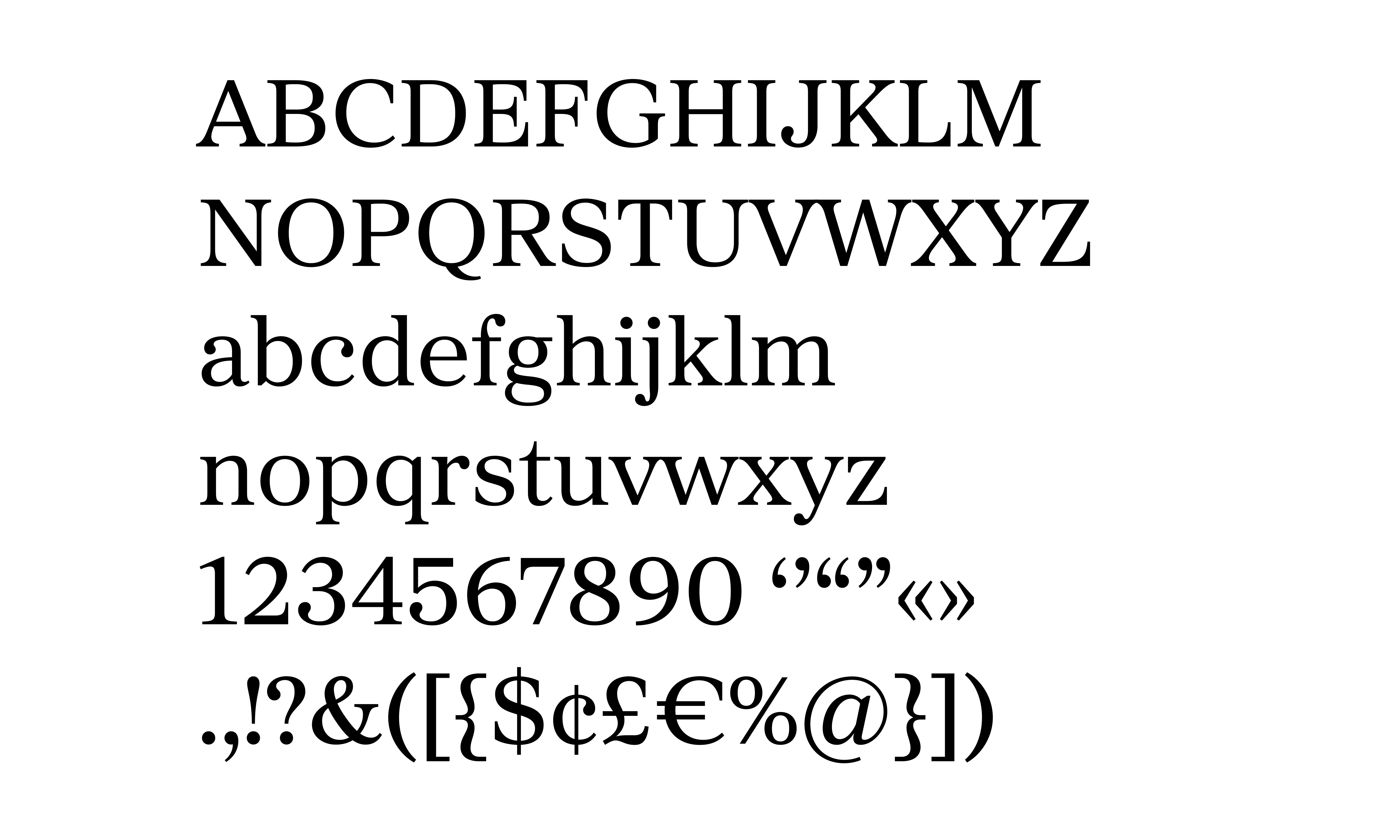
The complete character set contains 962 glyphs and supports most Latin-based languages, including Western and Eastern European languages and Vietnamese. It doesn’t yet support Greek or Cyrillic, but I expect to add those later on.

Here you can see the complete family so far—18 styles from Thin to Black Italic.
At some point, I will also add Condensed and Extra Condensed to match Proxima Nova.And I also plan to do optical sizes, for instance a display version with more refined features. And of course a variable version at some point seems inevitable.
The new family is called Proxima Sera.
So now I finally have a good answer to the question, “what serif font works best with Proxima Nova?” But, hey. Just because it’s meant to be used with Proxima Nova doesn’t mean you have to use it with Proxima Nova. Surprise me.
Get Proxima Sera from the ILT store.