


David Ricardo (1772–1823) was a versatile man. A stock trader, politician and, most importantly, an economist. He is considered the first of the classical economists, thus symbolizing the transition from mercantilism to capitalism. While his theories are mostly derived from mathematical abstractions, he communicated his ideas in understandable, down-to-earth language. Besides a versatile man, Ricardo is also a versatile typeface that bridges the gap between geometrical and humanist typeface design.

In broad terms, geometric typefaces express a certain conceptual clarity, a set of a few simple rules that seem to govern everything. In reality, even geometric typefaces deviate from strict geometry all the time, to account for small optical illusions in the way we perceive the shapes of letters. So, geometric typefaces may not be bound by true geometry, but they are bound by visual geometry. This kind of geometry, though very popular in today’s world, also creates limitations to the freedom of the designer, and generally results in suboptimal legibility. Humanist designs, on the other hand, find their origins in broad-nib pen calligraphy and Roman inscriptions. This reduces the visual simplicity, but provides opportunity to increase legibility, because both the pen and the chisel are flexible tools. Counters are given room to breathe, joints are made as thin as possible, and moderate contrast helps to guide the eye along the line. Ricardo is an attempt to combine the best of both worlds: the conceptual clarity of a geometric design, with the more airy character and legibility of a humanist design.

Design features
The most obvious humanist aspect of Ricardo’s design is its vertically cut terminals and open counters in letters such as a, c, and e. Cutting the curves vertically makes it easier to keep the counters wide open, and prevents the whitespace from clogging. While the terminals all appear to be of the same thickness, this is not the case. The influence of the broad-nib pen means that the top terminal of the c, for example, needs to be thicker than the bottom. Secondly, monolinearity (a constant thickness of strokes all around) is sacrificed for a more crisp appearance. Strongly thinned joints between bowls and stems, and thin strokes in the middle of the a and e create more whitespace in places that are otherwise very dense with ink or pixels. Thirdly, capitals are kept fairly small, which allows for easy distinction between the lowercase l and the uppercase I, and ensures that abbreviations in capital letters don’t stand out too much from the rest of the text. These humanist additions to an essentially geometric skeleton not only help to shape Ricardo’s friendly character, but also make it very suitable for use at text-size, in both printed materials and on screens (websites/applications).

When used in larger sizes, Ricardo’s idiosyncrasies come into play. The diagonal terminals on horizontal strokes such as in the f, z, T, and E are a hint to the broad-nib pen, infusing some warmth into an otherwise fairly rigid texture. The terminals in the j, comma, ampersand, and parentheses happily divert from the vertical expectation, and instead follow the angle of the curve. The currency symbols, which are usually very compact due to their complexity, are kept airy by simplifying their shapes, and in some cases opening up the area between the horizontal bars, creating a stencil-like effect. These slightly unusual characteristics become most pronounced in the heavier weights.

Family structure
The Ricardo family exists of three subfamilies: Ricardo, Ricardo ALT, and Ricardo ITA. The ‘normal’ Ricardo contains the most conventional forms, and is the most suitable option for long-form text. Ricardo ALT, which is also accessible through Stylistic Set 2 of Ricardo, has a slightly more geometric flavour, as the a, j, u, and t have been replaced by simplified forms. It can also be used in small text, but is probably most useful at larger sizes. Of course, both Ricardo and Ricardo ALT also come with matching italics. A third, more cursive set of italics can be found in Ricardo ITA. For all of these sub-families, be it upright or italic, there are also stylistic alternates for the A, M, N, V, W, v, w, and y which are accessible through the OpenType panel in opentype-savvy applications. These alternates switch the blunt apexes (where two diagonals meet) for sharper ones. Other OpenType goodness includes: (discretionary) ligatures, smallcaps, case-sensitive forms, fractions, nine sets of numerals, and more.

Ricardo contains seven carefully chosen weights. The ExtraLight and ExtraBold can give some extra elegance or punch to your headlines and advertisements. The Medium weight is intended as a slightly darker alternative for the Regular weight. In recent years, type has become lighter and lighter, but some of us still like text to have a little more body, and for those people, among whom I count myself, I created the Medium. For fanatics on the lighter side of the spectrum, the Light may be used for long-form text, and the SemiBold can then function to highlight.

Italics
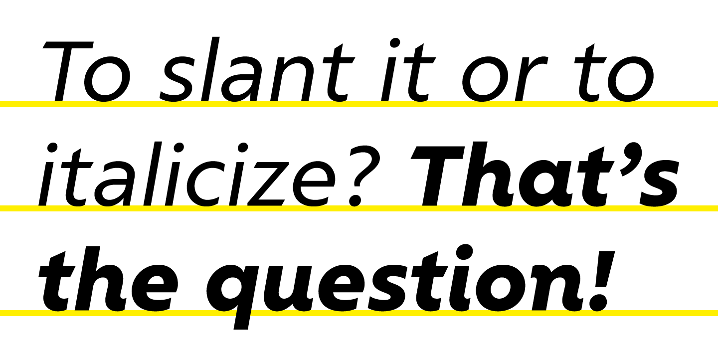
To provide significant typographic flexibility, Ricardo has not one but two sets of italics. The ‘normal’ italics (in Ricardo and Ricardo ALT) were created by first slanting the upright glyphs 10 degrees, and then painstakingly adjusting each glyph by hand. Some curved areas were even completely redrawn from scratch. Such measures may seem extreme, but are necessary to retain the geometric feel, keep the stroke modulation the same as in the Roman styles, and ensure a constant visual slant. A second set of italics, which can be found in the Ricardo ITA subfamily, is of a more eccentric nature. The R, K, and almost all lowercase letters were given tails. The a became single-story, the f borrowed a descending tail from the j, and some letters, like the v and x were completely redrawn. Together, these changes give Ricardo ITA a more cursive kind of feel, which not only looks nice, but also helps italicized words to stand out more strongly within a piece of text, or in an advertisement. It is in these funky italics that the influence of humanist design features is most pronounced. Cursive elements from the humanist realm, and consistent simplicity from the geometric side.
Marketing
A few years ago, I started a discussion on typophile.com about the emerging phenomenon of typefamilies that are discounted by eighty, or sometimes even ninety percent when they are released. I did not like this, and to be honest I still don’t like it. It seems to me to be a cause and a symptom of an overall devaluation of typefaces, and an increasingly short-lived significance of new releases. However, Bureau Roffa is only a small one-man foundry that needs exposure and revenue from its resellers to exist. To be able to find a spot among competitors, I saw myself forced to discount Ricardo by a whopping 75%, which is the most my heart can bare at the moment. I hope that this will not cause you, dear reader, to lose respect for my work and the work of other typedesigners. Many of us still put great care, a lot of time, and attention to the smallest of details into our work. In an attempt to establish my hopes on this matter, I have written this article, and created a small clip that functions as a sort of trailer to Ricardo and gives some insight into what it can do, and how it was made.