The library of the Gutenberg Museum
By Dan Reynolds
I. Introduction
Large or small, letters seem to inhabit their own universe. Re-arrangeable in any combination, they can spell out all conceivable messages, be they poetic, bureaucratic, or anything in between. But sometimes a text is just about its letters themselves, not an object to be read, but one to be looked at. Type specimens have taken various forms over the centuries, from posters to postcards and from primers to pamphlets. In fact, this web ‘page’ that you are reading now is also a type specimen, at least of some sort. In our digital age, creating type specimens has become easier than ever before. But what did our predecessors do 100 years ago, or even 500 years ago?

II. Mainz
Figure 1: Oversize type specimen from Johann Erasmus Luther’s typefoundry, the Luther’sche Schriftgießerei. Printed in Frankfurt, Germany, 1678. Original size: 43 cm by 28.5 cm. See figure three below for larger detail.
For hundreds of years, this small German city along the Rhine has been known for Johannes Gutenberg and his invention — printing with movable metal type. Almost any graphic designer who has passed through Mainz has stopped at the Gutenberg Museum. Next to the city’s landmark Romanesque cathedral, the Gutenberg Museum presents the history of Western (and some Eastern) printing. Several incunabula books are on display — including three Gutenberg Bibles — as well as printing presses and bits of city paraphernalia.
Figure 2: 1785–1786 specimen from William Caslon’s foundry in Great Britain (dimensions not recorded by the author). In addition to their famous serif typefaces, the Caslons cut seminal a blackletter type called Caslon Black. This forms a large part of the base of what we refer to as “Old English”-style fonts today. Click image for larger view.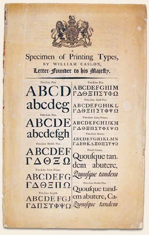
Lesser known is the museum’s small library, which is open to the public. Aside from trade and academic titles on printing and typographic history, the library has a large collection of type specimens from the 17th through 20th centuries. These were largely collected by Gustav Mori (1872–1950) during the first half of the 20th century, especially the large, one-sheet specimen from German type foundries.
III. Type Specimen
Mori may be most known for his work collecting type specimen from Frankfurt am Main. Just 40 kilometers east of Mainz, Frankfurt has played an important role in the book trade for almost 500 years. Over several decades, Mori was an employee at the D. Stempel AG type foundry, one of several large type foundries in Frankfurt at the time. Frankfurt’s University Library also includes a Mori collection of type specimen. [1] Mori published several works during his lifetime, but one of his most significant volumes was published posthumously in 1955: a folio book reproducing his collection of type specimen from Frankfurt-based founders from the 16th through 18th centuries. [2]
Today, type foundries tend to design and produce folded or bound catalogs to show off their typefaces. Increasingly, they post their designs online thus minimizing print advertising costs. Centuries earlier, many type specimens tended to take another form: large, over-sized single sheets, on which a type founder would display paragraph settings of each of his types at their various sizes — almost like a poster. The Gutenberg Museum library’s oldest specimens all take this form.
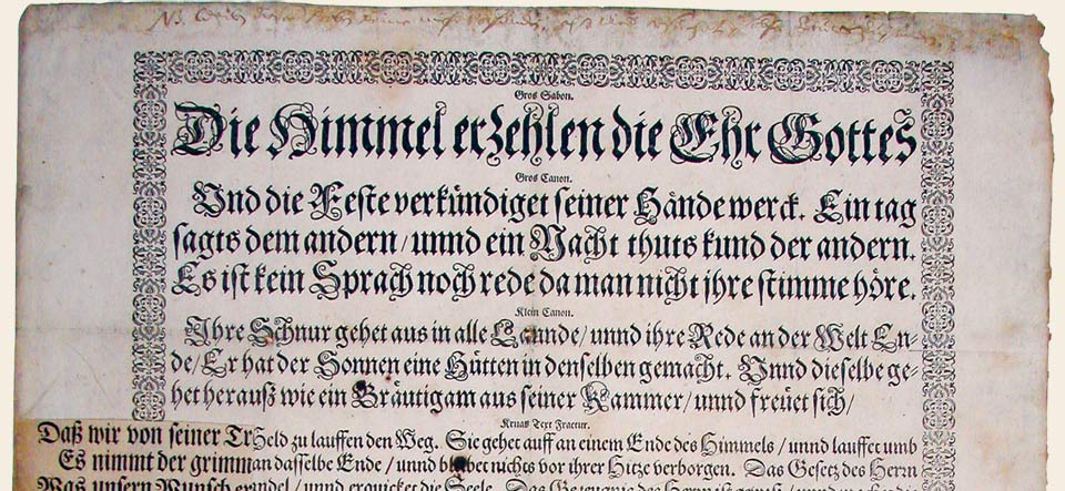
Figure 3: Detail from Johann Erasmus Luther’s 1678 specimen. (see fig. 1 above).
The Gutenberg Museum library’s specimen collection is broad, drawing on holdings from all over Europe. Traditional serif typefaces (called Antiqua type in German) are to be found in abundance, as are Greek, Hebrew, Arabic, Syriac, Armenian, and of course, blackletter typefaces. The first type sorts cast in lead — that were, in all likelihood, cast in Mainz — were blackletter designs. Blackletter remained immensely popular in Germany through the 20th century; even as late as 1900, perhaps half of all printed items there were still set in it. Only since the beginning of the post-war era has blackletter disappeared from the German mainstream media environment.

IV. Blackletter Classification
Figure 4: The basic blackletter styles—Textura, Rotunda, Bastarda, Fraktur, and “Experimental.” While many contemporary designs fall under the lattermost category, classical revivals are still being undertaken across the blackletter spectrum. Understanding classification schemes can be the key to choosing the right typeface. For example, a German Fraktur would be a poor choice for an English Pub, while almost any style could look right on a certificate, depending on its overall design. Old English, & Gotisch designs are further evolutions of the Textura idea. Gotisch (gothic) alone has several styles… from the Romanticist Fette Gotisch (pictured) to the so-called “jackboot grotesques” of the 1930s (not pictured). Schwabacher is a style of Bastarda that has been traditionally used in Germany. Indeed, Fraktur itself could even be classified as another Bastarda, but I have given it its own category, because it became the most-widely used blackletter text style in German typography. Evolving out of late medieval and early renaissance handwriting, the various blackletter styles also influenced each other over time. Another Bastarda gené, Civilité, was common in late 16th century printing in France & the Low Countries—not areas one would call “German.”
What styles of blackletter (“broken types,” or gebrochene Schriften, in German) types can one find in this specimen collection? Mostly Fraktur and Schwabacher typefaces. Although the first books produced in Mainz were set in Textura types, Schwabacher (c. 1480) and Fraktur styles (c. 1517) would come to dominate the German trade during the 16th century. The best Textura specimen in the Gutenberg Museum Library’s collection comes not from Germany, but from Great Britain: an Old English face in an 18th century catalog from William Caslon’s foundry (see figure two above). [3]
Rotunda types — the second oldest blackletter style — never really caught on as a book type in German-speaking lands, although 20th century calligraphers, as well as arts and crafts designers, have used it quite well for display purposes. However, these rounder styles were popular during the Renaissance in Italy, Southern France, and Spain.
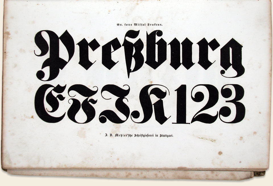
Figure 5: An 1840 specimen of a Fette Fraktur display weight from the J.B. Metzler’schen Schrift-Schneiderei of Stuttgart, Germany. The digital “Fette Fraktur” is one of today’s best selling blackletter fonts. As can be seen here, it was a mainstay of 19th century German foundries too (book dimensions not recorded by the author).
V. Digital Blackletter Fonts
Most remarkable is that many of the typefaces used in these blackletter specimens are available again to designers and publishers in digital format. For instance, Caslon’s above-mentioned blackletter design is sold today under the name Old English. Type from famous 17th century Frankfurt type founder, Johann Erasmus Luther, served as the basis for Linotype Luthersche Fraktur. Wittenberger Fraktur is based on Frakturs used in Wittenberg during the 17th and 18th centuries. Fette Gotisch and Fette Fraktur are both direct interpretations of big display types that were popular all over Germany during the 19th century.
Figure 6: Specimen of a Fette Gotisch weight from J.B. Metzler’schen Schrift-Schneiderei, Stuttgart, Germany, 1840 (book dimensions not recorded by the author).
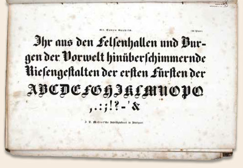

Figure 7: Fette Gotisch
What use are these old specimens to contemporary designers? The first lesson that old specimens can teach us doesn’t apply to blackletter designers alone: historically, punchcutters and typeface designers designed type in optical sizes. Before the age of scalable photo- and digital-typesetting, type could only be set in a range of sizes that were available as cast lead (or carved wooden) letters. Founders would produce each size individually. A six-point letter looked very different from a 24-point one. These days, designers tend to use one font for every size — from caption to headline. The result? Headlines that are often too heavy and too loosely spaced, and fine print that is too light and too tight.
Secondly, old specimens are beautiful pieces of history, and can act as springboards for the design of new blackletter types. For over two decades, blackletter has undergone a huge revival among designers — particularly in North America. Other than may be the case in Central Europe, one might even argue that its popularity in North America never really subsided. The digital revolution made blackletter democratic: now everyone can use new blackletter fonts, or even design their own.
VI. How is blackletter used today?

Figure 8: The New York Times Building
Mostly for display text. Fonts like Fette Fraktur are used for old-fashioned headlines and beer advertising. Wilhelm Klingspor Gotisch adorns many a wine label. Linotext and Old English are popular choices for certificates. Any of the above can be found the world over in tattoos. Pop culture is more enthralled with blackletter than ever before, examples range from newspaper mastheads (like The New York Times) to heavy metal band logos (à la Motörhead) and sneaker advertising (look no further than Reebok’s ca. 2006 global “I am” campaign).
VII. About the Gutenberg Museum
 Figure 9: Image from Reebok’s 2006 global ‘I am what I am’ campaign.
Centrally located in Mainz’s historic inner-city, the Gutenberg Museum is a must see for any type, book, or printing fan. The museum was founded in 1900 to coincide with a city-wide celebration of the 500th anniversary of Johannes Gutenberg’s birth, and is dedicated both to him and to his invention. The museum is open daily, closed only on Mondays and holidays.
Besides rotating exhibitions, some of which are very typographic in nature, the museum displays an enviable permanent collection. Books, typesetting machines, and printing presses can be seen side by side. A working print shop, called the Druckladen, is even on hand too. Inside, visitors may still set type and letterpress print by hand, a favorite for school children and book artists alike. The museum also has an excellent bookstore, which sells reproductions of pages from the Gutenberg Bible, plus the latest typographic titles from German design publishers.

Notes
1. Here, I am referring to the Mori Collection in the rare book department of the Universitätsbibliothek Johann Christian Senckenberg, Frankfurt am Main. One of the most significant items in this collection is the so-called “Engellhoff-Berner specimen,” an oversized sheet of types brought to Frankfurt from France by Jacques Sabon. This includes samples of cut by Claude Garamond and Robert Granjon. A full-sized facsimile of this specimen is published in the book mentioned in note number 2.
2. Diel, Robert & Mori, Gustav, Frankfurter Schriftproben aus dem 16. bis 18. Jahrhundert: eine Entwicklung in ausgewählten Beispielen. Gesammelt on Gustav Mori mit eider Einleitung on Dr. Robert Diel. Frankfurt am Main: Schriftgießerei D. Stempel AG (1955).
3. In 2008, Max Bollwage wrote a short history of Blackletter types for another issue for Linotype. See Bollwage, Max, “Where do Old English typefaces come from?” Linotype Matrix, volume 4, number 3 (Winter 2008). Pages 2–5.
About this article
An earlier version of this article originally appeared in Linotype Matrix, volume 4, number 2 (Spring 2006). Pages 16–23. I am grateful to Prof. Indra Kupferschmid, for her assistance in the revision of the classification scheme shown in Figure 4.
About the author
Dan Reynolds was born in Baltimore, Maryland. Before moving to Europe, he received a BFA in graphic design at the Rhode Island School of Design (RISD). Reynolds studied at the HfG Offenbach for a few years before receiving an MA in typeface design from the University of Read- ing (U.K.). Today, he lives in Berlin, Germany, where he works for Linotype GmbH and teaches typeface design at the Hochschule Darmstadt. His most recent typeface, Malabar, received a Certificate of Excellence in Type Design from the New York Type Directors Club, a silver medal at the ED-Awards 2009, and a gold medal from the 2010 Design Award of the Federal Republic of Germany competition. Dan blogs from time to time at www.typeoff.de.