


The process of drawing Vinter fonts began almost six years ago. The initial spark originated from one of the many magazines I regularly purchase for inspiration in my work as a graphic designer. Its headlines were set in an extremely thin sans serif, employing the thick–thin contrast commonly found in antiqua designs.

The serifless roman is not a new invention. Much like one can imagine William Caslon chopping serifs off billboard poster slabs to arrive at his Two Lines English Egyptian (sans as well as slab serif faces were both marketed as “Egyptians” at that time),1 a modified Bodoni might similarly have provided the starting point for a stressed sans.
The earliest example of a stressed sans serif typeface I’ve found is William P. Quentell’s self-named roman of 1895, cut by Nicholas J. Werner for Central TF/ATF St. Louis. The design was adapted for the Boston Globe newspaper under the name Taylor Gothic in 1897, and later refined as Globe Gothic. In close succession, ATF published Florentine in 1886 (based on a Binner Engraving Company hand-lettered face from 1984) and Inland Type Foundry released Studley2 (1887).

above: One of the first modulated sans serifs is William P. Quentell’s self-named roman, published in 1895.
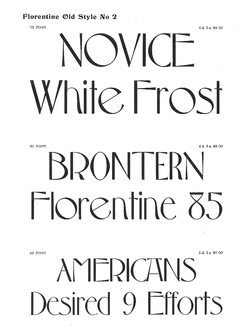
below: Although his involvement in the design is contested, the patents to Florentine credits the Danish designer, artist and architect Ludvig Sandöe Ipsen. The nature-like fluidity of Florentine’s curves is a hallmark of the Art Noveau style, but bolder weights show considerably more restraint. The “Florentine sans serif”, of which it lends it’s name – an inscriptional letter found on the ledger tombs in the floor of Basilica of Santa Croce in Florence – also proved an important influence to Hermann Zapf’s later successful serifless roman, Optima.
Fascinated by the lively expression of the serifless roman, I also noticed an untapped potential. While type designers in search of a sans serif letterform suitable for running text have been exploring the genre with some success, contemporary contrasted display faces are mostly nostalgic endeavors with little innovation happening below the surface.
With Vinter, I imagined what such a typeface might have looked like if the Modernists didn’t discard contrasted letters. By all means a display typeface, Vinter applies the strict geometrical logic of Modernism to modulated letterforms. This marriage of two seemingly polar opposites weaves text blocks with an unusual staccato rhythm, growing in tension as the weight increases. The contrasting opened and closed apertures terminate where necessary to paint the desired shape. Rather than adhering to a physical tool or any particular historical model, the shapes are limited only by the imagination of the designer.

Conventionally drawn cursives often borrow detailing from handwriting, slanted with the reading direction and sometimes making use of exit and entry strokes to convey the speed with which they were written. Most Modernist types reject such calligraphic traits. Instead they rely on slant angle alone to differentiate italics from their upright romans, occasionally employing single-storey variants of complex letters like the lower case ‘a’ and ‘g’.
As work commenced on Vinter’s italics, I came to a strange realization. The typefaces I considered “geometric” were in fact far from it. Their key signature shape was lost in the italics – the circles replaced by ovals.
What if the radical dogma of the Modernist designer had also been extended to the italic styles? Those “derivations” would likely be replaced by more ideologically pure companions. The notion of pure slant could be discarded in favor of a newly drawn style, mirroring the radical geometric construction of the roman.
In search of another solution, I stumbled upon a strange historical sidetrack: the rotalic. Instead of a rightward slant, the letters are rotated clockwise. The repertoire of the rotalic is severely limited and most contemporary applications use them for expressive effect. I wanted to create something more useful and subtle. Yet it sparked an idea I couldn’t quite shake. Rotation could help retain the rigidity of the design idiom. With a combination of slant and rotation, Vinter’s geometric cursive marks a definite break with established conventions.

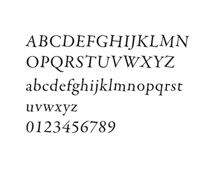
The family sports an extensive character set. With a combination of separate diacritical marks and pre-composed accented characters, Vinter supports more than 260 written languages and romanization systems. It also takes into consideration special localized conventions like the Dutch j with acute and Navajo accented nasal i.
The thinnest weight of Vinter was released in late 2012, earning a Certificate of Excellence in Type Design from the Type Directors Club. Commissioned by the Royal Drawing School in London in 2014, a custom variant was developed together with Sindre Bremnes. This version was subsequently used as a springboard for expanding the family to a more versatile set of tools, encompassing five weights with matching italics. In the process, the original spacing and drawing was revised.
Six years later, I’m more experienced, more confident – yet the initial idea for Vinter still excites me. Vinter poses a bold challenge, not only to type designers, but also to the graphic designers who will eventually put it to use and in doing so give it context. Developing the extended family allowed me to refine and clarify my intentions: Dogmatic adherence to the guiding form principle – when need be, at odds with conventions and tradition.
Whenever someone hears what I do for a living, invariably, they all ask me, “So, what is your favorite font?” I always tell them the same thing, “It’s the one I’m trying to make.”▣
1 Alessio, Joseph: Making Sense of Type Classification in Smashing Magazine.
2 In his book, American Metal Typefaces of the Twentieth Century, Mac McGrew questions the originality of Studley, finding it uncomfortably close to Quentell/Taylor Gothic/Globe Gothic. Source: Type Heritage.
3 Stephen Coles answering the question “Why are there hardly any sans serif typefaces with a high contrast in stroke weight?” at Quora.
4 There exists a lesser known text geared spin-off of Cassandre’s Peignot called Touraine. It has more traditional forms for the capital-like lowercase characters, namely ‘aeghmnrstu’, provided by Guillermo Mendoza y Almeida. Motivated by the success of Chambord (1945) by the competing Fonderie Olive. The name alludes to it as well (Chambord is a famous castle close to the Touraine region). Source: Fonts in Use. It is interesting to view Peignot’s unicase letterforms in light of the experimental Modernist letterforms in Herbert Bayer’s Universal typeface (1925).
5 Note also José Mendoza’s Pascal.