There are the many ways with which to understand letterforms. There are schools of thought that focus on the impact of punchcutting and metal type on the outlines of letterforms, or on the historical period in which a style of typeface first emerged.
Another way to look at type is to analyse the structures upon which letterforms are built and the tools which traced that structure. If the letterform is the body, then the structure is the skeleton upon which it is built. The thicks and thins created by the movement of the tool, the way that tool is cut, and the angle with which it is held, create the mass around that skeleton.
This latter view is what informs the CEDARS™ system of type descriptors. The name is the acronym for Contrast, Energy, Details, Axis, Rhythm, and Structure. CEDARS+ is a set of type descriptors that can describe any typeface in any script based on its formal qualities. The order is arbitrary but for the sake of ease we’ll follow the same order in this article.
In CEDARS, Latin book faces are labeled high contrast because Latin type design is skewed towards the higher end of the spectrum.
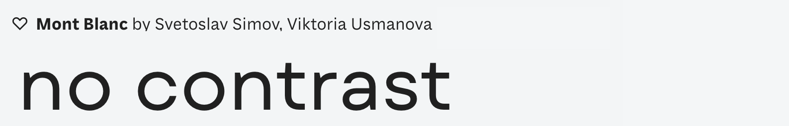
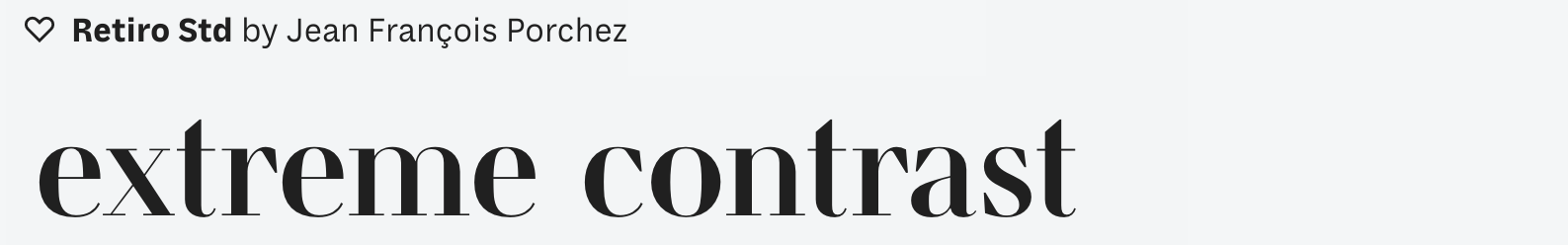
Contrast is the difference between the thickest and thinnest parts of a letter. This is a direct result of the writing tool and is a variable that type designers manipulate to striking effect. In current design trends, low contrast is seen as contemporary while extreme contrast is popular for display type and fashion magazines. Book faces are typically medium or high contrast while reading on-screen requires less pronounced contrast.

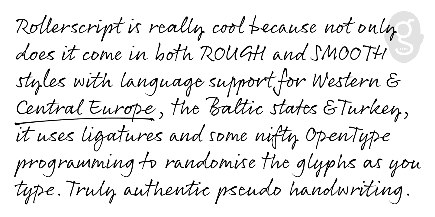
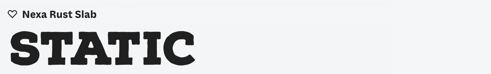
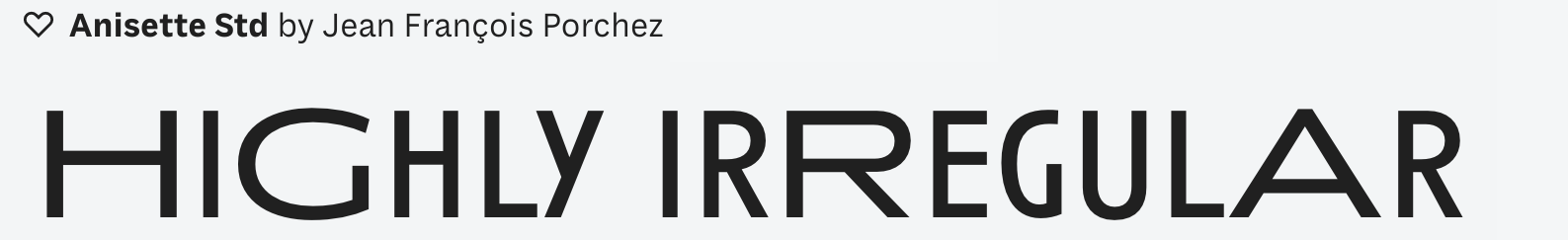
Energy level captures the speed of movement that created the letterform. Slow, deliberate movements create typefaces that have a static or calm energy level; while fast movements contribute to a lively appearance. In Latin, one can see this speed with the depth of the arches on the m, n, and h. The deeper the arches, the faster the movement — and the more energetic the typeface looks.


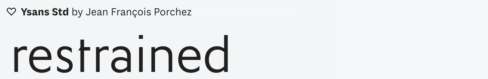
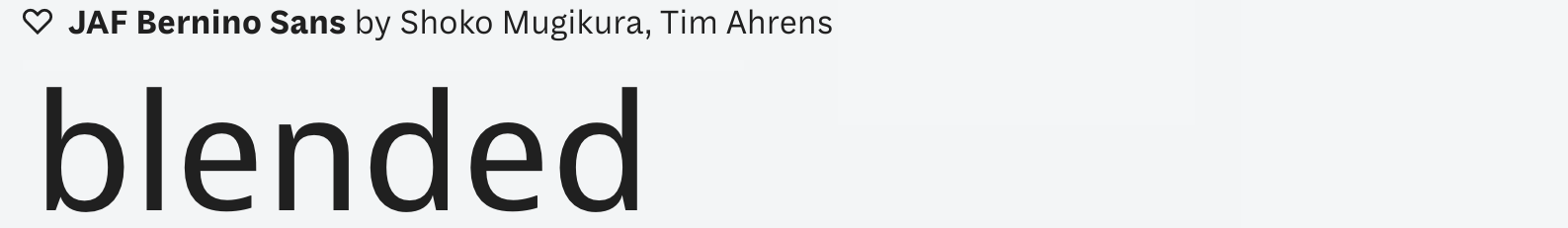
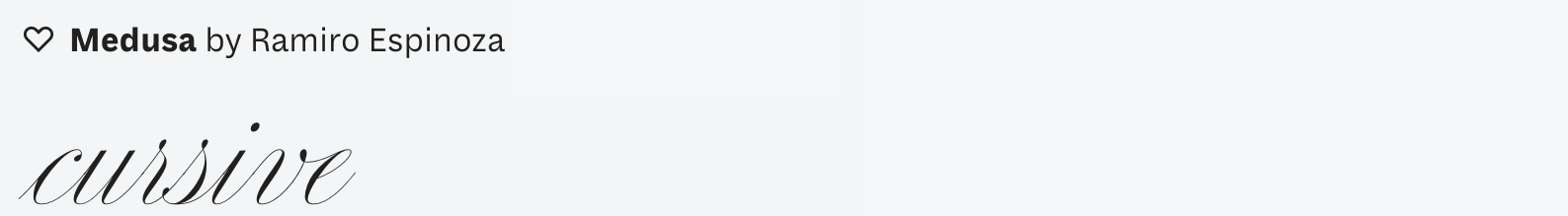
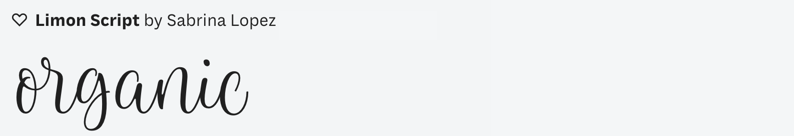
Details in type design are quite important! These include the way rounded arches meet stems and the nature of that transition. Do they blend in with one continuous stroke, or is there an abrupt corner at their intersection? Finials (or finishing strokes) are also interesting to track. Do you want an l that is restrained (as in, it doesn’t curl out at the end) or flourished? Such details affect the friendliness of the design. Do you want typeface that is inline or textured? Finally, the way the stem terminals finish (blunted edge, flared edge, etc.) can have a pronounced impact on the typeface. The most famous of these terminal styles is the serif. In CEDARS, serif terminals are listed as script specific as the serif is specific to Latin, Greek, and Cyrillic, but not to other scripts. More on that later!


Axis is a direct result of how the tool is held in the hand. Latin styles often have a vertical or near-vertical axis maintained across all letterforms. In Arabic Naskh, the axis changes even within the same letter as the calligrapher typically rotates the nib while writing.
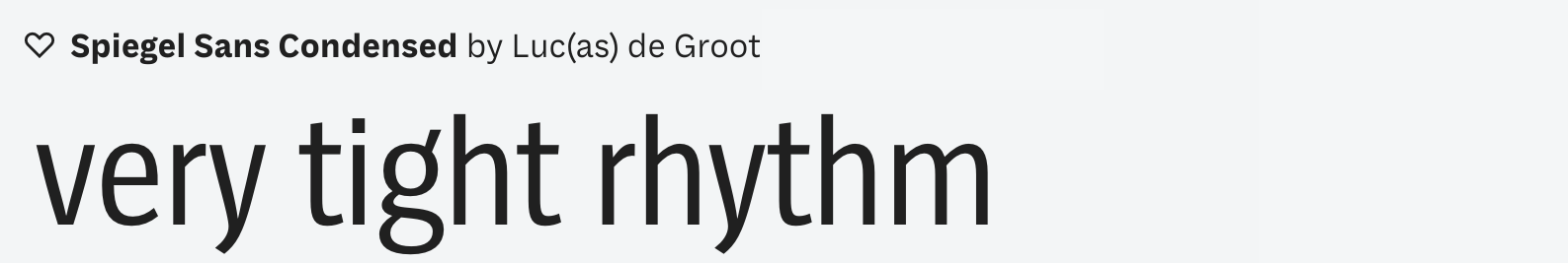
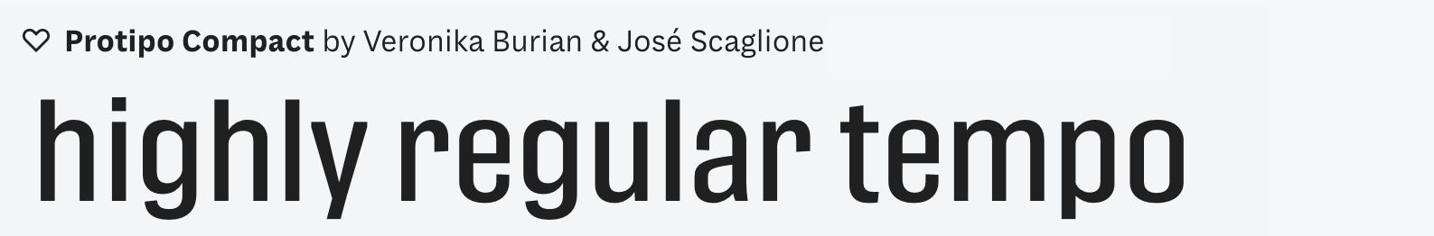
Rhythm is the beating march of letters coming together to make words. In Latin, the rhythm can be seen in the pattern of vertical stems repeating over and over. For example, the pattern can be tight, such as in condensed typefaces, where the stems are close to one another. A tight rhythm will often result in space savings as one can cram more words into a line, which is why, for example, most newspaper titles have tight rhythms.

‘Rhythm is the beating march of letters coming together to make words.’
Structure is the skeleton that the letterforms are built around. Draw a line in between the outlines of a letter and you’ll get the structure right there. Just like an x-ray will tell you if a mammal is human or ape, dog or cat, with all that that implies about the nature of that animal, so it is with letterform structures. They carry in their DNA the internal proportions of the typeface and other variables such as the rhythm, the details, and the energy level. They give insight into the mode of construction that a typeface follows.


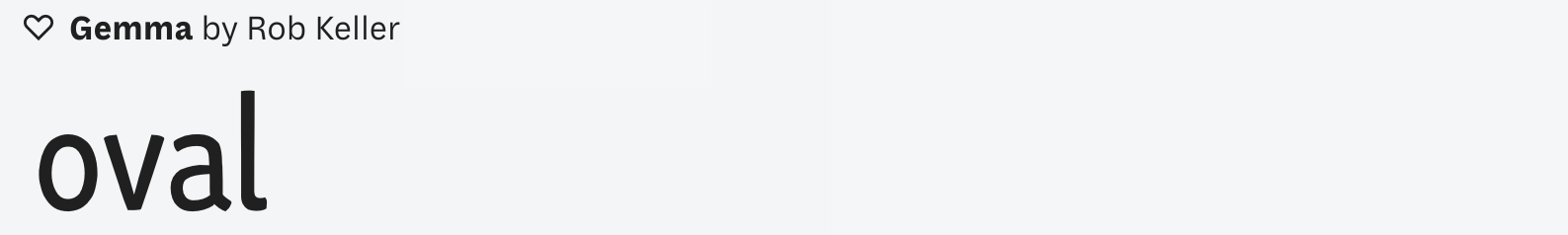
The loops subcategory describes the forms of closed or partially closed shapes that range from triangle through to rectangle. In Latin typefaces, loops typically range from oval to superellipse. The easiest way to identify the loop shape is to look at the top right arch of the letter n. Does it fall down quickly? If yes, then it’s oval. If it gets quite close to a circle, then then it can be considered circular. If it takes its time to fall down, then it is a superellipse. While this variable remains the hardest to identify with, changes to the structure of the loops has a massive impact on the design and is unsurpassed by any other variable. This is why it is the key to understanding typefaces, and to finding compatible designs across different writing systems.


Finally, there is that + sign. There are certain characteristics of typefaces that are script specific. Can we really talk about x-height in scripts such as Chinese that do not have that feature? Is it even right to force such terminology on scripts that might have a comparable structure of main body punctuated by ascenders and descenders such as in Arabic and Hebrew? The beauty of type design is the preponderance of variations in which letterforms can take shape, and thus we need a system to track such variety. Therefore, CEDARS appends the + for extensibility, to make room for additional descriptors for other scripts. The present iteration includes only Latin, but my hope is to keep expanding and celebrating the diversity and beauty that we see in typefaces across all writing systems. ◉
CEDARS+ is trademark of I Love Typography Ltd, which may or may not be registered in certain jurisdictions.