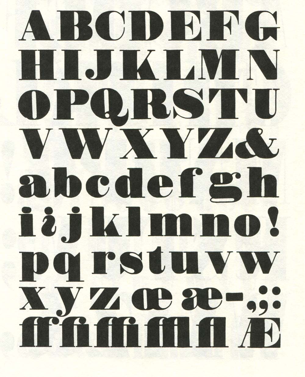
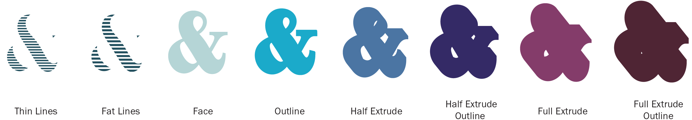
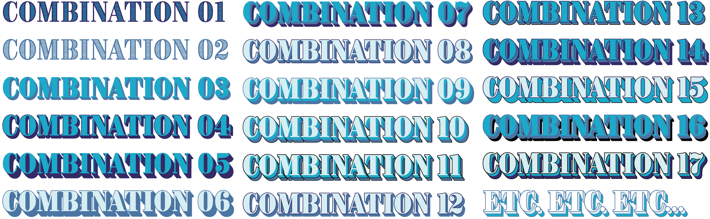
Brim Narrow is a chromatic typeface in eight type styles that are designed to stack together. Combining particular styles and assigning each a color produces a huge variety of visual effects.
While producing Brim, I met a number of technical challenges and discovered some fascinating quirks that are peculiar to chromatic type. Adhering to conventional methods for constructing its various styles would have left it compromised or possibly even discarded. However, an innovative solution saved it and saw it evolve into a more functional and thoroughly digital design.
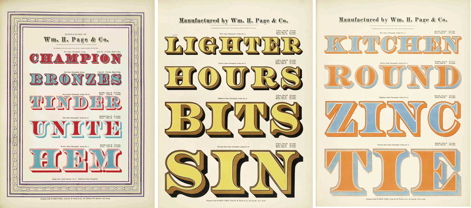
When each character in a typeface is multi-coloured or polychromatic, it is commonly referred to as chromatic, or layered type. Chromatic type became popular in the second half of the nineteenth century as improvements in printing technology permitted greater creative freedom. It was achieved by printing two or more corresponding type styles on top of one another in different colors. Areas were cut away from the individual styles so that their colors might abut each other or overlap to create a third color. Since this type was generally made for display use, it was frequently large and therefore typically made from wood.
Brim’s structure differs from that of traditional printing type in two significant ways. Firstly, all of its font styles are solid shapes, without cut-away areas. On a computer, light colors can be placed on top of dark colors allowing for more style combinations. Secondly, its extrude styles (also know as a shade) are allowed to overlap with that of the following character. This eliminates the need for looser spacing often associated with layered type.
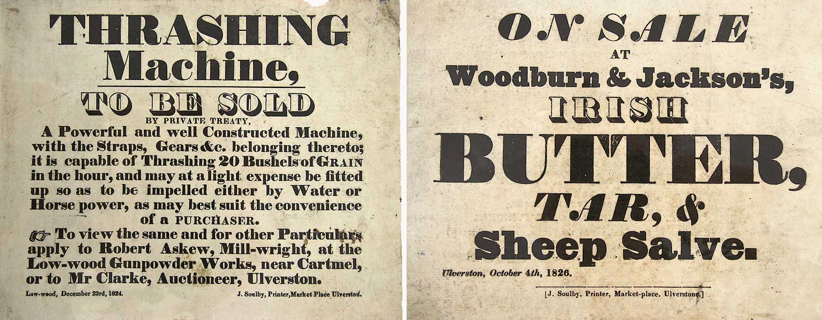
Although Brim’s layer architecture is a digital adaptation, its characters borrow their warm, tactile appearance from wood type from the first half of the 19th century. My references were various examples of fat face designs by London foundries of the time such as Fann Street (Thorne, Thorowgood), Figgins and Fry.
From the other side of the Atlantic, the American wood type shown in Rob Roy Kelly’s book, American Wood Type 1828-1900, was also an influence.
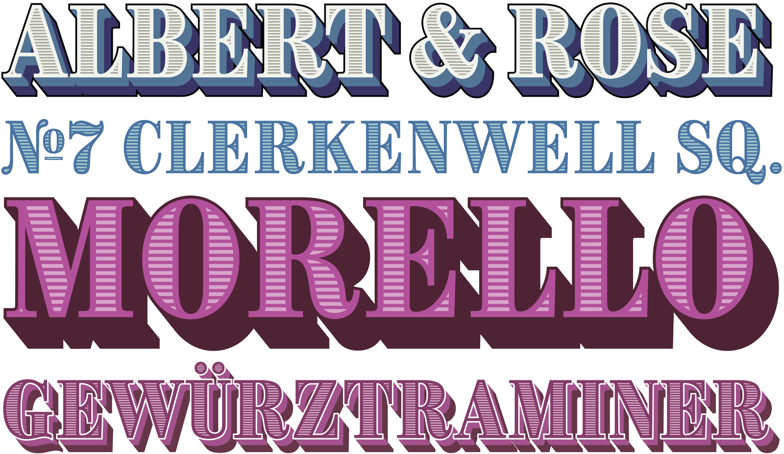
The typeface started out as a handful of letters forming a fictional logo that I’d designed as part of a self-initiated packaging project. The lettering was to compliment some very ornate Pouchée inspired Ampersands.

I’d drawn my original nine characters, ALBERT & ROSE, in Glyphs and then added decorative effects using Adobe Illustrator. Despite initially starting a wide version, I decided to focus on a narrow design, which was more versatile for longer headlines. Once the lettering was complete, I was compelled to explore how it might work as a complete typeface. Having the lettering to emulate was critical in making Brim, and it guided my steps throughout production. The key features were that the letters were tall and tightly spaced (in hindsight, perhaps too tightly). The serifs were bracketed slightly and the face had a deep extrude. This extrude was split into two colors (inspired by a double shadow I’d seen on the W. H. Page specimen, above) and its angle was steeper than the traditional 45°, to further emphasize the narrow design. I liked the way that the extruded areas overlapped each other, creating a solid platform from which the main face could jump out. Both the face and its extrude were outlined, which unified the whole stack.

I was determined that the font family would not only replicate the lettering effects but also produce the broadest variety of style combinations with the least number of font styles. I wanted the family to be easy to comprehend and simple to use. I’d read somewhere that the average number of things a brain can hold at once is seven1 so I aimed to come in under this “magic” number.
Recreating the various layer styles in Glyphs was reasonably straightforward,2 though it took some time. Transferring the shapes from Illustrator wasn’t a practical option as fonts require a higher lever of curve accuracy and coordinate precision. I also adjusted Brim’s proportions to produce various alignments and symmetry between the Face and each of its styles.
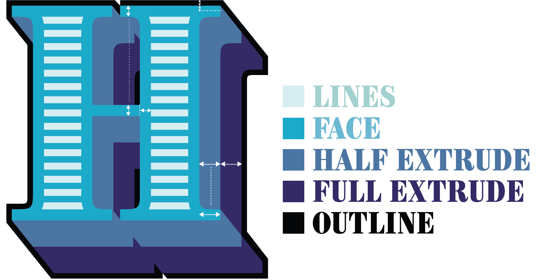
The widths of Brim’s thin strokes vary slightly for optical reasons, but they are all roughly equal to the depth of the serifs. The length of the serifs is double their depth and equal to the Half Extrude’s size (this relationship allows the Half Extrude to neatly align with the ends of the serifs). The Full Extrude’s depth is double that of the Half Extrude’s and the Outline size is half the depth of the serifs.
Creating the extrude shapes was straightforward enough, though labor intensive. FontLab Studio has a 3D extrusion tool that would have sped this up, but I made them by hand. Various adjustments were required to ensure their uniformity, but nothing like the amount needed for the decorative lines. Originally, these were produced roughly in Illustrator by masking a block of horizontal lines with a path that was offset from the Face. Often, this clipped lines at the top and bottom of characters making them thinner, or it resulted in awkward shapes that required simplification (see figure 1). In the end almost all of the inner contours were redrawn, especially those of smaller glyphs like the punctuation and accents. The lines were then distributed evenly within each area, with occasional refinement to the depth of the lines.

The Outlines proved to be the trickiest to create and were eventually the catalyst for Brim’s radical restructure. Ensuring that the layers were as modular as possible I envisaged the following combinations, with or without decorative lines:

In my lettering, the outlines were simply strokes applied around the Face and the Extrudes in Illustrator. In Glyphs, this could be achieved by offsetting the path of each shape; however, this highlighted a complication: I would need to chamfer the right angle corners of the Face where they connected to the Extrudes, so that they would align.
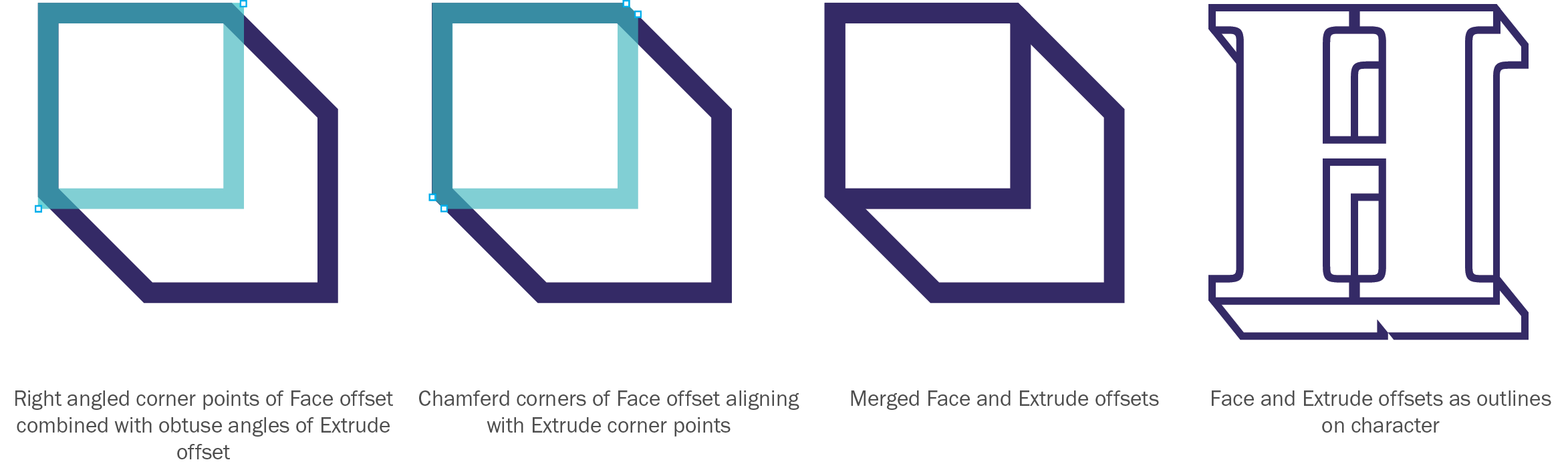
This is a laborious manual job and would mean that the overall shape of the Face’s outline would be compromised when used on its own. I came to the conclusion that if users wanted to apply an outline to the Face they would simply apply a stroke in Illustrator or InDesign and that there was no point duplicating these easy effects. Following this logic, I decided that if the Face Outline on its own was redundant, I could reduce the number of layers by creating one unified Outline style around both the Face and Extrude. This would also negate the need to manually chamfer the corners.
Once I was satisfied that I could produce all these styles in Glyphs, I began to expand on my initial nine glyphs. Keeping the adjusted proportions in mind, I drew the uppercase with European diacritical marks (accents), lining figures and some basic punctuation.3
I then sent a test font to three industry friends for feedback, together with screenshots of how I saw the layer styles behaving. Dave Foster, Toshi Omagari and Terrance Weinzierl, all highly awarded type designers, gave me invaluable feedback that steered the design of the characters and the diacritics. Terrance, who had previously won a Type Directors Club award for his chromatic typeface, Pizza Press, also gave helpful suggestions on the layer styles.

There was some division over whether or not I should create overlaps, like built-in trapping, between the layers. This traditional measure aims to ensure that no gaps appear between printed layers that abut each other. Toshi made the point that any overlap would be too large or too small in most situations and, to operate effectively, any overlap would need to be consistent with the size of the printed typeface. Secondly, it would be impossible to know which layer style the overlap should be on, as this would depend on the layer order and color value when printed. All of these possibilities are out of the type designer’s control; moreover, design software provides various methods of trapping. Therefore, I decided not to make any overlaps. Happily, because of Brim’s final overlapping structure, this issue became moot. However, at certain sizes, when light layers are stacked over dark layers, a faint outline can sometimes appear where edges abut. After much experimenting, I established that this is a screen rendering issue in certain applications, and that these ‘ghost lines’ don’t appear to print.
Once I’d finished refining my letterforms, I exported my font to make a few more layer tests in Illustrator and InDesign. It didn’t take long to figure that there was an error in my layer structure. When setting chromatic type in Adobe InDesign or Illustrator, each style of text is in a separate layer; you simply add some text, duplicate the layer and then change the font style and color in the overlapping layer. In Glyphs however, each individual character with all of its associated styles is grouped together. This means that each character’s group of styles overlaps the adjacent character’s group. On export the true behavior of the layer design was revealed: The unified Outline style, designed to go around the Face and neatly stack above the Extrude layers dissected the Extrudes of the following character.
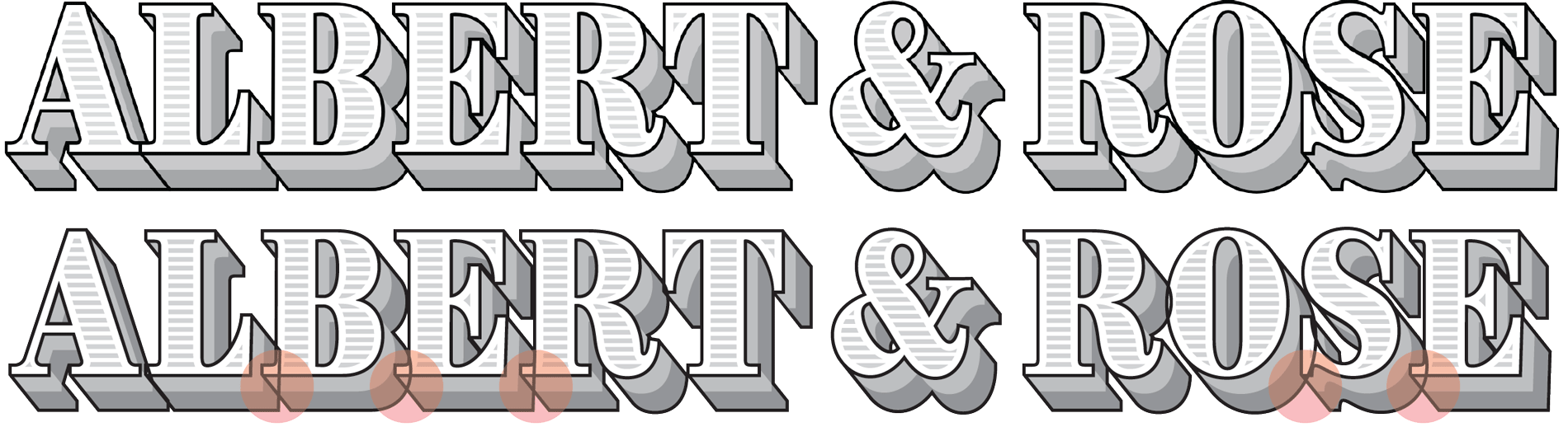
In hindsight, I should have realized this much sooner. However, I didn’t have a solution. I couldn’t simply move the unified Outline onto a lower layer because the Extrudes would mask the outline around the Face. Increasing the letter spacing so that the Extrudes were clear of each other would destroy the overall design. I also didn’t want to create a whole load of extra font layers for every conceivable combination. The goal was the least number of layers to achieve the largest variety of style combinations.
I reasoned that if I separated the outlines, then I’d need to chamfer the Face outline and its sole purpose would then be to interlock with an Extrude outline. This would be fine but it would create another layer and add to the complexity of the font family. In response to this I mused that if I merged the half- and full-extrudes with their own outlines, the unified version would do the job of two layers. I was onto something here. I then realized that dedicated outlines for the face and each extrude would allow for far more combinations than I had originally anticipated. This was the more modular structure I was striving for!
Instantly the new layer structure felt more logical; the Lines would sit on top of the Face and the Extrudes beneath it. It was then that I realized there was no point in subtracting the Face shape from its accompanying style. The result would be simpler shapes with fewer nodes, likely resulting in a smaller file size,4 which is significant if loading multiple font styles for a web page.
With the design fixed, I pushed ahead with the production process. There were still a few quirks awaiting me: I found several visual anomalies while chamfering the Face outline, which were fixed by eye rather than trigonometry, but most interesting was the special d.
As you’d expect, for each layer to stack precisely on top of another, certain numerical values must correlate across all styles. The horizontal values were logical. Glyphs automatically adjusted the right side-bearing of each character’s styles to keep each layer’s spacing value consistent. However, the vertical values were less logical. A guide on the Glyphs website revealed a little known peculiarity in the way that Adobe Illustrator vertically aligns text used in text boxes. In short, Illustrator tries to be smart about finding a vertical measurement to position the first baseline in your text box. Surprisingly, it measures the lowercase d, and uses its ascender height as an offset for the first line. Basically, it means that if the height of the lowercase d isn’t the same across all styles, then Illustrator will position them at different heights, causing misalignment of styles and much confusion and frustration to the typographer. Other than educating users about this anomaly, a solution is to add a tiny, one unit dot5 (an alignment marker) to the highest position matched on all layers of the lowercase d. Then, when Illustrator measures them it will find them the same height and position them accordingly. So, although Brim is an uppercase only typeface, the lowercase letters all reference their uppercase equivalents with the exception of the lowercase d, which has a virtually invisible alignment marker on some of its layers.
The final version of Brim evolved beyond my original expectations. They say that necessity is the mother of invention and this was certainly true in the production of this typeface. Having a clear vision, in the form of my lettering, to steer decisions by was essential and forced me to rethink the traditional methods of layer creation.
The shapes became simpler, more logical to use, and produce combinations that Illustrator effects can’t elegantly replicate. In throwing off the limitations of older technology, Brim firmly positions itself as a digital product tempered by the character of pre-Victorian type. Terrance Weinzierl described it as having a “quirky, antique feeling to it. Not too much, but enough to make it warm, casual. Like a proper British pub.”
Footnotes:
Test Brim Narrow on ILT.
[1] Millers Law: “The Magical Number Seven, Plus or Minus Two: Some Limits on Our Capacity for Processing Information.”
[2] Gylphs includes specific functionality for making chromatic fonts together with an excellent tutorial on the Glyphs website.
[3] The character set was expanded before release to be more comprehensive.
[4] In tests, the file size for the extrude layers was reduced by just over 20%.
[5] Brim was designed on a grid of 1000 UPM (Units per Em).