
An interview with Kunihiko Okano
By Taro Yumiba
How and when did you become interested in typography & type design?
At university I majored in graphic design. I used to leaf through typeface catalogs in search of letters to use in my poster design assignments. However, I could never find any typefaces that matched perfectly what I had in mind, so I began making my own. I was lucky enough to have access to a Macintosh and Fontographer 3.1 at the university lab. At that time the Macintosh wasn’t particularly popular, and few knew how to use them. I found it great fun making fonts from scratch. It took me some time to get used to drawing letters on the computer, but I can still vividly recall the excitement when my font first appeared on the screen. From that instant, I was hooked on designing type.

Quintet Family
When Matthew Carter won the Tokyo TDC award in 1993 for his typeface Sophia, I returned home with his workshop brochure. That gave me good insight into the profession of a type designer. Although I had the opportunity to see the work of Emigre and Neville Brody — two big names back then — and, since their work had a strong graphic element, I wasn’t actually conscious of them being type designers. I wanted to create something similar to the brochure, which was beautifully executed to resemble a specimen book. From the start, I was interested in type design with a strong design element. When I had my typeface examined by Mr. Carter during a ten-minute critique at TypeCon Seattle in 2007, I was so happy to be able to tell him that his brochure inspired me to get into type design. I still treasure that autographed brochure.

Left: Matthew Carter’s autographed brochure from the 1998 Tokyo workshop.
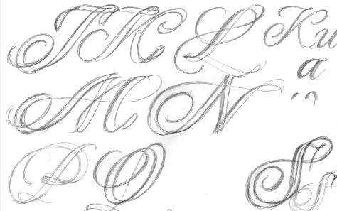
Right: Sketches based on TypeCooker recipes.
You recently completed the Typemedia course at the Royal Academy of Art in The Hague (KABK), Netherlands. What did you enjoy most about the course?
Perhaps I most enjoyed the TypeCooker experiments. The assignment was to draw letters from a randomly generated recipe TypeCooker recipe. I discovered many things by taking a pencil in my hand to draw the sketches. When I looked over the sketches of my classmates, they had unique approaches based on the very same recipe. There were many cool designs and it was very inspiring. Before I went to KABK, I self-studied letter-design, so it was particularly inspiring to see so many different kinds of designs from my classmates. And it made me realize how important it is to use your hands to sketch. I still perform these kinds of sketching exercises.
How did you start designing Quintet?
Quintet was part of my graduation project at KABK. Prior to designing Quintet, I was working on a typeface called Emotional. I thought it could be used for social networking by implementing emotional feelings in a font such as ‘happy’, ‘sad’, and ‘mad’. However, while I was sketching, I realized that this idea would not work in practice, since there is no common cultural concept for, say, ‘laugh’. Also, seeing how the teachers and students all reacted differently to the fonts, demonstrated that the implied meanings were ambiguous.

Left: Double-pencil technique.
Right: A rough sketch made at the Typeradio workshop.
While I was looking for different ideas, I thought it would be interesting to design a typeface that works even when the weight of the letters or even the numbers of layers is changed. When I designed the Latin component of the Japanese typeface, Hiragino UD, I drew it so that the width of the characters remained the same across all weights and styles. This time I wanted to create more developed letterforms. I went ahead with this idea once I had confirmed that these letterforms would be interesting with the addition of more layers. After looking at the script font designed at the Typeradio workshop, I discovered that it was possible to develop the weight without having to change the width of the letters, and without making the design awkward by adding all the weight to the inside of the strokes.

Left: Presentation made at the Typeradio workshop.
Right: Designs from the workshop.
Can you tell me about the Typeradio workshop?
At the ‘Typographic Chinese Whispers’ workshop, TypeMedia students were challenged to design letterforms as an interpretation of an excerpt of music or sound. The music was composed by students of the Hochschule der Bildenden Künste (HBR Saar) in Saarbrücken, Germany, who had earlier been assigned a typeface, and asked to interpret it as a one-minute piece of music or sound. Each student was allocated an anonymously labelled sound piece and their challenge was to create a typeface inspired by the sound. Our challenge was to reinterpret those sound clips as letterforms.
How did you draw the strokes?
In the beginning, I was sketching the font in double-strokes, but I realized that it was difficult to check the counter-balance and flow, so I first made a calligraphic font and, after checking the balance, I traced its outer line to form the strokes. On top of that, I wanted to add a little elegance to the strokes, so I slanted the letters to achieve better contrast. At this stage, I couldn’t make it exactly into the shape I wanted, so I made a couple of templates.

Left: The second stage designed after the workshop.
Right: Retouched from the unsatisfying second stage.
How did you convert ideas from the music?
I imagined a primitive sketch from the assigned music, while the stringed instrument was being played; I heard sounds of a line being drawn, paper being turned and a mouse being clicked, or sounds that could be associated with the history of the making and changing of the typeface. If I could convert the sketches into a digital font, I was convinced that I would be able to represent the process of letter-making. From there, I began sketching with two pencils, thus mimicking the contours of a flat brush.
I changed the style to a single stroke that better matched the flowing melody of the music. At the same time, I was excited to find that one discovery lead to another: while I was searching for a way to unfold a heavier weight, I realized that it was possible to keep the width of the letter even if the inner part, outlined with two lines, is bold. Being the inner part, it was possible to make a heavier weight by adding weight to either the left or right side as well as to make a new pattern — one with a hollow space in the middle by blending both sides. Fortunately, the activity enabled me to develop good ideas to make the most out of the shape.
How did the design change while you were searching for the shape?
I struggled to find a balance between a letter and its concept; the letters shouldn’t be made illegible by my insistence on drawing them in a single stroke. For example, I was not sure whether to draw the middle stem for the lowercase ‘m’ or the dot for ‘j’, so, for those letters, I gave up drawing them in a single stroke and retained them as ‘alternates.’ Initially, I wanted to make individual letters with an elegant flow but, in the end, I decided that the overall balance was more important so that it would work well as either a single- or multilayer typeface.

What made you design a layered script face?
I wasn’t thinking of making a layer font from the start. As I was sketching over and over again, I realized that I could easily turn it into a layer script face with a double stroke that created more variations in its weight without having to change the width of the letter. There are two types of font-users: those who use the font and those who read the font. Nowadays, anyone can make a greeting card design using a computer. Wouldn’t it be fun to be able to customize your font just like you can choose a gift and message? With Quintet, there are at least thirty different combinations and, if colors are added, the permutations permit almost infinitive possibilities. At this stage, only the left stroke is bold but you could also have the right stroke bold. Moreover, you could have it condensed. From the four master fonts, the variations can be expanded even further.

Above: Quintet Script combination chart.

Future family concept diagram.
What was the most challenging part in creating Quintet?
I incorporated many ideas into Quintet Script, but I didn’t want the design to look like a decorative font. In terms of design, I struggled to make an elegant, flowing line drawn as a continuous, single stroke. It was tricky to draw a double-stroke as a single stroke — it was like trying to solve a Wisdom Ring or Gordian Knot puzzle – and everyday I examined which connection method looked most beautiful. I once screamed with joy when I discovered the best solution while I was working in the middle of the night. I think I was able to come up with an interesting design solution, because I gave a lot of thought to a variety of ways to draw and connect the two strokes. Another key to my design, was to create a layer font that works both as a single- or multilayer design. I didn’t want to compose the layers as mere decoration — the individual layers had to function as letters too.
What were the difficulties in making the serif types to accompany the script face?
At the same time that I was creating the script face, I was working on a text typeface for package captions in short sentences and small sizes. The workload for a text typeface is heavier than that of a script face, but having the know-how from the interpolation and AFDKO, I calculated the time and got to work. I first designed an italic face, which is easy to draw along with the script face, and then gradually, I merged them with the Roman. The italic face was partly inspired by those I found beautiful at the Plantin-Moretus Museum.

Quintet Serif.
In what kind of media would you like your typeface to be used?
Of course it can be used well in print, but I designed the typeface with the screen in mind. It would be interesting if there was content where you could interactively customize the layer combinations. I insisted on the single stroke because I had in mind to move the font in a series of animations. It would be great fun if the letters were drawn in motion along to music, while at the same time the layers change color.
How would you like to use your typeface?
In addition to type design, I work on packaging design, so initially I would like to use it for package design. I would be able to create an in-depth design by adding gold or overlaying more embossed layers on top of a colored layer. Quintet is particularly suited to different and numerous color combinations; for example, tea and coffee packages need to have a coherent design while clearly identifying each flavor.
Are you planning to release the Quintet family and if so, when will it to be?
I have released the layer script component of Quintet through Photo-Lettering. I also have plans to release the entire Quintet family as OpenType fonts. There will be additional characters, and a new twist for the script face.

Kunihiko in Asakusabashi, Tokyo.
Interviewee: Kunihiko Okano graduated from Kyoto City University of Arts in 1995. He worked as a packaging designer for ten years; has worked on the Type Project since 2005, established Shotype Design in 2008, and studied at TypeMedia (KABK) 2010-2011.
Interviewer: Taro Yumiba is an interactive designer currently working at tha ltd. in Tokyo. After graduating from Rhode Island School of Design, he worked for several studios in San Francisco and New York. He also continues to explore graphic illustration and create typographic experiments.