Face to Face
An Interview With Stefan Hattenbach
Stefan Hattenbach started designing typefaces in 1996. In 2003, he established his own independent foundry and design studio, MAC Rhino Fonts (MRF). Proud A.S. Roma supporter and father of two, Stefan works his magic from a studio in the beautiful city of Stockholm.
What do you love about designing type?
Oh many things. One is the challenge of getting the details to work, but at the same time contribute to the overall style of the typeface.

Another pleasure is to see if your initial ideas will be suited for a final product. Sometimes the end result turns out just fine but not as you planned from the beginning. A third thing would be the fact that the same “basic pieces” are used over and over again, like notes in music, and yet the outcome can be so different.
Why do you design type?
Because I have to! It’s both a drug and a passion combined into a weird “relationship”. My passion for typography and the shapes of letters had been lurking for long time.
Then in 1996 I couldn’t hold it back any longer. Ever since, it’s grown stronger. The more I do it, the more involved I get. I have high expectations and am quite strict with myself, but overall it’s fun, fun and fun.
How do you feel when you see your typefaces in use?
Of course I feel very proud to see graphic designers or others make good use of my own typefaces. It’s like a personal reward and also a proof that they are worth buying. Sometimes they are used in a disagreeable way, but that’s part of the game when you make your typefaces available to the public.
Actually I’m often surprised at how others can come up with so many nice solutions—solutions that I wouldn’t have envisaged myself.
Do you see yourself more as an artist or an “engineer”?
I would say more as an artist. The technical aspects of type design interest me far less than the “arty” ones.
I know both are important for the end result, but I often let other colleagues help me with kerning, format generating, etc. At this stage of the process my brain is often set on the next typeface in line.
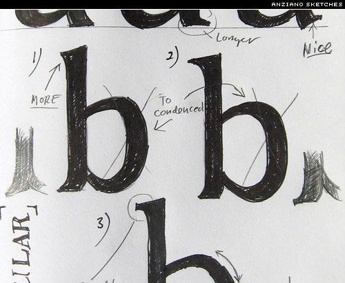
Do you have any more plans for Anziano? A sans serif counterpart, perhaps?
I’m not sure about Anziano sans serif. For now I can’t see it on the horizon. What I do know for sure, is that it will be upgraded in the near future.
My friend Peter Bruhn at Fountain Type Foundry has urged me to complete a full range of small caps. This is a part of the transformation which will eventually turn Anziano into an OTF Pro.
Anziano includes some beautiful ornaments. Where did you get your inspiration for those?
Thanks. I’ve always been fascinated by icons, ornaments, and patterns. So for me it feels quite natural to include a set like this for most of my typefaces.

I gather information and inspiration from various places. I usually take a lot of pictures when I travel. I know for sure that some details found on buildings and elsewhere inspired some of the Anziano ornaments. Others were found in old books.
Do you have a favourite period in type history?
I love the Jugend era in general and some of the ideas for my icons and ornaments have been found within that period. However, the typefaces of that period are very distinctive and therefore “marked by their time” and not wholly suitable for modern layouts.
Having done more text oriented typefaces over the past years, I’ve become influenced by the masters from the 17th and 18th centuries. I’m full of respect for the letter forms shaped back then, and how they still hold such a strong position even today!
Do you have favourite typefaces and type designers?
I assume every artist is influenced by others, for better or for worse. I see it as a part of one’s “artistic evolution”. Barry Deck, Neville Brody and Emigre were my early sources of inspiration. Also the Swedish designer Karl-Erik Forsberg (1914-1995) has inspired me.
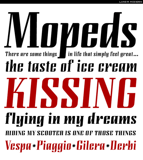
Two of my earlier designs are interpretations of his work and sketches (Lunda Modern and Remontoire).
As for favourite typefaces, some “all-time picks” would be: Bello (Underware), Home Run Script (Doyald Young), Eidetic (Rodrigo Cavazos), Morgan (Mario Feliciano) and Proforma (Petr van Blokland).
Can you tell us something about how you design type?
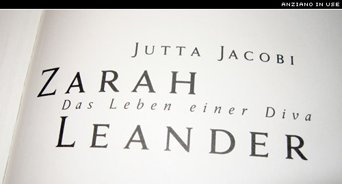
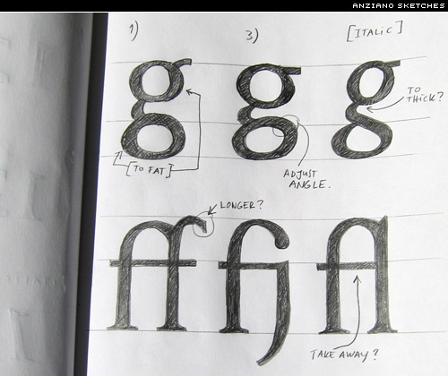
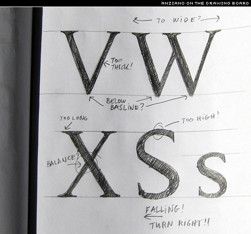
Basically I do a lot of research to make sure it hasn’t already been done. If It’s an interpretation of some historical typeface, I study the existing versions in detail. All this is to be certain that I end up with a unique and personal typeface, while paying the utmost respect to designers of the past and the present. Another important thing to figure out from the beginning is how the typeface is intended to be used.
Different usage requires different approaches and needs—these factors will influence the design. I always begin with the “regular” weight. After that I usually let the typeface rest for a while. Usually some weeks but sometimes even months. That gives me a good perspective on the design. 9 out of 10 times, this will lead me in a new direction—one that I wouldn’t have envisaged at the beginning.
I’ve found this process very “healthy” and it always moves the design forward in a positive direction. When the regular master weight is done (after a few rounds), I move on with the italic, bold, small caps, etc. I finish up with alternates and ornaments/dingbats if needed.
What are your plans for the future?
For the past two years I’ve managed to work almost full time with type design. My long-held desire is to be able to continue this way. I really enjoy designing logotype, identities and graphic design in smaller portions. This is an excellent way of testing my own typefaces in real projects, and also stay in touch with the “end user side”. Regarding upcoming projects, I have a few custom type projects lining up. More designs are planned and in progress for Veer Inc. Also, some major upgrades for my designs at Fountain are just around the corner. Oh yes, the web site needs a major face lift as well, but that’s another story….

You can buy Stefan’s fonts from Psy/Ops, Fountain, Veer, and FontShop.
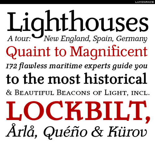
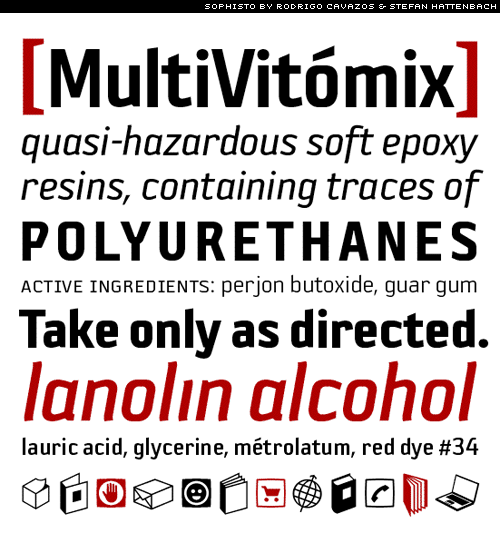
Image credits: Luminance, Sophisto, and Lunda Modern specimens courtesy of Stephen Coles.


