


In my experience, life presents a fascinating series of opportunities, decisions and challenges, each of which impact us in different ways. Pushing and pulling us in various directions, and introducing new opportunities, decisions and challenges along the way. Of these experiences, one of the most special was my time at TypeParis.
Discovering the program
It was March 2015 that I first heard about TypeParis, thanks to a tweet from Gemma O’Brien. In hindsight, the timing couldn’t have been better. I had been hooked on type since early 2012, and would constantly draw letters during the one hour commute to and from my job as a junior designer at a small studio in Sydney.
Want to learn typeface design in Paris in Summer!? Sounds dreamy! Check out @typeparis and apply before April 1st: https://t.co/0uHo8GRX2d
— Gemma O'Brien (@mrseaves) March 19, 2015
Coming from a background as a graphic designer, I was familiar with a vector workflow, and soon realised I could take my lettering pieces a step further by tracing them using Bézier curves. This was revolutionary to me at the time, and it unlocked something in my brain. I began eagerly digitising my hand-drawn lettering, enchanted by the fine-grain level of control this technique afforded me over my letterforms.
Before long, my fascination with digitising letters grew beyond compositional pieces. I started considering the implications of organising these letterforms in a system: and my interest in type design was born.
I spent the next two years playing in Glyphs, examining other typefaces, floating back and forth between lettering and type design and constantly hunting for educational material; particularly on the latter. My love for letters was steadily growing, and I knew that I wanted to get more serious. When I clicked the link in Gemma’s tweet and read through the writeup on the TypeParis homepage, it was like finding water in a desert! I was comforted to note that the program was open to people of all skill levels, from beginners to experienced professionals. Everyone has to start somewhere, and it was nice to feel included despite my inexperience.
I put together the best portfolio that I could muster, massaged my CV and wrote a cover letter. I recall thinking how absurd it was that I was even considering the possibility of not only applying, but pausing my sole source of income and taking myself and my pregnant wife across the world to draw letters for five weeks. But we knew it we had to do it. I sent off my application on the 27th March and successful candidates were being announced on the 10th April. It was a very long two weeks, but you can imagine my delight when I received:
Dear Dave Coleman,
I have the pleasure to inform you that we have accepted your application. We’re thrilled to meet you in Paris on 15 June 2015.
A great many things happened between receiving this email and arriving for the first day of class, including wrapping up freelance projects, frantic fundraising efforts, and 28 hours aboard an aircraft; however I will fast-forward for the sake of brevity. We arrived in Paris a few days early, to see some sights and give me a chance to wind down from the flight before getting right into it.
First impressions
I remember walking up to the ECV building for the first day of class, butterflies dancing in my stomach, with no idea what to expect. There were 15 other attendees in total, and we all began filing in, gradually filling up the classroom and choosing the seats we’d keep warm for the next five weeks.
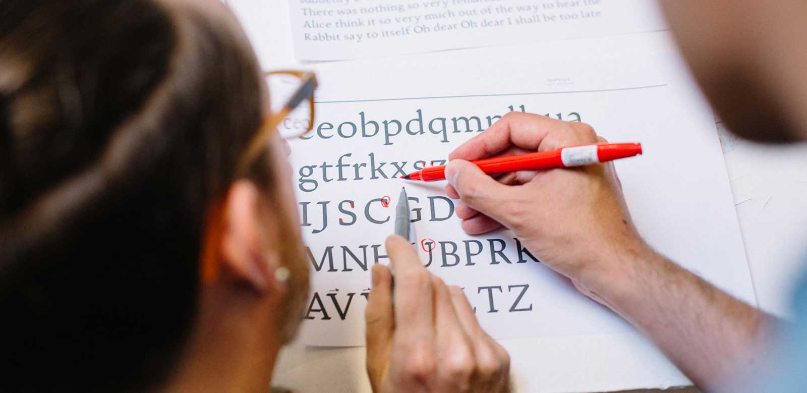
Jean François rose to address us in his wonderful French accent, and just like that, we were off! After some housekeeping, we launched right into calligraphy with Julien Priez. Julien is easily one of the gentlest and most talented people I know. Jfp knew what he was doing when he placed him first in the lineup. His disarming personality and approachable teaching style eased us into the program beautifully, and set the tone for what was to come. Calligraphy was (and still is) well outside of my comfort zone, so I was immediately knocked off balance; exactly what I needed. Julien challenged and encouraged us to stretch ourselves, and to consider the impact of the writing tool on our letterforms. Whilst it may seem obvious now, the link between writing and type design was new to me at the time, and having this relationship not only pointed out but expanded upon and demonstrated was an invaluable take-away for me.

For the next couple of days, we drew lines and shapes, used a wide assortment of mark-making tools, flicked through examples of work from the instructors and other gifted artists, studied existing typefaces and the shapes found in their letters, and even began to draw (and redraw) our own calligraphic letters. We sorted through these letters and began working the shapes into our first project: a humanist typeface.

We were joined by the amazing Frank Jalleau, who had an uncanny knack for extracting beautiful letterforms out of our calligraphic exploration.
We were introduced to the wonders of tracing paper, and clever techniques for duplicating shapes from one letter to another, saving certain parts for later, even alternating which side of the sheet upon which to draw to increase versatility and efficiency. We had the great pleasure of being introduced to one of the core instructors, Mathieu Réguer. Some of my best conversations were had with Mathieu, an incredibly genuine person, with an understated wealth of knowledge upon which he liberally drew as he helped us tighten our designs. The quality of the instructors plays a huge role in what makes TypeParis so good, and the following year, in 2016, we were particularly grateful to have Xavier Dupré as a core instructor. A talented type designer, Xavier’s words and advice were valuable both in the classroom and after the program had ended, on the internal TypeParis discussion boards.
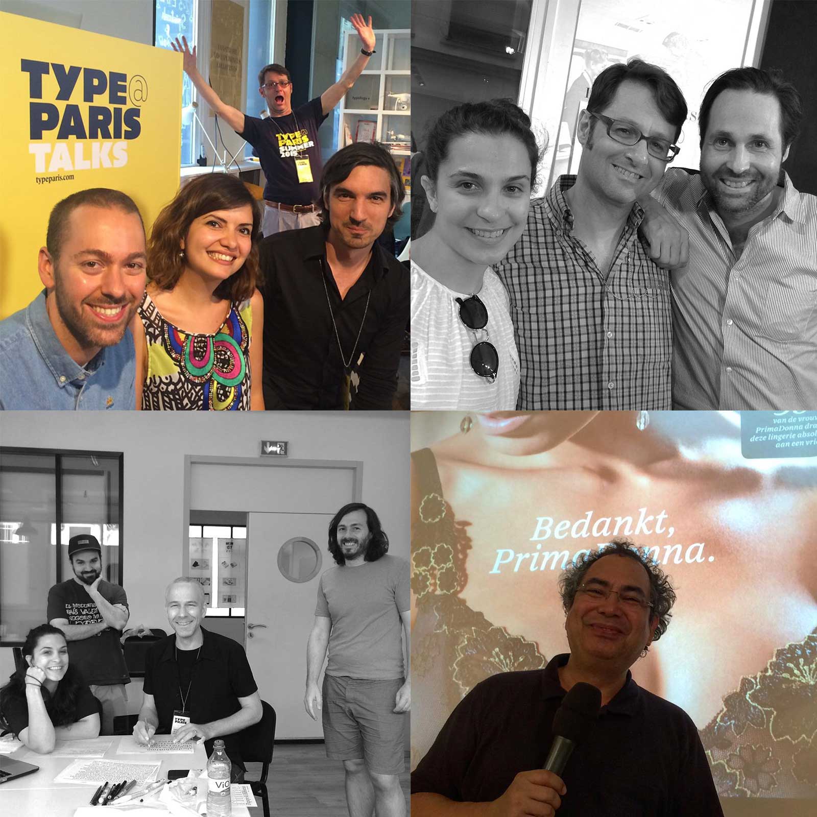
One of the most unexpectedly rewarding parts of TypeParis was getting to know the other attendees. I don’t think any of us anticipated forming as close a bond as we did. Barely two weeks passed and we had gone from nervous smiles and introductions, to being a close-knit group of friends. We exchanged banter, encouragement, contact details and trash talk, eagerly learning about each other and our widely varying cultures and life experiences. It was very special, and years later we still keep up over group chat.
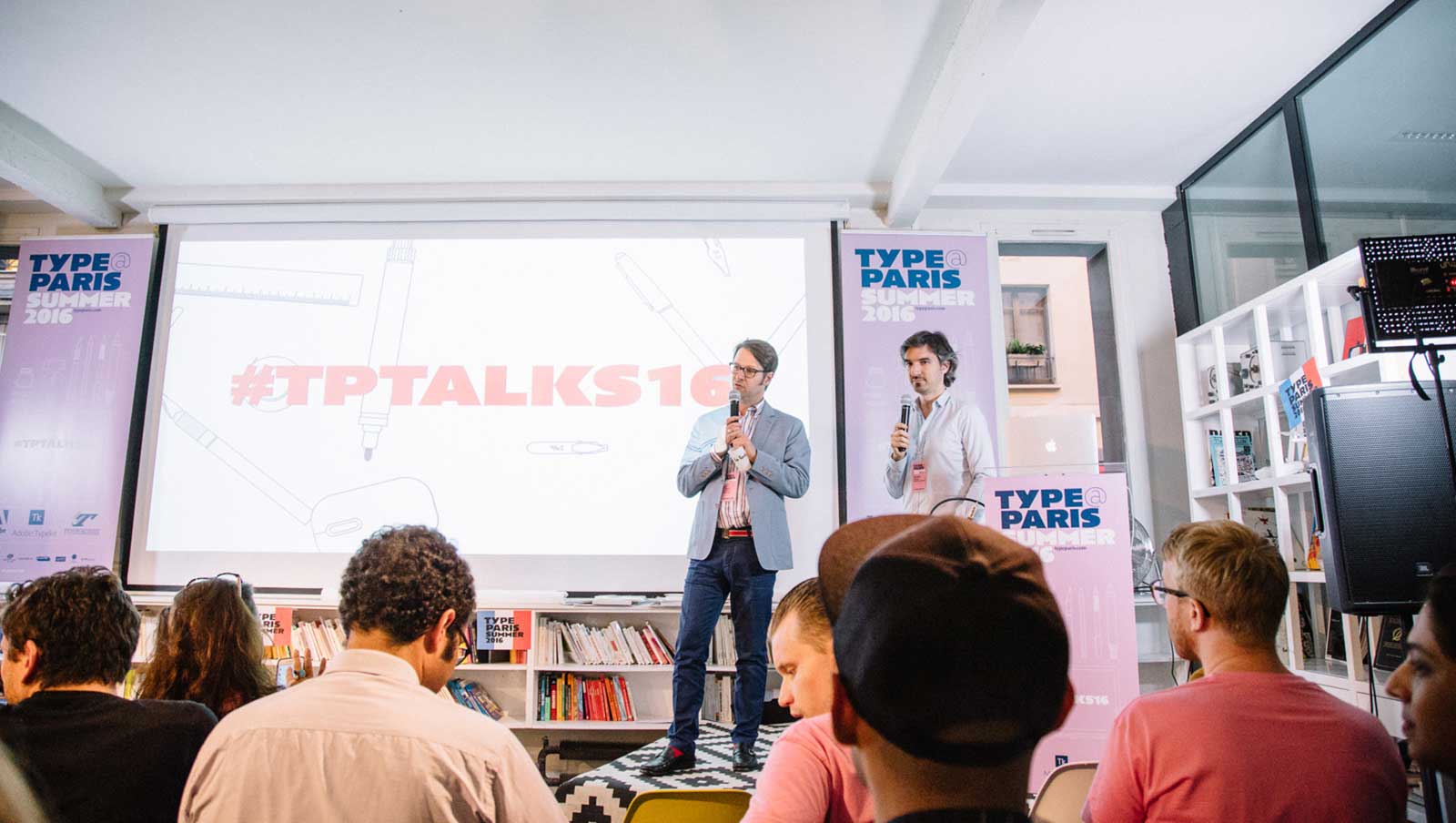
TypeParis Talks
Wednesdays at TypeParis were intense and exciting. Each week we were graced with a visit from an international guest. They would spend the day with us, helping us with our projects, often taking us through a presentation of their work and later providing invaluable critique on our drawings. This was the day you’d gear up for, ensuring you were well prepared to present your progress, to ensure you got the most out of the critics’ visit. It wasn’t every day you got a chance to meet Nadine Chahine, Jeremy Tankard or Fred Smeijers! These guests are industry leaders, incredibly gifted in their field. Having them around us, chatting and sharing, was an honour.
Wednesday nights we’d all walk—or ride, the bike service in Paris, called Vélib’, is fantastic—over to LeTank for TypeParis Talks, a speaking event open to the public and organised by Jean François and the TypeParis team. This was always a highlight. We’d hear from our international guests, providing insight from a type design perspective, as well as local Parisian graphic designers, from studios with a strong typographic focus. Hearing from both makers and users of type helped reinforce the power that a typeface has to communicate effectively, particularly when placed in the right hands. After the talks, we had a chance to clear out the cobwebs, meet new people, chat over beer and pizza and get away from type design for a while.
It was obvious an enormous amount of energy and preparation had gone into each element of the program, not the least of which were the field trips. We visited incredible places, including Bibliothèque Nationale de France, Bibliothèque Mazarine, even a trip to Lyon to visit Musée Imprimerie. We carefully thumbed ancient printed pages, and pored over countless type specimens. It was fascinating to hear about France’s great contribution throughout the ages to the advancement of type design—all completely unbiased, of course.
Getting started on our own typefaces
Week Two rolled around, and with it the moment we’d all been waiting for: we began discussing ideas for our own personal typeface project. We’d cut our teeth on the humanist design, and were ready to take what we’d learned and put it to good use. We were encouraged to consider a brief; a typeface should solve a problem, so what was our problem? I found this particularly challenging, as my approach to type design at that stage of my journey tended to err more towards ‘being attracted to pretty shapes’. Being forced to take a more utilitarian approach stretched me.
During the calligraphic exploration, I was especially tickled by the shapes produced when turning my broad nib pen 90°, changing the axis so the thick parts of the letters become thin and the thin parts become thick. This sparked my love for reverse contrast type, a flame fanned by the work and writings of David Jonathan Ross. I decided my brief was to create a reverse contrast typeface suitable for text at small sizes. In hindsight, this was an enormous undertaking, and far beyond my fledgling skill set. However, having a crack was an invaluable learning experience.
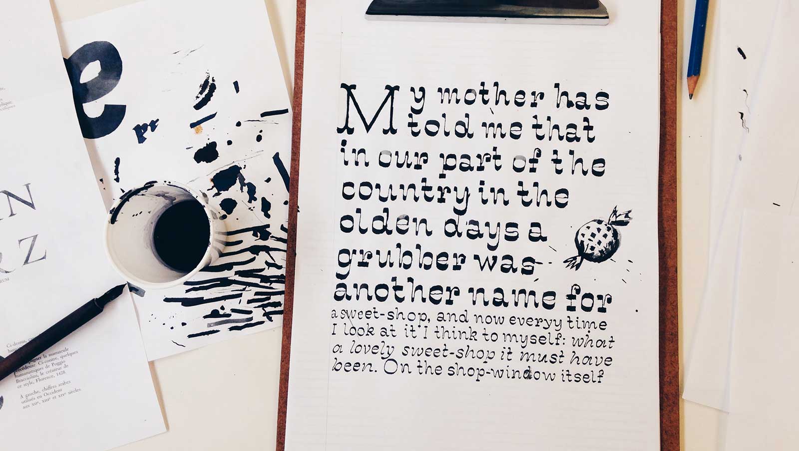
The weeks really started to fly by, as we put our heads down and drew countless iterations of letterforms, experimenting and soaking up the insight provided by the teaching staff and visitors. In Week Three we welcomed Rainer Erich Scheichelbauer, from Glyphs, who walked us through digitising our work; drawing paths, tips on spacing, anchor points, diacritics and much more. We rode the high of seeing our sketched letterforms come to life on screen, and madly worked to fill out our character set, even introducing new axes: light, bold, low contrast etc.
There is something very powerful about dedicating 5 whole weeks to the pursuit of type design. Particularly when sharing that experience with a room full of like-minded people, working alongside you the entire way, regardless of skill levels and backgrounds. Each of us ran into different problems, and we compared notes, shared struggles and tales of woe, and rejoiced together when one of us encountered a breakthrough! To a person uninterested in the formation of letters (which, frankly, is most people), describing it as exhilarating might sound ridiculous; but it truly was. There was an addictive electricity about the whole program—which is probably why I’ve pleaded to be allowed to come back each year since. Even to be nearby, to help out and watch the magic unfold, has been an honour.
Approaching the finish line
In what seemed like no time at all, we’d hit Week Five, and it was time to begin wrapping up our designs and moving on to our presentations. We had been tasked with writing about our project, providing insight into the creative process, our inspiration and how we’d approached a solution to the problem outlined in our brief. We created and printed in-use specimens to showcase our hard work, which doubled nicely as mementos of our experience to share with the class and instructors. It was with a mixture of joy and sadness that we listened to one another present our work. At once incredibly proud of our classmate’s efforts and lamenting that soon we had to go back to our normal lives, where every waking moment isn’t spent dreaming of type. Or perhaps it is.
Final thoughts
In closing, I’d like to extend much love and a hearty thank you to Jean François and Véronique. Laura and I are proud to call them friends, and are constantly blown away by their generosity and efforts to make us feel welcome in their country and company. Not only this, but by their efforts to improve upon and enrich an already stellar program. There was a marked improvement between the quality of the first and second year, and I’m confident 2017 will be better still. Also huge thanks to Joachim Vu and Benjamin Blaess, part of the Typofonderie team, for working tirelessly to make TypeParis possible.

I know that my path was drastically altered thanks to TypeParis. I went in not knowing whether I ‘had what it took’ to be a type designer, and I was shown that there is room for all sorts of people, skill levels and styles in this industry. It steeled my resolve to continue making letterforms, and I’ve been grateful to finish and release two typefaces since my graduation in 2015. Buffon was my TypeParis 2015 typeface project, and is now available on LostType (something I would never have thought possible before attending TypeParis). Keller Script is a brush script created to raise funds for a couple hoping to adopt. I have more projects in the works, and I’m so excited to schedule releases for 2017.

Find out more
It is difficult to give a full account of an experience as rich as that of TypeParis. I’ve had to leave out a lot. If you’re curious to hear more, or have any specific questions, feel free to get in touch with the TypeParis staff, hear from the attendees themselves and even read weekly reports on the TypeParis blog.

Dave Coleman is a type designer and lettering artist, currently living with his wife Laura and daughter Isla in Sydney, Australia. He is passionate about letterforms, and discovering interesting ways to express them, enjoy them and put them to good use.
To keep up to speed on his comings and goings, follow him on Instagram, Twitter and Medium.
It’s obvious that Jean François cares deeply about the attendees, and helping to discover and extract each individuals’ potential. He works hard to demonstrate that it’s not about your experience or qualifications, it’s about giving it a go. 5 weeks is a long time, and regardless of your skill level going in, the improvement that occurs over the course of the program is striking. Jfp’s genuine desire to see young people succeed and master their craft is what drives TypeParis, and I believe the key ingredient in making it unique. Apply for TypeParis17 now.