
Three years ago MetaDesign Berlin asked us to design a custom Serif and Sans typeface for the German federal government. They had been assigned to redevelop the government’s corporate design with the typefaces as part of the update. The project was to cover all communication issued by the government and their ministries, online or offline, national or international. It was a demanding and interesting task. Though we were accustomed to working on projects like these for corporations, we were now asked to design “for the people”.
A custom type design job begins with the definition of aesthetic and technical goals, dictated to a large extent by the target group. A typeface for an art school can be more liberally designed than the typeface for a company of financial advisers or a newspaper font, though all three have easily definable target groups. Assumptions about a client’s target group are based on lifestyle, age group, likes and dislikes, etc. and shape the development of an aesthetic design.

The new typefaces for the German federal government
The technical savvy of the target group — how current their technology is, what devices, browsers, etc. they use — is also crucial. It informs us on the font technology required: font formats, hinting, and so on. The more homogenous the target group, the more straightforward the definitions are upon which we base our design.


Custom typefaces for the Glasgow School of Art, the northern Italian region of Südtirol, the Dutch weekly newspaper Staatscourant SC, and the Berlin Lottery (an assignment from Connex Advertising, Berlin). Custom type designs with set target groups and applications.
For this project we were faced with the challenge of mapping a goal for a target group that encompassed the general public — all citizens and persons coming into contact with information issued by the German government and its agencies, ranging from the age of 9 to 99, from all educational and cultural backgrounds — which was basically everyone. The written word, whether just a footnote or the headline on a billboard, had to be accessible and user-friendly to this widely diverse group.
Besides the public audience, the other target group for the typeface was the government itself: employees and officials using the fonts, creating information and communicating with them in an office environment. Though smaller than the first target group, it was crucial that their needs be met as well.
Our foremost goal in considering this broad audience was outstanding legibility — creating glyph shapes that made for pleasant reading. Not only because the user group was so diverse but also because the official text issued by the government could at times be complex and detailed.
The second aim was a consequence of the first: the typeface should have no extroverted details. By ornamenting information we would run the risk of distracting the reader. We chose therefore not to give the typeface too much personality, and aimed to design an unbiased yet friendly “transmitter”. This impulse was the opposite as that for a corporate typeface design, where we would enhance the profile with strong recognizable details. We were not competing with another brand in the free market, the typeface did not have to look “cooler” than the one before, it just needed to work “better” by serving a public function.
Translating our next two goals into definable shapes was more straightforward. We wanted to balance femininity and masculinity as well as infuse it with determination and sure-footedness. Both aspects have visual correlations and reflect the values implicit in “democracy”. One recognizes the equality of both sexes, while the other acknowledges the authority of government, tempered by democratic and humanitarian ideals. We strove to make an inclusive typeface, not an exclusive one.

Both writing and construction were part of the design concept for the two families.
The typefaces the government previously used were a combination of Neue Praxis and Neue Demos by Gerard Unger. These typefaces, originally designed in the 1970s, were built up of fairly coarse pixels and made to function within a specific technical environment where letters were formed by a cathode ray tube. This meant that the design had to match the technology and not the other way around.

Previously in use for the corporate design of the government: Neue Demos by Gerard Unger. BundesSerif has more definite and dynamic features.
The technical requirements for the BundesSans and BundesSerif were more demanding, requiring cross media, cross platform and cross browser usage. Again, with their heterogenous target group, our aim was to foster the government’s obligation to make information accessible to everyone. As not everyone has the latest computer or software, we had to create backwards-compatible typefaces. That meant the fonts would require hinting on various levels for good display on screens, especially under difficult conditions with font smoothing switched off.

The fonts rendered in Firefox Windows (left) and Mac OS. The ClearType and grayscale hinting for the web and office fonts was made by Monika Bartels from fontwerk.de
We approached the actual design of the typefaces on the macro and the micro levels. The macro meant defining the general profile or cornerstone of our design. Only after that did we start sketching and drawing letters on the micro level.
The foundation of our design began with general proportions, vertically (especially the ratio uppercase, ascender and x-height) and horizontally. We knew the typefaces should not demand too much space but also should not appear too compact or cramped. Then we looked at the possible shape of the letters for Sans and Serif, and at the level of individuality — recognizability — of the characteristic shapes.
Our first macro approach to vertical and horizontal proportions.

Balancing the proportions within the letters, design options (top and middle, blue is our choice) and some problem letters and combinations we needed to aware of.
On the micro level, we methodically considered how pointy/round the curves should be, compared dynamic (humanist) with more solid (constructed) shapes, and tested symmetrical/asymmetrical serifs. At that point in the process we gave great thought to each detail, questioned and discussed — sometimes fiercely — all the features that led us in the end to conclusions and possible design options. These were discussed with MetaDesign who assisted in streamlining our decisions to correspond with their modernized corporate design. Only after that did we present the development to the clients.

The glyphs’ individuality increases recognizability.
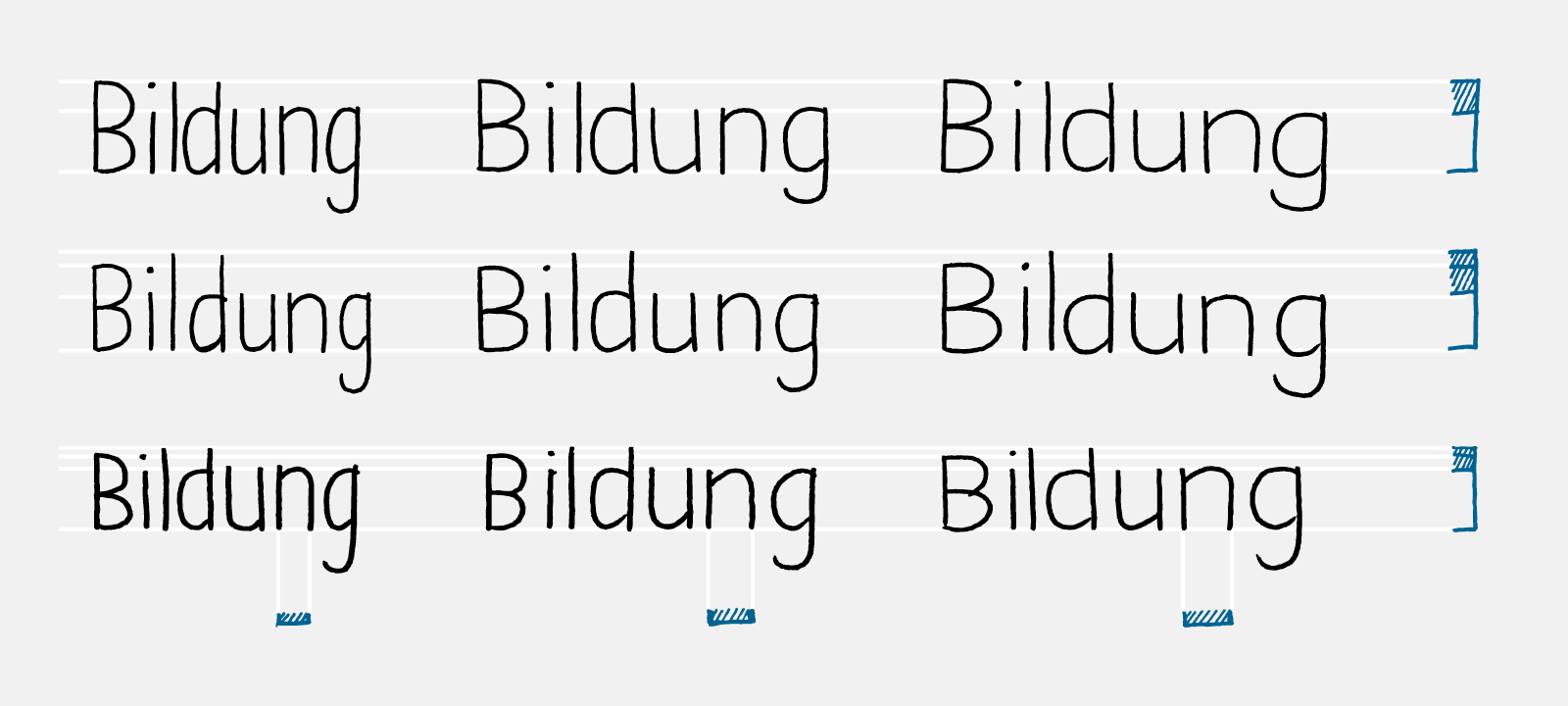
It is not easy to present individual letters to a client, laymen of type, and ask them to make decisions on details. Commonly, the client finds certain features strange because they have never been exposed to them close up. Characteristics of Times New Roman and Arial might be not questioned because they are never examined in detail, but when viewing a new alphabet through a magnifying glass, questions on forms and proportions suddenly arise — “why isn’t the letter ‘t’ as tall as the ‘h’ or ‘b’?” For this reason we always use meaningful words in our presentations — in this case, Bildung, Berlin, Demokratie — rather than individual letters.

Presentation of the typeface to the client.
After finalizing the last design decisions, we presented the complete glyph set of each weight/style on A2 boards (tabloid format x 2) to the client and after a few more detail tweaks, received the final “go ahead” signature on each — a green light for the last step of the production process. The result was two families for DTP, web and office use with each available weight in Roman and Italic, containing about 580 glyphs covering the European languages that use Latin script.
We have learned from this assignment that the usual corporate type design reasoning only applies to a certain extent. It is not a quest for the most groundbreaking “winning” solution or a visualisation of a company profile, because it is outside ‘commercialistic’ thinking where the sole objective is to increase and maximise financial gain. Our objective here was to create an understated design with a sense of integration, not exclusivity — universality instead of selectivity.
The project ran smoothly and our progress was viewed with great interest by the Bundespresseamt (German government press office) who mediated the assignment. Though their communication specialists were familiar with the processes of corporate design, the development of a typeface was something new to them. They came to see great advantages in a new, custom typeface over having their previous typeface overhauled. The latter would have meant an upgrade from Type1 to OpenType and web fonts, resulting in considerable license fees. The custom font allowed them to freely use and distribute it within the governmental bodies and ministries.
BundesSerif and BundesSans received awards from the International Forum Design and the German Designers Club.

Requested by the client: the design of an uppercase ß, the German double s (a ligature of ſs, a long s followed by a regular one) which typically becomes SS in uppercase writing. The letter has been included in the Unicode standard in 2008 as U+1E9E.
Prof. Jürgen Huber and Martin Wenzel are two experienced and enthusiastic type designers forming the custom type design partnership, supertype.de. Jürgen studied Communication Design at the Folkwang University in Essen with Prof. Volker Küster before he worked for MetaDesign until 2004. Since 2012 he runs http://typedepartment.de together with Malte Herok. He currently teaches typography at the University of Applied Sciences HTW, Berlin. Martin studied at the Royal Academy of Art, The Hague, while embarking on his own type design projects, eventually launching his foundry http://martinplusfonts.com in 2011. Martin also teaches typography part-time at the University of Applied Sciences HTW in Berlin.