
Xavier Dupré is a world-renowned type designer. After studying calligraphy and typography at the Scriptorium de Toulouse, France, he collaborated with Ladislas Mandel. Since then, he has established himself in Cambodia where he designs typefaces with as much freedom as possible. He appreciates Licko’s creativity, as much as the fluidity and calligraphic tensions in Slimbach’s works, and the simplicity of the design of Carter or Unger. Xavier began type design on screen but then moved back to pencil drawings on tracing paper and even painting with gouache.
Can you talk to us about your training?
From the age of 15, I spent three years in an applied art training scheme, that exposed me to different types of creation, even though I had been drawing and painting for a long time. Then, I trained in graphic art in Paris. At this time, I met Olivier Nineuil who greatly encouraged me to persevere and invested his time to explain to me some of the essentials; like the simplicity which we should aim for when designing a character. Then, I felt I had to further my training in order to learn how to draw letters, because I was already creating lots of fonts that were as clumsy as they were impossible to use. Furthermore, I realized that the work of a graphic designer in an agency was going to be very boring. Therefore, I went to the Scriptorium in Toulouse, in order to specialize in the letter. I was lucky to receive tailor-made teaching thanks to Bernard Arin who quickly understood my aspirations. I was able to learn paleography, all the Latin scripts since the Roman capital, without much constraint. I was making a font every time I studied a new writing style. Besides, I was making more experimental personal fonts. During my stay in Toulouse, I met José Mendoza, then Gérard Blanchard who left me with very good memories, and my teachers Bernard Arin and Rodolphe Giuglardo whom I still deeply respect. Their teaching was founded on the basics of graphic design rather than that of communication. They made me focus, that I might avoid moving in more fanciful directions, and they led me to discover type for text.
It is during this period that I met Ladislas Mandel, on the occasion of a group visit to his home in Provence. Shortly thereafter, I started to collaborate with him in order to help him digitize humanistic characters he drew in his spare time. Working alongside Mandel allowed me to understand his way of thinking, to get to know better his theories on the evolution of scripts. I did not always agree with him, especially when it comes to sans characters. Mandel considered that there was humanistic writing on the one hand and sans like Univers or Helvetica on the other hand. It was difficult to get him to recognize the interest of humanistic sans and their multiple variants that appeared in the past few years. His approach has influenced and still influences me. He allowed me to see typography differently: the importance of letter proportions and their differences as well as the psychology of readers.
You are one of the few contemporary type designers who expresses his admiration for living type designers…
We all have conscious or unconscious influences. Why not mention them? My influences are diverse. To start with, there are French designers that left their mark on my formative years, like Ladislas Mandel or José Mendoza, who were held in high esteem in the teaching of the letter at the time in France. They left a strong mark on a few French designers too. Afterwards, I liked type designers who are different like Matthew Carter, Roger Excoffon, Eric Gill, Zuzana Licko, Martin Majoor, Jean François Porchez, Robert Slimbach, Gerard Unger, Hermann Zapf. The difficulty when you give out names is that you forget some. All the great designers are of interest to me because each of them manages to create a harmony and a subtle style recognizable from very simple forms: letters. Licko’s creativity has always impressed me, as much as the fluidity in calligraphic tensions in Slimbach’s works, the simplicity of design of Carter or Unger. The audacity in the choice of forms, as well as the accuracy in the designs of Porchez have often attracted me.
What influences do you draw from your environment?
It is difficult to know what are the things from daily life that may influence a typographic design. Sign is an abstract design; furthermore, it is imbued with occidental culture when it comes to Latin characters: therefore inspiration is above all Western. I never wanted to mix anecdotal details that are reminiscent of eastern scripts because I consider that each script is something very particular or unique, without much in common with the others. Indian, Chinese or Latin inspired scripts are in radically different spheres. A Thai sans, like Frutiger designed, will have some signs in common with a Latin character but intrinsically remains a Thai script. It has actually happened that I wanted to reuse elements found in vernacular characters, but I never made very good use of them. Many of them actually stay in my sketchbooks. My life in Asia has more of an impact on my way of seeing society, seeing life in general, than on my work in particular — it is far more global. The connection I have with Cambodia is very particular because it is above all a family history. My great-grand-father was in Indochina a hundred years ago and my grand-father is buried in Phnom Penh. My father was born in Saigon and lived a few years here.
How would you see yourself in terms of belonging to a school?
I am part of a French school because I was trained in France by French teachers. I am conscious that some of the shapes I draw come from this affiliation. However, today influences are globalized, for me as well as for most young designers. It is difficult to differentiate between all of them. The training at Reading University (UK) is a good example because students and teachers come from across the whole world. Personally, I work in a very independent manner. I am not closely linked to a style, to sponsors who have defined sociocultural criteria. Further, what with not being active in France, and being published mostly by foreign foundries, I don’t know if it is possible to say that I am part of the renewal of the French scene. It’s been 12 years since I published my first characters and it is at the same time that I started to live in Asia: it is possible to link my typographic life with my life abroad!
Type designers often mix a few activities. How does it work for you?
I don’t need to work on assignments, even though I do it in very particular cases. It is very lucky, because that gives me a lot of freedom on a daily basis. Actually, I don’t work full time because I do sports in the morning (yoga or swimming) and I like to take my time to live. It happens occasionally that I make lettering or identity work but in general, it is with people I know well. I avoid assignments linked to commercial imperatives which I cannot control, and where deadlines are always too short. I take a lot of time to be happy with the shapes that I draw and I need to take the time to mature my characters. Besides drawing characters, this year I did the layout of a children’s book, and I used the occasion to use FF Masala and FF Masala script. It was a collaboration with a publisher and a writer I know well. This is the kind of work which is rather pleasant and gives me a little break from letter design.
You worked for a few foundries: what differences do you see?
In the past, I chose publishers who were renowned in the market. Today, I know with whom I want to work and my choices have narrowed. The collaborations with Emigre or FontFont are very different and may change from one character to the other. For Vista Sans (Emigre 2005), I was asked to work a lot on corrections. Afterwards, Malaga was accepted as is by the same publisher. At FontFont, the characters are accepted with barely any modification in the design, even though later on, in-house technicians work a lot on the production (kerning, hinting, adding additional glyphs like some diacritics, generating the fonts in different formats, checking compatibility). Sometimes I would have liked to receive feedback in order to improve some inconsistencies. I think that at FontFont, technicians have a lot of respect for the formal choices of the designer. At Typofonderie, they are very demanding in terms of glyph design and above all kerning (which takes a lot of time!) without changing the nature of the designer’s work. It is an enriching collaboration.
Can you tell us a bit about the way you design?
Actually, I like the characters that ‘leave a mark’ on the page, fat letters with massive serifs, like you see on the humanistic or slab characters. These have a roughness which gives them a lot of strength. In the case of a text character, I generally start with the regular roman but, in some cases, when the character is more fit for titling or short text use, I like to start with the bold, like I have done on FF Masala or the Mislab. I initially draw some lower-case a-e-i-l-n-o-d, then the others and always v-w-y-z then x finally. The diagonal lowercase are less interesting in my eyes because they don’t have curves. Then I work on the uppercase, the numerals and all the signs required of a font.

You are from the generation that designed with digital tools straightaway. Has this impacted the way you design?
I started type design on screen but then I moved back to pencil drawing on tracing paper and even painting with gouache. This allowed me to sharpen my eye and see that the fluidity of a curve is not easy to find. We may understand black and white masses more easily with real material at the end of your fingers. By hand, I designed differently, I added more small details, I had difficulties synthesizing the shapes. Vector design helped me to simplify lines. I have always had the calligraphic shapes in mind and, from time to time, I take up a felt-tip brush or a calligraphic pen to write a few words when I need to understand the tension in a character. I never took to the stylus and graphic tablet to draw directly on screen, but it’s possible to obtain good results. Usually, I draw by hand on the touch-pad of a laptop. When it comes to drawing in general (nude, life drawing, still life) — I got back to it last year — and I always come back to paper with great pleasure. Being a bibliophile and collecting old posters, paper is rather important to me.

Can you talk to us about the Mislab in particular?
I had been wanting to design a slab character that was not derived from a sans like Vista. On a 1940s US cinema poster, I found a slab that had an interesting impact and that was the starting point. I erased some shapes that were too geometric, re-calibrated the proportions and sizes of the serifs. The title was set in bold italic. Thus, I started with this weight and I immediately did the bold to see how it looked. For the lowercase, I made some attempts with and without the vertical serifs on the letters c-s-z, but I quickly kept the version without serifs. I kept the serifs on the z because it is a letter without curves, and without serifs it’s a sans — in contrast to the curved letters, a or e which work as a slab, even without serifs. Furthermore, there is hardly enough space to include them. I also tried semi-serifs on the letters v-w-x-y but I came back to more structured horizontal serifs. Vertical serifs have a tendency to close letters and decrease their legibility. It is for this reason that most slab characters don’t have any serif on the a or e. On top of that, in humanistic scripts (even in the Carolingian minuscule), these vowels don’t have serifs. The starting stroke (attaque) on the a may translate as a drop but a straight serif looks heavy. This lack of serifs allowed keeping a horizontal weight (at the top of a-c-s, at the bottom of c-e-s) which gives Mislab this humanistic characteristic. For the italic I kept full horizontal serifs – the norm is to make more cursive serifs – that accentuate this ‘horizontality’ and gives the italics more stability. Despite the rigid shapes and the very sober design, Mislab maintains the warm and convivial aspect of humanistic scripts.
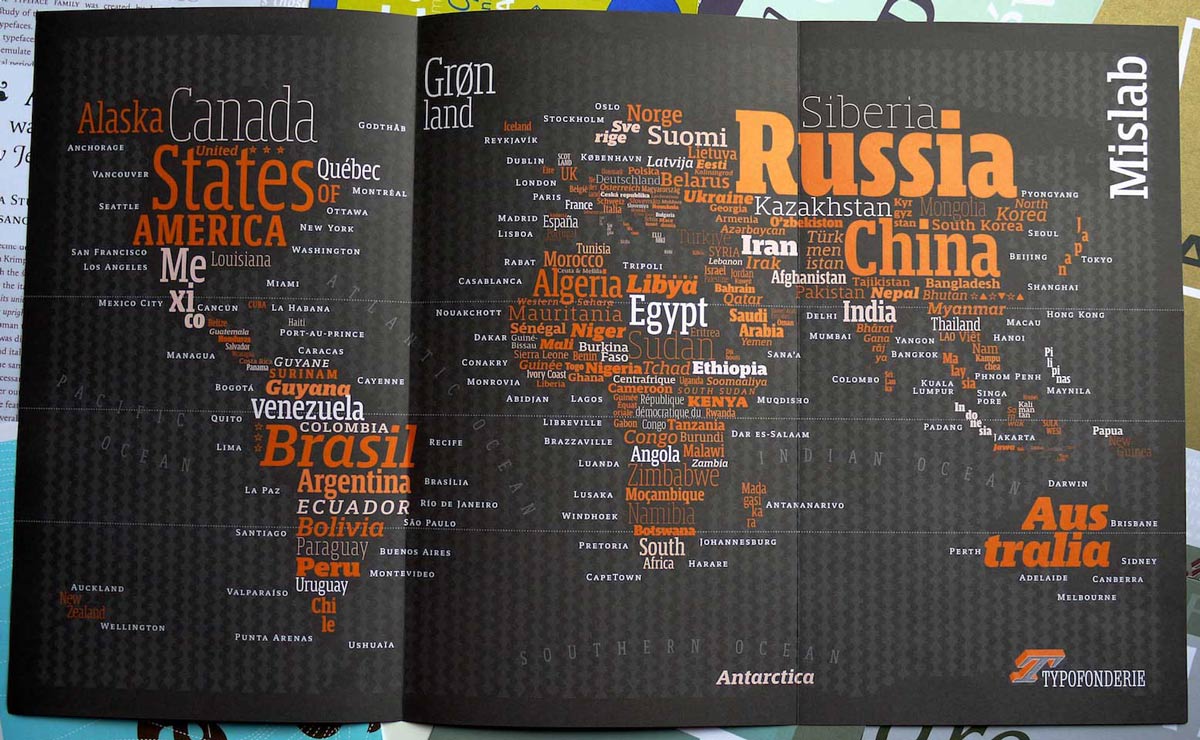
For the design of the Mislab, what role did the specimen play?
I always make personal layouts like fake magazine covers on which I try out my characters. This allows me to see whether the fonts work well in context. For the Mislab specimen I had a lot of fun doing this typographic world map and I spent a lot of time on it. I am passionate about maps of the globe and maps in general so this idea came to me quite naturally. It must not be taken literally, because I had to cheat to include the name of each country on each continent. Names are clearly not on the exact place of these countries, they are actually placed continent by continent. In fact, I realized that Africa has a great number of countries and that Europe includes a lot of microscopic countries (especially since the break-up of the Balkans). When I had space, I added regions like Siberia or Louisiana. Then, the size of the name more or less equates with the size of the country. Capitals or city names allowed me to show the small caps. When the country uses a language with Latin script, I kept the language of the country (Guiné-Bissau in Portuguese vs Guinée Équatoriale in French and Peru in Spanish). I used English by default for countries where the script is not Latin (China, North Korea etc.). In the end we have a very important range of sizes from 4.6 for Bosnia to 151 pt for Russia, which demonstrates the characters in a wide range of sizes.
How do you see your evolution as a designer? Do you think you will ever work on a Didone, which is very different from your style (straight axis, few calligraphic phases)?
I would like to make more characters that can be used in books. Of course, I try to create original shapes, but above all I try to create a functional family, and this is already far from being easy. Each new creation is a personal challenge. A priori, Didones are not among the characters that attract me because I find them difficult to read for text but I can appreciate them in titling where they are usually very elegant. It is not on the agenda at the moment but it is always interesting to give oneself new challenges. Formally, I like the duality between flexibility and rigidity – one may say softness and aggressiveness – and it is likely that I will follow that path for some time. Loose scripts, by this I mean those that reproduce handwriting, like Just van Rossum’s FF Justlefthand have always interested me too: I even have quite a few waiting in the ‘drawers’ of my laptop…
By Dàvid Ranc.
Xavier Dupré’s biography:
After studying in France, applied arts in Valence, graphic design in Paris then calligraphy and typography in Toulouse, Xavier Dupré worked between 1999 and 2001 as lettering artist and type designer in a packaging design agency. In 2001, he moved out of France (he has notably lived long periods in Asia where he settled again recently) and published his first typeface: FF Parango. Since then, Xavier has built a very impressive body of work including another twelve typefaces with FontFont (FF Reminga, FF Tartine Script, FF Jambono, FF Angkoon, FF Absara, FF Absara Sans, FF Megano, FF Sanuk, FF Masala & Masala Script, FF Yoga, FF Yoga Sans); three with Emigre (Vista Sans, Vista Slab, Malaga) and most recently Mislab with Typofonderie.
Xavier has also received numerous awards including three consecutive Certificate of Typographic Excellence from the New York Type Directors Club (2004: FF Angkoon, 2005: FF Absara, 2006: Vista Sans).
Links
→ Mislab typeface family
→ Xavier Dupré’s website
→ Mislab, a new design by Xavier Dupré, on the Gazette
→ Download Mislab pdf specimen