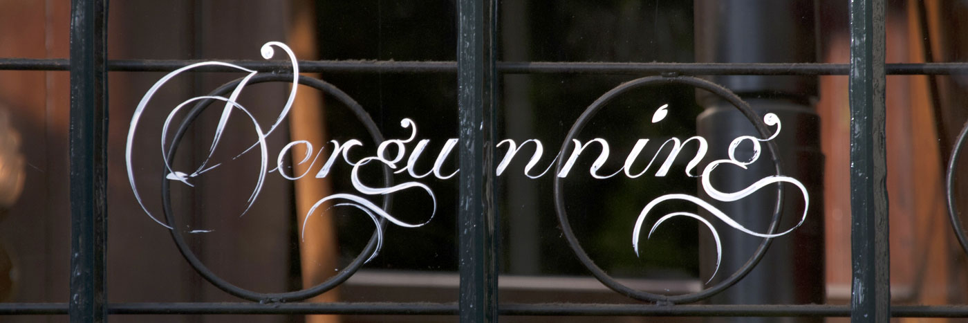
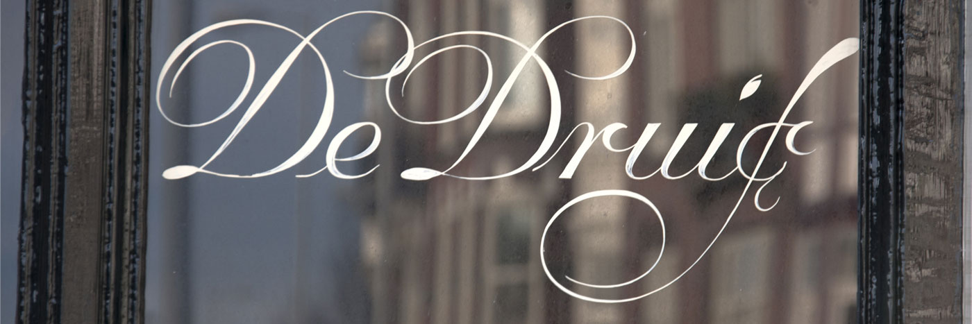
In a way, my research into the ‘Amsterdamse Krulletter’ (Amsterdam’s Curly Letter) began eight years ago as I was walking down the streets of what is possibly the city’s most beautiful district, the Jordaan. As every local knows, this area hosts quite a few of the old, traditional pubs that the locals call ‘bruin cafés’ (brown cafés). In urban environments, type designers are always looking at letters, and especially at hand-painted ones. It didn’t take me very long to notice that many of the pubs in the area had their windows painted in a very interesting and beautifully executed script. Later I discovered they had been painted throughout other parts of Amsterdam too, notably also in the De Pijp area.

Upon closer inspection of the letters painted on the windows and wooden panels, it was obvious that the style was very consistent. Leaving aside the natural variations you would expect from work done by hand, each letter had a defined design that had been strictly followed every time. Interestingly, this mysterious script was unknown to me. I could tell it had influences from seventeenth-century Dutch penmanship, but it also differed in many ways from the handwriting that Jan van den Velde, Felix van Sambix, and Cornelis Boissens — among others — had published in their writing manuals.

I started asking Dutch colleagues about this pub lettering tradition, but no one had much information about its authors or origins. It is true that almost without exception every ‘connoisseur’ of good lettering who took a look at them immediately expressed admiration, but the specialized press and Dutch design authors had never seriously taken this tradition into consideration. Piet Schreuders‘s groundbreaking essay ‘Lay in – Lay out’, first published in 1977, had dedicated two separate chapters to two of the most representative and original of Amsterdams’s vernacular letters: the ‘Bruggenletter’ and the almost extinct ‘Spiegelglas’ letter. However, there is not a single mention in the book of pub lettering, which at that time would have been omnipresent.
In a more recent example, the 2008 photography book ‘Amsterdam in letters‘ by Marteen Helle, features numerous examples of fine Amsterdam lettering, but, again, the ‘Krulletter’ is absent.
It was only in 1983 that the trade magazine, ‘Grafisch Nederland’ published an issue including an article entitled ‘Kijk! Letters!’ (Look! Letters!), with pictures of several pub facades bearing the style along with an interview with Leo Beukeboom, one of the two people responsible for painting it. Nevertheless, the article focused more on the most general and everyday aspects of Mr. Beukeboom’s work, and it failed to delve any deeper into the origins of his most celebrated letters and what may have influenced them.
The fact that such gorgeous and original letters have largely been ignored in a country with such a rich type- and letter-making tradition reminds me of the plot of Edgar Allan Poe’s famous story “The Purloined Letter”. In the story, an important document cannot be found because it is lying in plain sight. Sometimes things can become invisible to us because of their very familiarity.
I have mentioned the name of Leo Beukeboom. This talented and prolific sign painter, responsible for many of the best ‘Krulletter’ that still can be found in Amsterdam and neighbouring cities, began painting them in 1967 when he was hired by the Heineken Brewery to be its in-house letter painter and to provide services to the pubs sponsored by the firm. But the history of the style goes back further than that. It was created by the sign painter Jan Willem Visser (Amsterdam, 1911-1987) who from the early 50s to 1968 worked for the Amstel Brewery (the company was sold to Heineken that same year, almost at the same time as Leo Beukeboom began painting the style for Heineken).

Jan Willem Visser was the son of Johannes Visser, another letter painter, and he was very gifted and highly respected by his colleagues, but his story has never been properly told. He learned the trade from his father, and in 1941 he opened his own workshop in Da Costakade street. At its peak it was one of the biggest in Amsterdam, with 24 employees.

Numerous images kept in the Amsterdam Photographic Archives show that by the early 50s Mr. Visser had already painted the ‘Krulletter’ in many bars in a manner almost identical to the one that still can be found today.
For a long time I wondered what exactly had influenced him. His capital letters were undoubtedly inspired by one particular plate published in the second volume of “Spieghel der Schrijfkonste” (1605), Jan van den Velde’s most important work, but some of the details of the lowercase letters were too original to have come from that source, and were unlike anything published in the works of the famous calligrapher.
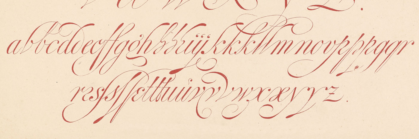
Thanks to a visit to his daughter, Annick Visser, who kindly allowed me to inspect her father’s belongings and documents, I was able to solve this little palaeographic mystery. Jan Willem Visser owned a book published in 1885 entitled ‘Letters en hare grondvormen naar de beste bronnen bewerkt voor schilders, steenhouwers, graveurs en voor het onderwijs aan Ambachts en Kunstnijverheidsteekenscholen’ by the engraver P. van Looy Jr. The book was a catalogue of different alphabets ‘from the best sources’, designed to serve as a guide for craftsmen in the rendering of letters. This volume featured three plates that had undoubtedly served as models for Visser’s pub lettering. In hand-written captions, the book’s author P. van Looy Jr. gives credit for the images, indicating that these models were taken from J. Heuvelman’s work.

Johannes Heuvelman was a Dutch writing master from Haarlem, and his only known published book is: ‘Stichtich ABC tot Nut der Jeucht geschreven’ from 1659. A comparison of the script models of J. Heuvelman, P. van Looy Jr., and J. W. Visser is particularly interesting. Although each of them could have made an exact copy of his predecessor’s lettering, none of them chose to do so. Each of them introduced variations and diverse influences that made their versions richer and more remarkable. Realizing this fact had important consequences for the development of my revival. I had worked for a long time on a model that was an attempt to reproduce the Kruletter design as accurately as possible. I was very concerned that Amsterdam might be about to lose one of the most distinctive and beautiful elements of its graphic identity. Many of the window displays with the painted letters had been lost forever due to renovations of bars or changes in ownership, and there are no letter painters left in the area with the skills to paint the style properly.

But at the end of 2011 I suddenly came to the conclusion that I was on the wrong track. These letters had been painted to meet needs different from those that my letters would serve. The letters’ finishing required the use of a fine-pointed brush, and their contrast had been planned to work in really big sizes. I was seeking something with a wider range of possible uses, and the letters as they were written were of limited use in the contemporary graphic industry.
Even more, I felt just as Visser had, that instead of simply creating an accurate copy, as a designer my role should be to offer my own interpretation, changing things I considered undesirable or incorrect while enshrining the attributes in new letters of my own. In this way I would be preserving the tradition and making my discreet contribution.
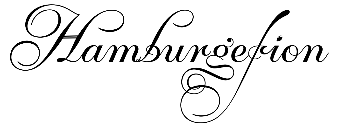
Therefore, I redrew my version and made ‘Krul‘ more ‘typographic’: a disconnected script, a bit more ‘rationalistic’ and less sloped. Some problematic characters were altered or downgraded to the category of ‘alternates’, while new letter shapes which were not present in Visser’s model but were part of the Dutch formal penmanship tradition were included. The style owes both its name and much of the appreciation it has earned from Amsterdam’s people to the abundance and exuberance of its plentiful swashes. Naturally, ‘Krul’ includes many of these typographic decorative elements like different swashy ascenders, ending forms, numerous fleurons and ornaments.


For the moment it is too early to tell what the fate of this attempt to revive a endangered fine lettering tradition will be, but there is something I know for sure: I have done all I possibly could to recover a forgotten chapter of Amsterdam’s popular culture and to give its protagonist the credit he deserves.
Krul fonts on ILT.
Author: Ramiro Espinoza.
Acknowledgements:
I would like to thank the following people and institutions for helping me in different parts of my research: Tom Croiset van Uchelen, James Mosley, Mathieu Lommen, Annick Visser, Leo Beukeboom, Library of the University of Amsterdam, & Noord-Holland Archives.