
Engaging contextuality
BY NICK SHINN
There are many OpenType features that can be built into a font, but Contextual Alternates is something special.
Swash characters, ligatures, small caps and figure variants are all very well, but they merely duplicate cleverness that was available prior to digital type. The Contextual Alternates feature however, in which the choice of glyph alternate for a particular character is set automatically with reference to an adjacent character, enables new possibilities for the type designer. Consider it as ‘smart fonts’, because the appearance of typography is determined not by the person laying out a page, but by a font’s response to the particular words that comprise the text.
At the heart of the feature’s code is a process of glyph substitution, e.g.
sub a b’ by b.alt ;
This means, “When a is followed by b, don’t set the default glyph for b, substitute an alternate (b.alt)”.
Here is a brief history of the feature, illustrated with the five typefaces I’ve designed which address some of its possibilities. Most typefaces mentioned are linked to MyFonts, which has an online type tester that demonstrates OpenType features.
Simulating scripts
The Contextual Alternates feature was developed by Adobe ten years ago and registered in the OpenType Layout tag registry as providing “… better joining behavior … in script typefaces which are designed to have some or all of their glyphs join”.
Caflisch Script was the proving ground; it was a typeface which had originally been created for Adobe by Robert Slimbach in 1993, based on a writing style of calligrapher Max Caflisch. Apart from its Multiple Master format (weight axis), it was published as a two-font system, one with default characters, the other an Expert font containing a handful of ligatures and swash alternates which could be set laboriously by keystrokes such as “i” for the “tt” glyph.
The OpenType update, Caflisch Script Pro, was released in 2001, the same year as Adobe InDesign 1.5, the first major layout application to support OpenType. I was very keen on this new technology, and wrote about it for Graphic Exchange magazine: Big Thing [PDF].
It should be stressed that OpenType is a system; the fonts and applications which implement it are interdependent. Consequently, Adobe developed its OpenType-savvy layout applications in tandem with Pro OpenType fonts initially containing the traditional “Advanced Typography” features of Small Caps, Ligatures, and Old Style figures, that were accessible via a special OpenType sub-menu in the character panel. Taking it to the next level, InDesign 2 (2002) showcased Caflisch Script Pro, which had been expanded with hundreds of alternate glyphs and ligatures, activated by InDesign’s new Contextual Alternates feature to mimic the “letter joining rules” of traditional calligraphy, with which, as a calligrapher in his own right, Slimbach was very familiar. Such joining conventions were already a species of coding exhibiting a logical reduction and marshalling of letter form, so their adaptation to computer code was opportune.
Certainly, fonts had been available with alternate forms before, but the sheer quantity of those in Caflisch Script Pro, and the rigor with which they were automatically deployed, created an emergent quality of organic script typography. Zapfino Extra (Herman Zapf, Akira Kobayashi and Adam Twardoch, 2003) and Dear Sarah Pro (Christian Robertson, 2004) were also instrumental in popularizing contextuality in OpenType script faces. In conjunction with Adam Twardoch and Thomas Phinney, I gave a workshop on on how to code such fonts, at TypeCon 2005 in New York. The three of us had previously discussed this and other OpenType issues extensively in the Build forum at Typophile.com.

Also in 2005, I updated my script face Handsome (1999) to Pro status, with Contextual Alternates, for a more natural written look.
Snug fit
Although not a cursive script, Ed Interlock (Ed Benguiat, Ken Barber and Tal Leming, 2004) used contextual substitution to deploy a huge array of ligatures, simulating the effect of custom-designed hand lettering.
Recognizing that there are many possible formal relationships between adjacent glyphs, beyond cursive joining style or interlocking ligatures, my next foray into contextuality addressed something different: proximity. I created a rounded sans serif font, Softmachine (2006), in which the closest distance between letter parts—both within and between letters—was equalized. The primary goal was to enable a clean outline stroke which didn’t overlap itself in hot spots or produce pinched negative spaces.

This was achieved not just by well-placed stems within glyphs, and plenty of kerning adjustment between them, but by alternates that modulated the negative space between adjacent glyphs. So Softmachine contains, for instance, several variants of “l”, each with a different length of tail, selection of which is programmed according to the following glyph shape. The overall effect is a novel kind of text color.
Pseudo-randomness
LettError’s Beowolf (1989) and Kozmik (1993) introduced the notion of randomness to digital typography, challenging the convention that every time a character repeats, the glyph should be identical. However, the non-standard programming in those types was not widely supported in layout applications. Then in 2005 several pseudo-random types were released with OpenType contextual programming by Tal Leming: Ken Barber’s Studio Sable and Studio Swing, and Christian Schwartz’s Local Gothic. Since then many foundries have followed suit. Patrick Griffin weighed in with Chapter 11 (2009) and Outcast (2010), distressed styles in which disparate alternates suggest the randomness of wear and tear and uneven, haphazard printing. And Beowolf and Kozmik have been reconfigured to OpenType.

In 2008, I designed Duffy Script, an interpretation of the lettering of Toronto illustrator Amanda Duffy. Each weight contains four glyphs for every character (including all numbers, punctuation and symbols). These are coded to set in a non-repetitive order, for a subtle, natural effect—and this is generally what is meant by “random” in OpenType fonts. The variant glyphs for each character are not radically different, but consistent in the way that letters from Ms Duffy’s hand exhibit slight modulations from a distinctive pattern.
In 2010, for the OpenType makeover of Fontesque (originally designed in 1994), I again applied a random feature. However, this time it was achieved more economically, with only one set of alternates. Here’s how. Fontesque’s Contextual Alternate (‘calt’) feature has two parts:

Toggle. This causes every other character in text to be a ‘calt’ glyph, so that when a character is doubled, the two glyphs are different (note the double ‘s’). It also provides two different looks—useful for optimizing the appearance of display settings. And of course, further refinement may be made by manual selection from the glyph palette.

Proximity. When an alphabetic or numeric character repeats, separated by a single character, the second instance is programmed to be the other glyph for that character. Therefore, the closest that a glyph may repeat is when separated by three characters. So, with just two sets of glyphs and the “Toggle + Proximity” system, repetition will not occur until the fifth character, far enough apart to make it unobtrusive. This system works because there are no languages in which an alphabetic character appears three times in succession. (Well, actually there are a few words in German.)
Most Fontesque alternates are similar in structure but slightly different in proportion, alignment, and detail, so that the overall effect enhances the original premise of the type—the appearance of graceful, slightly off-kilter hand lettering devoid of mechanical repetition.
So far as I know, pseudo-randomness has not yet been implemented in a text face to simulate the vagaries of the letterpress process, but Contextual Alternates has been integrated into several text faces—switching glyphs to improve readability—beyond dealing with the traditional problem of ‘f’ colliding with accents, punctuation and ascenders.
Readability
Rob Keller’s Vesper (2009) has pushed the envelope furthest in using a large set of alternates to improve the fit of text type. By retracting or extending serifs, clashes and gaps are smoothed away. This is extremely practical in many character combinations, but as with kerning one wonders at what point the effect becomes counterproductive, and where the threshold is between smooth and bland. The question arises of whether such a process might dilute the personality of a typeface—or disguise its faults—and more profoundly, to what extent does the physiological process of reading type depend on consistency of letterform? Vesper raises these questions, but one theoretical typeface cannot provide the answer. Don’t ever expect a categoric decision, the best one can hope for is a consensus derived from practical experience with this and other types, yet to be designed, which implement contextuality as a readability strategy.

Counterpoint
My new release Checker is a monowidth, all-cap ‘three-D’ display font which alternates white letters on black tiles with black letters on white tiles.
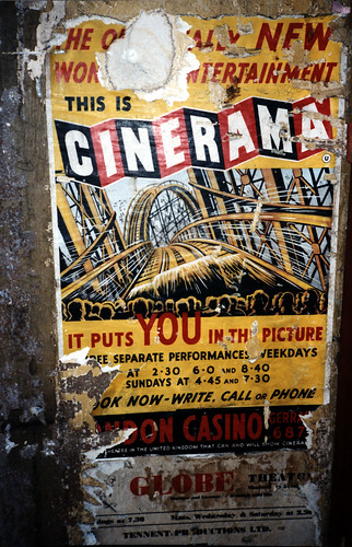
When working on the face, I was aware that I was channeling nostalgia for a kind of counterpoint layout that was popular in the early 1950s, involving bold type and large areas of spot color, but I didn’t reference anything in particular. After I had completed the typeface, I came across the old Cinerama logo (1952–1974), which has some similarities with Checker.
Now I recognize the interplay of memory and imagination that occurs in bringing vague and half-grasped imagery into sharp reality, and the differences between the Cinerama logo and Checker reveal something of my graphic interests and modus operandi. Whereas the logo has white lettering and proportional width tiles with a gap between them, Checker alternates positive and negative lettering, monowidth tiles, and forms an accordion strip – qualities which may be traced to themes and content in my recent work:
Contextual alternates. Checker integrates contextuality at a fundamental level of design, making it the pronounced sine qua non of the font. The contextual alternation of Checker involves figure/ground and italic/backslant switching, and baseline disruption.
Extreme Italicization. The lively zigzag employs extreme italicization of 20° (the norm is close to 10°) of a bold weight; this style is adapted from Figgins Sans. (Figgins is a derivative of one of the first sans serif types, from a time when the lower case sans serif did not yet exist; there was thus no model to revive and so the Figgins italic was based on its serifed Modern Suite partner, Scotch Modern Italic, which is at 20°.)
Monowidth. Panoptica (2005) was designed for constraints-based verse, with a monowidth, unicase alphabet.
Perceptual dissonance. I gave a talk at Typo Berlin in 2009 investigating the conference theme of “Space” through a history of the representation of three dimensions on a flat surface—linear perspective, from Pompeian murals to Google Earth. This touched on the graphic qualities of axonometric projection (parallel line perspective with no vanishing points) and its propensity for optical illusion. Perceptual dissonance has some relevance to type design. Geometric transformations (flipping, rotating, skewing), if not the most basic of vector drawing processes, are nonetheless actions used all the time in drawing type, to manipulate and form the components of glyphs. However, when it comes to finessing different characters, the plot thickens, because merely transforming one glyph shape to another by flipping, rotating or skewing all or part of it is not necessarily enough. Some account must be made for visual perception’s demand for bias. Put simply, when a viewer is presented with two elements which are plain transformations of the same shape, there is a modicum of confusion. At its most problematic, this manifests as dyslexia, when, for instance, a reader confuses b with q or d. To establish meaning, the eye must have its clearcut categories, to differentiate between objects which are identical and those which aren’t. Images which are transformations of one another have a hint of ambiguity; identical in shape, yet different in alignment. This is perhaps one reason why serifed types are preferred for long stretches of text, because the serifs applied to b, q, and d render them non-transforms of one another.

Letters vs Word. As a design based on the concept of transformational opposites—contrast, angle of skew, and mirroring—Checker is highly invested in the issue of perceptual dissonance. Ambiguity is embraced in the tiles’ axonometric perspective, which simultaneously suggests a view from above and below, yet rejected in curved glyphs whose mechanically skewed distortions of stem thickness have been partly unmade by manual drawing (in the time-honored typographic tradition) to facilitate the gestalt of words—emphasizing tension between letter perception and word perception as the fundamental theme of the font’s design, embodied by the principal of contextual alternates.
Nick Shinn was born in London in 1952. He has a Dip.AD in Fine Art from Leeds Polytechnic, and is a Registered Graphic Designer in Ontario, Canada, where he has lived since 1976. During the 1980s he worked in advertising as a creative director. Going digital in 1989 he started Shinn Design, specializing in publication design. Since 1980 he has designed over thirty typefaces. In 1999 he launched Shinntype, online.
Shinn has written for Druk, Eye, and Graphic Exchange, spoken at ATypI, TypeCon, TypoBerlin and Graphika conferences, and taught at York University and Humber College in Toronto. He was a board member of SOTA from 2001-2006.